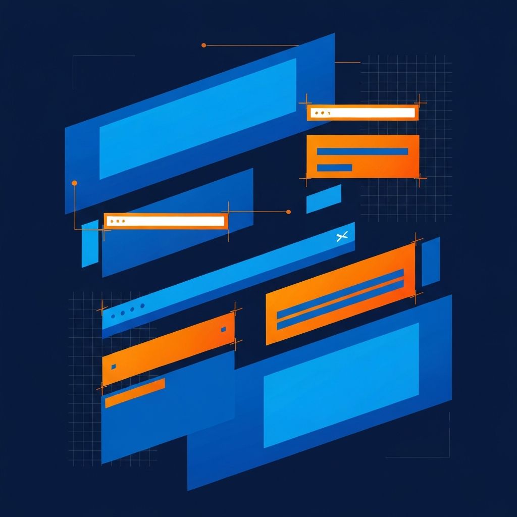
Web Page Design Elements
Building Blocks of Web Pages
Every web page is composed of distinct elements that work together to create cohesive user experiences. Understanding these elements, their purposes, and best practices for their implementation is fundamental to effective web design. Each component serves specific functions that contribute to usability, aesthetics, and conversion goals.
At AAMAX.CO, we approach web design with deep understanding of how page elements interact to serve users and businesses. As a full-service digital marketing company offering web development, digital marketing, and SEO services, we craft pages where every element is purposefully designed and strategically placed.
Header and Branding Elements
The header establishes brand identity and provides primary navigation. It typically includes the logo, main navigation menu, and sometimes secondary elements like search, login, or contact information. Headers should remain consistent across all pages to maintain brand recognition and navigation familiarity.
Logo placement traditionally follows the top-left position where Western users naturally look first. Navigation should be clear and limited to essential items to avoid overwhelming users. Sticky headers that remain visible while scrolling can improve navigation accessibility on long pages. Our website design services create headers that balance branding with functionality.
Navigation Systems
Navigation enables users to explore websites and find desired content. Primary navigation typically appears in the header, while secondary navigation may appear in sidebars or footers. Effective navigation is intuitive, consistent, and clearly indicates the user's current location.
Dropdown menus accommodate complex site structures without cluttering the main navigation bar. Mega menus display multiple options simultaneously for content-rich websites. Mobile navigation often transforms into hamburger menus that expand when tapped. Breadcrumb navigation helps users understand their position within site hierarchy.
Hero Sections
Hero sections are prominent areas typically appearing immediately below the header, designed to capture attention and communicate key messages. They often feature bold imagery, compelling headlines, and primary calls-to-action. Effective heroes immediately convey what the site offers and why visitors should care.
Hero images or videos should be high-quality and relevant to the content. Headlines should be concise yet compelling, communicating unique value propositions. Supporting text provides additional context without overwhelming. Primary CTAs guide users toward desired actions.
Content Sections
Content sections deliver the main information, products, or services that visitors seek. They should be organized logically with clear visual hierarchy that guides users through the content. Headings, subheadings, and visual breaks improve scanability.
White space prevents content sections from feeling cramped and improves readability. Consistent spacing and alignment create professional appearances. Content sections should adapt responsively to different screen sizes while maintaining readability. Our front-end web development team ensures content sections display beautifully across all devices.
Typography Elements
Typography significantly impacts readability and aesthetic appeal. Heading hierarchies (H1 through H6) structure content and indicate importance. Body text should be sized for comfortable reading, typically 16-18 pixels for desktop viewing.
Font selections should align with brand personality while ensuring readability. Serif fonts suggest tradition and reliability, while sans-serif fonts feel modern and clean. Line height and paragraph spacing affect reading comfort. Limited font families (typically two or three) maintain visual consistency.
Image and Media Elements
Visual elements break up text, illustrate concepts, and create emotional connections. Images should be high-quality, relevant, and optimized for web performance. Alt text provides accessibility for screen reader users and contributes to SEO.
Video content can powerfully convey messages but should not autoplay with sound. Image carousels and galleries showcase multiple visuals without overwhelming pages. Icons provide visual shorthand for concepts and actions. Illustrations can differentiate brands and explain complex topics.
Call-to-Action Elements
CTAs guide users toward conversion actions like purchases, sign-ups, or contact. Effective CTAs are visually prominent, clearly worded, and strategically placed. Button design should stand out from surrounding elements through color, size, and contrast.
CTA copy should be action-oriented and communicate value. "Start Free Trial" outperforms generic "Submit" by indicating what users gain. Multiple CTAs throughout pages capture users at different decision points. A/B testing optimizes CTA performance over time.
Form Elements
Forms collect user information for leads, registrations, purchases, and feedback. Well-designed forms balance data collection needs with user convenience. Each field should be justified by clear business value.
Input fields should be appropriately sized and typed. Labels, placeholders, and help text guide users effectively. Validation prevents errors and provides helpful feedback. Submit buttons should clearly indicate the action being taken.
Social Proof Elements
Testimonials, reviews, logos, and case studies build trust by demonstrating others' positive experiences. Social proof elements should be genuine and verifiable. Customer testimonials with names, photos, and companies carry more weight than anonymous quotes.
Client logos showcase notable partnerships without requiring lengthy explanations. Star ratings and review counts provide quick credibility indicators. Case studies demonstrate detailed results for skeptical prospects. Trust badges and certifications provide third-party validation.
Footer Elements
Footers provide secondary navigation, contact information, and legal content. They're often overlooked but serve important functions for users seeking specific information. Well-organized footers help users find what they couldn't locate in main navigation.
Common footer elements include secondary navigation links, contact information, social media links, newsletter signup forms, and legal links (privacy policy, terms of service). Copyright notices and business information establish legitimacy. Our website maintenance and support services ensure footer information remains current.
Sidebar Elements
Sidebars provide supplementary content and navigation without disrupting main content flow. Blog sidebars might include category navigation, recent posts, or newsletter signup. E-commerce sidebars often feature filters and refinement options.
Sidebar content should enhance rather than distract from primary content. On mobile devices, sidebars typically relocate below main content or become accessible through toggle buttons. Consider whether sidebar content truly adds value or simply fills space.
Interactive Elements
Interactive elements engage users and provide dynamic experiences. Accordions and tabs organize content efficiently while keeping pages compact. Modals and popups focus attention on specific actions or information. Hover effects provide feedback and reveal additional information.
Animation and micro-interactions add polish and guide user attention when used judiciously. Excessive animation can distract and slow page performance. Interactive elements should always serve functional purposes beyond mere decoration. Our web application development services create sophisticated interactive experiences.
Loading and Progress Elements
Loading indicators and progress bars manage user expectations during wait times. Skeleton screens indicate content structure before full loading completes. Infinite scroll loading indicators signal more content is available.
Progress indicators for multi-step processes show users where they are and what remains. Clear loading states prevent users from thinking pages are broken. Fast perceived performance through optimistic UI updates improves user experience even when actual loading takes time.
Responsive Design Elements
All page elements must adapt appropriately to different screen sizes. Breakpoints determine when layouts shift between desktop, tablet, and mobile configurations. Elements may reorder, resize, or simplify based on available space.
Mobile-first design ensures core functionality works on smallest screens before enhancing for larger displays. Touch targets must be sufficiently sized for finger interaction. Content prioritization determines which elements appear prominently on constrained mobile screens.
Conclusion
Effective web pages result from thoughtful composition of multiple elements working harmoniously together. Each element serves specific purposes that contribute to overall user experience and business goals. Understanding these building blocks enables designers to create pages that are both beautiful and functional.
At AAMAX.CO, we design web pages where every element is purposefully crafted to serve users and achieve business objectives. Our comprehensive approach ensures all page elements work together seamlessly. Contact us to learn how we can help create exceptional web experiences for your business.
Want to publish a guest post on aamax.co?
Place an order for a guest post or link insertion today.
Place an Order