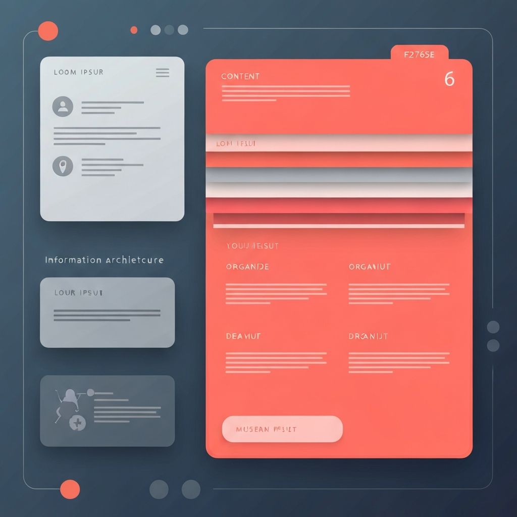
Tabs in Web Design
Understanding Tabs in Web Design
Tabs are a fundamental user interface pattern that allows web designers to organize large amounts of content into manageable, easily navigable sections. When implemented correctly, tabs in web design improve user experience by reducing visual clutter, organizing related content, and making information easier to find. At AAMAX.CO, we leverage tabs and other UI patterns strategically to create websites that are both visually appealing and highly functional.
The tab pattern mimics physical file folders, making it instantly recognizable to users. This familiar metaphor helps visitors understand how to interact with tabbed content without explicit instruction. Users know intuitively that clicking a tab will reveal associated content while hiding other sections. This cognitive familiarity makes tabs an effective tool for presenting complex information in an accessible way.
When to Use Tabs in Web Design
Tabs are most effective when you have multiple categories of content that users will likely want to view one at a time rather than all together. Product pages often benefit from tabs that separate descriptions, specifications, reviews, and shipping information. Account dashboards might use tabs to organize different settings categories. Documentation sites use tabs to present the same information for different platforms or versions.
However, tabs aren't always the right choice. If all content is essential and users need to see everything at once, tabs create unnecessary friction. If the content sections are very short, the overhead of tab navigation might not be justified. Our website design team carefully evaluates content structures to determine when tabs add value and when alternative approaches might be more effective.
Best Practices for Tab Design
Effective tab design requires attention to several key principles. First, tab labels should be clear and concise, accurately describing the content they reveal. Users should be able to understand what they'll find behind each tab without clicking it. Avoid vague labels like "More" or "Other" that don't communicate specific content.
Visual design of tabs should clearly indicate which tab is currently active. This typically involves differentiated colors, borders, or typography that make the active tab stand out from inactive ones. The connection between the active tab and its content panel should be visually obvious, often achieved through shared backgrounds or connected borders.
Responsive Tab Design
Tabs present interesting challenges in responsive web design. The horizontal tab pattern that works well on desktop screens may not function effectively on narrow mobile screens where tabs might wrap awkwardly or become too small to tap. Different strategies exist for handling tabs responsively.
One common approach transforms tabs into an accordion pattern on mobile devices, where each section header expands to reveal content. Another approach uses horizontal scrolling for tab navigation on mobile, with clear indicators that more tabs are available. Our front-end web development team implements responsive tab solutions that maintain usability across all device sizes.
Accessibility Considerations
Making tabs accessible to all users, including those using assistive technologies, requires careful attention to semantic markup and keyboard navigation. Tabs should use appropriate ARIA roles and attributes that communicate their structure and state to screen readers. This includes role="tablist" for the container, role="tab" for each tab, and role="tabpanel" for content panels.
Keyboard navigation is essential for accessibility. Users should be able to navigate between tabs using arrow keys and activate tabs with Enter or Space. Focus states must be clearly visible to help keyboard users understand where they are in the interface. Our commitment to accessibility ensures that all users can interact with tabbed content effectively.
Technical Implementation
Implementing tabs well requires clean HTML structure, thoughtful CSS styling, and appropriate JavaScript functionality. The HTML should use semantic elements and ARIA attributes that communicate the tab structure to assistive technologies. CSS handles the visual presentation, including active states, hover effects, and responsive behavior.
JavaScript enables the interactive behavior—showing and hiding content panels as users click tabs, managing focus for keyboard navigation, and updating ARIA states to reflect the current selection. Modern frameworks like React provide component-based approaches to tab implementation that promote reusability and maintainability. Our ReactJS web development services leverage these capabilities for sophisticated tab implementations.
Animation and Transition Effects
Subtle animations can enhance the tab experience by providing visual feedback and creating smooth transitions between content panels. When a user clicks a new tab, animating the content change—perhaps with a fade or slide—helps them understand that the content has changed and provides a more polished feel.
However, animations should be subtle and fast enough not to impede users who are navigating quickly. Overly elaborate transitions can become annoying with repeated use. The goal is enhancement, not showmanship. Our designers carefully calibrate animations to improve the experience without slowing users down.
Content Organization Strategy
The effectiveness of tabs depends heavily on how content is organized within them. Each tab should contain a complete, coherent section of content that makes sense on its own. Cross-references between tabs should be minimized—if users constantly need to switch back and forth between tabs to understand content, the organization may need rethinking.
Content length across tabs should be reasonably balanced. If one tab contains significantly more content than others, users might not realize how much information is hidden behind it. Consider breaking particularly long sections into sub-tabs or using alternative organizational approaches for asymmetric content.
Alternative Patterns to Consider
While tabs are powerful, alternative patterns might better serve certain situations. Accordions work well when users might want to view multiple sections simultaneously or when vertical scrolling is preferable to horizontal tab navigation. Segmented controls suit binary or simple choices where tabs might feel too heavy.
Anchor links that scroll to different sections of a long page can serve similar organizational purposes while keeping all content visible and searchable. Step indicators work better than tabs for sequential processes where order matters. Our web development consulting services help clients choose the right patterns for their specific needs.
Performance Considerations
Tabs raise interesting performance questions about when to load content. Loading all content upfront ensures instant tab switching but increases initial page weight. Loading content only when a tab is clicked reduces initial load but introduces delay when switching tabs.
The right approach depends on the content and usage patterns. For relatively small content amounts, upfront loading is usually best. For tabs containing heavy content like images or complex data, lazy loading makes more sense. Our website development process considers these tradeoffs to optimize performance while maintaining good user experience.
Testing Tab Interfaces
User testing is valuable for validating tab implementations. Watch how real users interact with your tabs: Do they find the content they're looking for? Do they understand the tab structure? Are there pain points in navigation? Analytics can reveal which tabs receive the most and least engagement, informing decisions about content organization and emphasis.
A/B testing can compare different tab implementations—different label wording, different visual styles, different content organization—to identify what works best for your specific audience. Data-driven iteration helps refine tab interfaces to maximize their effectiveness.
Tabs and SEO
Content within tabs is generally accessible to search engines, but some considerations apply. Make sure that tab content is present in the HTML and not loaded exclusively via JavaScript after user interaction—search engines may not index content that requires interaction to appear. Progressive enhancement approaches that work without JavaScript provide the best search engine visibility.
Also consider whether users arriving from search should land on specific tabs. If a user searches for product specifications and lands on a product page, having specifications immediately visible (or auto-selecting that tab) provides a better experience than requiring another click.
Conclusion: Mastering Tabs for Better User Experience
Tabs in web design are a powerful tool for organizing content and improving user experience when used appropriately. Understanding when to use tabs, how to design them effectively, and how to implement them accessibly enables web designers and developers to create interfaces that serve users well.
At AAMAX.CO, we thoughtfully incorporate tabs and other UI patterns into our web designs to create intuitive, user-friendly experiences. Contact us to learn how we can help organize your content effectively and create websites that delight your users.
Want to publish a guest post on aamax.co?
Place an order for a guest post or link insertion today.
Place an Order