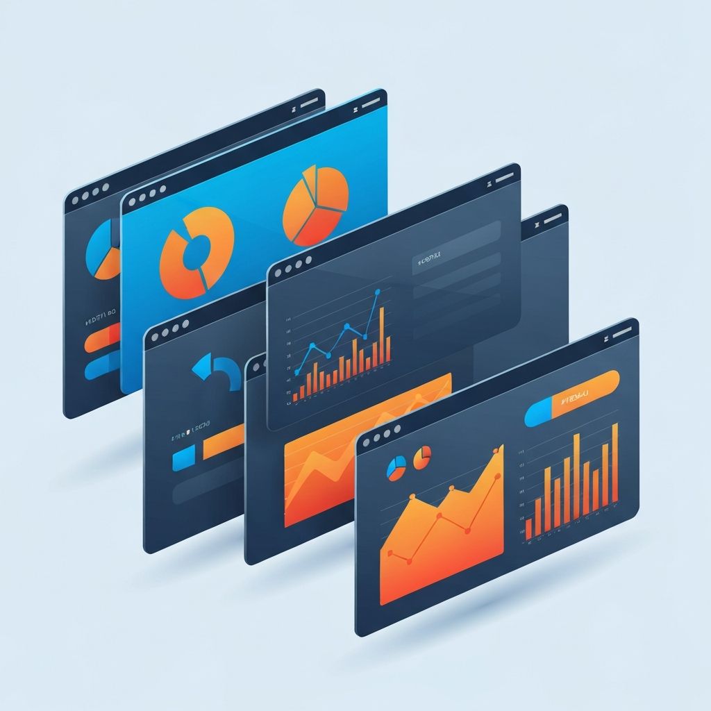
Dashboard Web Design
Introduction: Why Dashboard Web Design Matters
A dashboard is more than a pretty arrangement of charts. It is the command center of your business, the place where data becomes insight and insight becomes action. Good dashboard web design helps executives make confident decisions, helps operations teams spot problems early, and helps customers understand the value of a product at a glance. Poor dashboard design does the opposite: it hides important information in noise, slows down workflows, and erodes trust.
At AAMAX.CO, we design and build custom dashboards for SaaS platforms, internal tools, e-commerce analytics, healthcare systems, and enterprise operations. In this article, we share the principles, patterns, and practical tips that go into a dashboard that truly delivers.
What Is a Web Dashboard?
A web dashboard is a browser-based interface that consolidates key metrics, data visualizations, and controls into a single view. Common types include analytics dashboards, operational dashboards, admin dashboards, customer-facing dashboards, and executive overview dashboards. Each has different audiences, priorities, and data refresh cadences, and each requires a tailored design approach.
Start With Clear Goals and User Needs
Great dashboards begin with questions, not widgets. Who is the primary user? What decisions do they need to make? What actions follow those decisions? How frequently will they return, and from which devices? Without answers, dashboards devolve into cluttered walls of numbers.
We facilitate discovery workshops to map user roles, jobs-to-be-done, and critical KPIs before a single screen is designed. This upfront clarity drives every subsequent decision, from layout and hierarchy to data pipelines and performance budgets. Teams looking for structured guidance often engage our web development consulting services at this stage.
Information Hierarchy and Visual Priority
Every dashboard must answer the unspoken user question: what should I look at first? Strong visual hierarchy solves this using size, color, contrast, and position. Primary KPIs anchor the top of the screen. Supporting metrics provide context. Detailed tables and drill-downs live below or behind interactions.
Whitespace is not wasted space. It groups related content, reduces cognitive load, and lets important numbers breathe. A dense dashboard is not necessarily a powerful one. A focused dashboard almost always is.
Choosing the Right Chart for the Job
Chart selection is a design decision, not a decoration. Bar charts compare categories. Line charts show trends over time. Area charts emphasize volume. Donut and pie charts display parts of a whole, but only with a small number of segments. Heatmaps reveal density patterns. Tables still win when users need exact values.
Misused charts create confusion and mistrust. We favor straightforward, well-labeled visualizations that prioritize clarity over novelty, and we validate choices with real users before build-out. Custom visualizations come in when standard charts truly fall short.
Color, Typography, and Brand Alignment
Dashboards should feel like part of the product, not a detached tool. That means thoughtful use of brand colors, consistent typography, and predictable iconography. Color also carries meaning. Red for alerts, green for success, and neutral tones for context must be used consistently across the entire system.
Accessibility is essential. Sufficient contrast, readable font sizes, and non-color-dependent status indicators ensure every user can interpret the data. Our website design team weaves accessibility into the design system from day one.
Responsive and Multi-Device Dashboards
Modern users expect dashboards to work on laptops, large monitors, tablets, and phones. Responsive dashboard design requires more than shrinking charts. It requires rethinking hierarchy, prioritizing the most valuable metrics on small screens, and providing progressive disclosure for the rest.
We often build mobile views that highlight alerts and headline KPIs, while desktop views deliver deep analysis. This matches how people actually use dashboards in real workflows, checking quickly on the go and analyzing thoroughly at their desks.
Performance: Why Speed Is a Feature
A dashboard that takes ten seconds to load is a dashboard that gets ignored. Performance is a design feature, not just an engineering concern. Smart data aggregation, caching, pagination, skeleton loaders, virtualized tables, and efficient queries make dashboards feel instant.
We build high-performance dashboards using modern stacks such as ReactJs web development and Next.js web development, paired with robust APIs delivered through our back-end web development expertise. This combination keeps interfaces responsive even at scale.
Filters, Search, and Drill-Down Interactions
Dashboards become exponentially more useful when users can slice data their own way. Global filters for time range, region, product, or team empower self-service analysis. Inline search and smart defaults reduce friction. Drill-downs let users pivot from high-level KPIs to row-level detail without losing context.
We design filter systems that persist across sessions, sync with URLs for shareable links, and gracefully handle empty states or invalid combinations, because polished interactions separate good dashboards from great ones.
Real-Time vs. Periodic Data
Not every metric needs to update in real time. Financial totals may only need daily refreshes. System health, however, may demand live updates. Designing the right cadence prevents unnecessary load on infrastructure and unnecessary distraction for users. Where real time matters, we integrate web sockets, server-sent events, or smart polling to keep data fresh without sacrificing performance.
Security, Roles, and Permissions
Dashboards often display sensitive information, so role-based access control is critical. Different users should see different metrics, different filters, and different actions. We design with security in mind from the first wireframe, integrating authentication, authorization, audit trails, and encryption as core parts of the system rather than afterthoughts.
Common Dashboard Design Pitfalls to Avoid
Many dashboards fail because they try to show everything at once. Others rely on vanity metrics that look impressive but do not drive action. Some use novel visualizations that look trendy but are hard to read. And many forget empty states, loading states, and error states, which are essential for a trustworthy experience.
Our process includes usability testing, analytics instrumentation, and iterative refinement, so dashboards keep improving after launch with the help of our website maintenance and support team.
Conclusion: Partner With Experts for Your Next Dashboard
A great dashboard is a product in its own right. It takes careful planning, thoughtful design, rigorous engineering, and continuous iteration. When done well, it becomes the decision-making engine of your business.
If you are planning a new dashboard, rebuilding a cluttered one, or adding analytics to a SaaS product, hire AAMAX.CO for web design and development services. We will help you turn complex data into clear, confident action.
Want to publish a guest post on aamax.co?
Place an order for a guest post or link insertion today.
Place an Order