

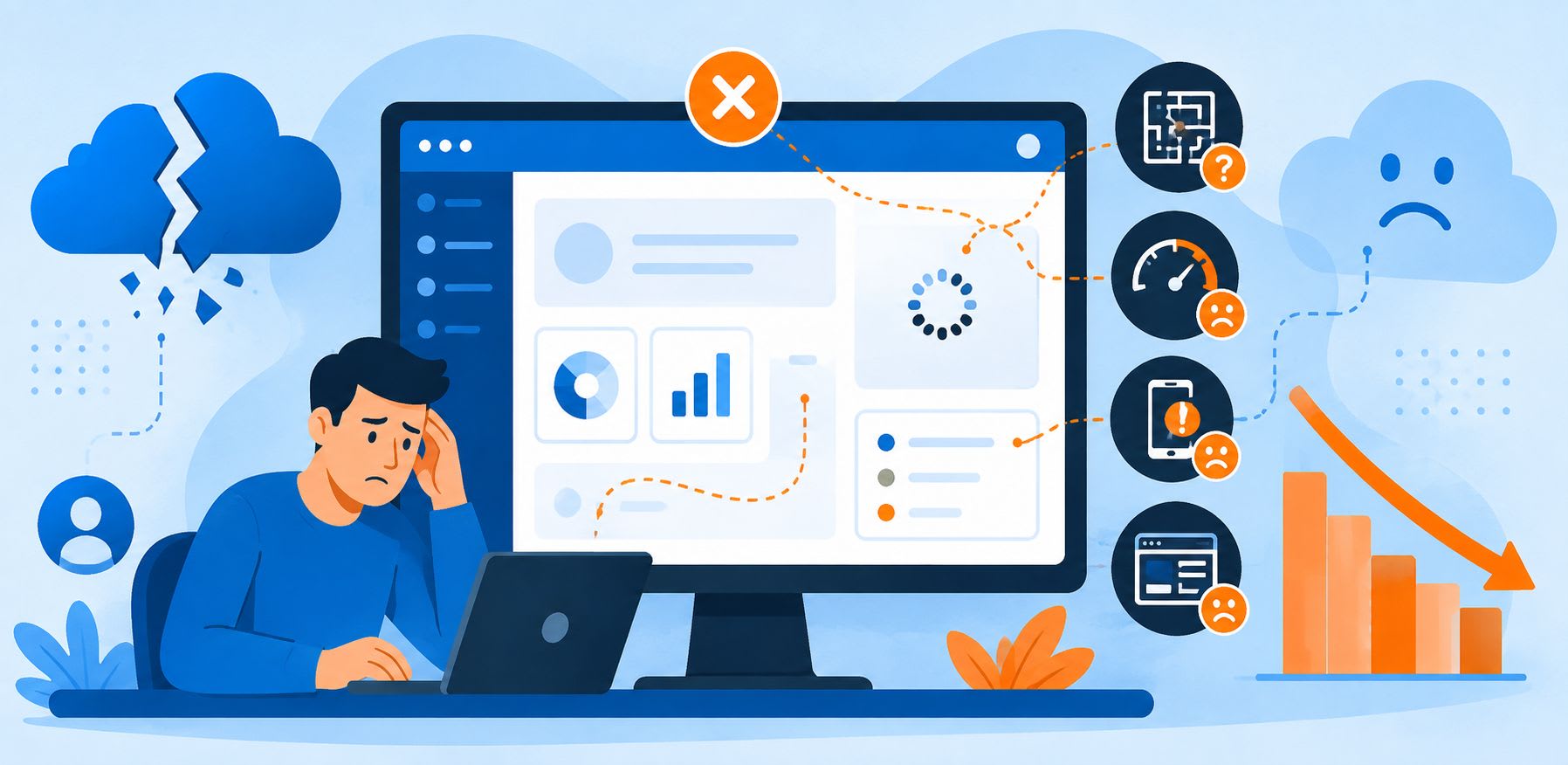
Why Good SaaS Products Fail: The UX Problems Users Notice First
Most failed SaaS products were not bad products. They were good products that nobody stayed long enough to understand. The engineering held up, the feature list was competitive, the pricing was reasonable — and churn still ate the business alive. When founders dig into the numbers afterward, the story is rarely "we lacked features." It is almost always some version of "people signed up, poked around, got confused, and never came back."
That gap between product quality and product experience is where the real money leaks. A user forms a judgment about your software in the first two or three minutes, long before they touch the capability you spent eighteen months building. If those minutes feel slow, cluttered, or vaguely humiliating, no roadmap item will rescue the relationship.
This article breaks down the UX problems users notice first — in the order they notice them — and what each one costs you. If you are auditing your own product as you read, it helps to work with people who do this professionally; teams offering ui and ux design services spend their days finding exactly these fractures. But you can spot most of them yourself with a fresh pair of eyes and an honest hour.
The First Two Minutes Decide Everything
Users do not evaluate SaaS products the way we evaluate them internally. We see architecture and capability. They see a wall of unfamiliar words and one question: can I get something done here right now?
Here is the rough sequence of what a new user actually registers, and how fast:
| Time in product | What the user notices | What they conclude |
|---|---|---|
| 0–10 seconds | Load speed, visual clutter, whether the screen looks familiar | "Is this professional or amateur?" |
| 10–60 seconds | Whether there is an obvious next step | "Do they know what I came here for?" |
| 1–3 minutes | Labels, jargon, empty states, form friction | "Is this built for me or for the engineers?" |
| 3–10 minutes | Whether they reached one small win | "Was this worth signing up for?" |
| Day 2–7 | Whether they remember how to repeat the win | "Do I keep this or forget it?" |
Notice that nothing in that table is a feature. It is all navigation, language, speed and reassurance. This is why products with weaker feature sets routinely beat stronger competitors: they win the first two minutes.
Problem One: The Empty Dashboard
The single most common failure in B2B SaaS is the blank slate. A user finishes signup, lands on the main screen, and finds an empty table, a zeroed-out chart, and a sidebar of features that mean nothing yet. The product is technically working perfectly. It is also communicating nothing.
Empty states are not a design afterthought — they are the most-viewed screen in your product for every new account. Treat them as onboarding surfaces:
- Show a populated example with sample data the user can delete, so the value is visible before any work is done.
- Give one primary action, not six. A single high-contrast button beats a tour with twelve steps.
- Explain the payoff, not the mechanic. "Connect your inbox to see reply rates" works. "Configure integration" does not.
- Preserve progress. If a user completed three of five setup steps, show it. Losing progress is a reliable way to lose a person.
If you want a deeper look at how these screens should be structured, AAMAX covers this in detail in their guide to web application page design, which walks through dashboard hierarchy and first-run layouts specifically for software products.
Problem Two: You Are Speaking a Language the User Doesn't Have
Internal vocabulary leaks into interfaces constantly. Teams name a database table "Entities," and eighteen months later the user-facing menu still says "Entities." Nobody on the inside notices, because everyone on the inside learned the word years ago.
Bad labels create a specific kind of failure: the user cannot even formulate the right question to ask support. They do not know what the thing is called, so they cannot search the docs, so they leave.
| What the product says | What the user needs to read |
|---|---|
| Configure workspace entities | Add your clients |
| Provision access token | Connect your account |
| Sync pipeline status: idle | Last updated 4 minutes ago |
| Error: constraint violation | That name is already taken |
Run a simple test. Take screenshots of your five most-used screens, hand them to someone who has never seen your product, and ask them to narrate what each button does. Every hesitation is a churn risk written down for you.
Problem Three: Speed Is a Feature, and Users Grade It Harshly
Performance is perceived as competence. A dashboard that takes four seconds to render does not read as "complex query" to the user — it reads as "this company is sloppy." And unlike a missing feature, slowness is felt on every single session, compounding irritation over weeks.
Three performance problems users notice immediately:
- Blocking spinners. A full-page loader hides everything. Skeleton screens that reveal layout instantly feel dramatically faster even at identical load times.
- Unacknowledged clicks. If a button does nothing visible for 800 milliseconds, users click again — and now you have duplicate records to explain.
- Layout shift. Content that jumps as assets load causes mis-clicks, and mis-clicks in a paid tool feel like the tool's fault.
Sometimes the fix is not front-end at all. Plenty of teams optimize images and minify bundles while the actual bottleneck is infrastructure — a case AAMAX makes well in their write-up on how VPS hosting improves performance and reliability. Diagnose before you refactor.
Problem Four: Forms That Interrogate Instead of Onboard
Signup forms are where optimism goes to die. Every additional required field is a small tax on a person who has not yet received anything from you. Asking for company size, job title, phone number and team headcount before the first login is asking a stranger to fill out paperwork for a product they have not seen.
A better sequence is progressive: collect the minimum to create an account, then gather context inside the product once the user is invested. Ask for a phone number when they need SMS alerts, not when they need a password.
- Validate inline, not on submit — nobody wants to discover eight errors at once.
- Never clear a filled field on error. It is the fastest way to lose someone.
- Label errors with the fix, not the diagnosis: "Password needs 8+ characters" beats "Invalid input."
- Support paste in verification-code fields. This one is small and it matters constantly.
Problem Five: Mobile Treated as an Afterthought
B2B teams assume desktop usage and are consistently wrong about the margins. Approvals, notifications, quick status checks and shared links get opened on phones — often by the executive who signs the invoice. When that person's first exposure to your product is a horizontally scrolling table with 8px text, the impression sticks.
You do not need feature parity on mobile. You need the read-and-respond paths to work flawlessly: view a record, approve or comment, check a number, receive an alert. Everything else can wait for a laptop.
Problem Six: Nobody Knows What Changed
Silent shipping is an underrated churn driver. You move a button, rename a section, or redesign a workflow, and the user who had finally built a habit around the old version now feels lost in a product they were paying for happily. There was no announcement, no tooltip, no changelog — just a Tuesday where things stopped working the way they remembered.
Change is not the problem. Unannounced change is. A one-line in-app notice does more for retention than most feature launches.
A Practical Audit You Can Run This Week
You do not need a research budget to find most of this. You need five people and an hour each.
| Step | What to do | What it reveals |
|---|---|---|
| 1 | Watch 5 new users sign up without helping them | Where the first-run flow breaks |
| 2 | Count clicks to the core action | Hidden depth in your navigation |
| 3 | Read every error message aloud | Developer language in user-facing copy |
| 4 | Open the product on a mid-range Android phone | Real-world performance and layout failures |
| 5 | Read the last 50 support tickets and tag by screen | The exact interfaces costing you money |
That last step is the highest-leverage thing on the list and almost nobody does it. Your support inbox is a free, continuously updating usability study. If four tickets a week mention the same settings page, that page is not a documentation problem. It is a design problem.
Why This Keeps Happening
Teams do not neglect UX out of ignorance. They neglect it because feature work is legible to stakeholders and experience work is not. "We shipped SSO" fits in a board deck. "We rewrote nineteen error messages and cut signup from nine fields to three" does not — even though the second one usually moves activation more.
The organizations that get this right treat experience as a measurable line item: activation rate, time-to-first-value, support tickets per hundred accounts, week-four retention. Once those numbers are on the same dashboard as revenue, the argument for design stops being aesthetic and starts being financial. AAMAX's overview of how UX and web design work together is a useful framing here, particularly for teams where design and marketing sit in separate silos.
The Short Version
Good SaaS products fail for boring reasons. An empty first screen. A label only the engineering team understands. Four seconds of white space where a dashboard should be. A signup form that asks for a phone number before it delivers any value. None of these appear on a roadmap, and all of them are decided in the first few minutes of a user's life with your product.
Fix the first two minutes and the rest of your roadmap finally gets a chance to matter.
Want to publish a guest post on aamax.co?
Place an order for a guest post or link insertion today.
Place an Order