What Is a Hero Section Web Design Definition
Hero Section: A Clear Definition
In web design, a hero section is the prominent introductory area at the top of a webpage, typically positioned immediately below the navigation bar and spanning the full width of the screen. It is the first content visitors see when a page loads and is intentionally designed to capture attention, communicate the page's primary message, and invite the visitor to take a specific action. The term comes from print design, where a “hero image” was the dominant visual on a poster or magazine cover, and it has been adopted by the web to describe the same dominant top-of-page experience. At AAMAX.CO, we treat the hero section as the most strategically important area on any page, because it sets expectations for everything that follows.
This article walks through the formal definition, the components, the role, and the best practices for designing a hero section that performs.
Why the Hero Section Exists
The hero section exists because attention online is scarce. Most visitors decide whether to stay on a page within a few seconds. The hero section is engineered to win that decision by communicating, in one glance, what the page is about, why it matters, and what the visitor should do next.
Beyond first impressions, hero sections serve as a navigational anchor. They help visitors orient themselves, understand the context, and decide whether they are in the right place. A clear hero section reduces bounce rates and increases the chance that visitors will engage with the rest of the content.
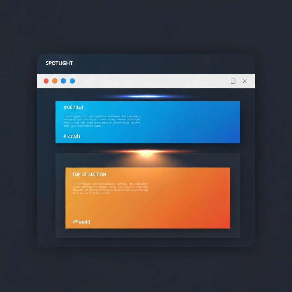
The Anatomy of a Hero Section
A typical hero section contains several core elements. The headline is the dominant piece of text, usually styled as an H1, that delivers the page's main promise. It should be specific, benefit-driven, and immediately understandable.
The subheadline sits below the headline and adds supporting context. It explains, qualifies, or expands the headline in a sentence or two. Together, the headline and subheadline should answer the visitor's implicit question: “What is this page, and why should I care?”
The primary call to action is a button or link that tells the visitor exactly what to do next. It should be visually prominent, use clear action-oriented language, and be unambiguous in its outcome. Common examples include “Get Started,” “Book a Demo,” “Shop the Collection,” or “Get a Free Quote.”
A secondary call to action is sometimes included for visitors who are not yet ready for the primary action. It might say “Learn More,” “Watch the Video,” or “See Pricing.” The key is that it must not compete visually with the primary CTA.
The visual — an image, illustration, video, or animation — reinforces the message and adds emotional weight. The visual should support the copy, not distract from it.
Finally, optional elements like trust signals (client logos, ratings, awards), navigation cues (scroll indicators), and contextual information (subtle stats or quick benefits) can enhance the hero section when used sparingly.
Hero Section vs. Banner
People sometimes confuse hero sections with banners or sliders. A banner is typically a smaller promotional element, often used for marketing campaigns or announcements. A slider rotates through multiple slides automatically and was once popular in hero placements but has largely fallen out of favor because it dilutes the message and reduces engagement with any single slide.
A modern hero section focuses on a single, clear message rather than rotating between several. Sliders are now generally reserved for specific cases like product galleries, not main hero placements.
Variations and Styles of Hero Sections
Hero sections come in a wide variety of styles, each suited to different business types and audiences. The split hero places copy on one side and a visual on the other, providing balance and clarity. The full-bleed hero uses a large background image or video with overlaid text, ideal for emotionally driven brands.
The minimalist hero uses generous whitespace and a single dominant headline, projecting confidence and sophistication. The video hero immediately captures attention with motion. The interactive hero invites the user to engage right away, perhaps with a search bar or product configurator.
The conversion-focused hero packs the headline, subheadline, CTA, and trust signals tightly to drive action quickly — common in landing pages and SaaS marketing sites. The storytelling hero uses cinematic imagery and copy to draw the visitor into a narrative, often used in nonprofit, lifestyle, and luxury brands.
Best Practices for Designing a Hero Section
The most effective hero sections share a few common traits. Clarity is the first principle. The visitor should understand the offer in seconds, without parsing clever wordplay or industry jargon.
Visual hierarchy ensures attention flows naturally from headline to subheadline to CTA. Size, weight, color, and spacing all play roles in directing the eye.
Performance matters. Hero sections often contain large images or videos that can drag down page speed if not optimized. Modern formats like WebP and AVIF, lazy loading, and responsive image sizes keep the hero fast.
Mobile responsiveness is critical. The hero must look and function beautifully on phones, where layouts often need to be restructured. Stacking the visual above the copy, increasing button sizes, and adjusting font sizes are common mobile adaptations.
Accessibility ensures the hero works for everyone. Sufficient color contrast, descriptive alt text, and keyboard-navigable CTAs are essential.
Alignment with brand is the final principle. The hero should feel unmistakably like the brand it represents, in voice, imagery, color, and personality.
Common Mistakes in Hero Sections
Many hero sections fail in predictable ways. Vague headlines like “Welcome” or “We are passionate about quality” waste prime real estate. Overcrowded layouts try to cram too much information into a single area. Generic stock photos that have nothing to do with the actual business cheapen the experience.
Weak or hidden calls to action are another widespread issue. If a visitor cannot immediately find what to do next, they will likely do nothing. Multiple competing CTAs split attention — one primary plus an optional secondary is usually best.
Heavy media that slows the page is also common. A beautiful video that takes seven seconds to load loses more visitors than it converts.
Measuring the Success of a Hero Section
Because the hero section disproportionately influences user behavior, measuring its performance is critical. Key metrics include click-through rate on the primary CTA, scroll depth past the hero, bounce rate, and time on page. Heatmaps reveal where users actually look and click, while session recordings show how they navigate.
Continuous testing of headlines, visuals, and CTAs is one of the most reliable ways to lift conversion rates. We integrate this kind of optimization into our broader website design and development engagements.
How AAMAX.CO Designs Hero Sections That Perform
Our hero section design starts with strategy. We dig into the audience's biggest pain points, the brand's unique strengths, and the page's primary objective. We craft headline options that pass the “five-second test,” pair them with visuals that reinforce the message, and design layouts that guide the eye toward the call to action.
We then engineer the hero with our MERN stack development, Next.js, or WordPress teams — whatever fits the project — ensuring blazing performance, full responsiveness, and accessibility on every device. Finally, we measure and iterate, because the hero is too important to leave on autopilot.
Final Thoughts
The hero section is the most prominent and most consequential area on any webpage. A clear, compelling, well-engineered hero earns visitor attention, communicates value, and drives action. A weak hero quietly costs you customers every day. Hire AAMAX.CO when you want a hero section — and an entire website — designed to perform from the first pixel.
Want to publish a guest post on aamax.co?
Place an order for a guest post or link insertion today.
Place an Order