Web Page Design List Design
The Underrated Art of List Design
Lists are one of the most common patterns on the web. From product grids and feature highlights to navigation menus, blog archives, and pricing tables, almost every web page contains some form of list. Yet list design is often overlooked—treated as a default rather than a deliberate design decision. When done well, list design can dramatically improve scannability, usability, and conversions.
At AAMAX.CO, we treat list design as a strategic discipline. The right list pattern can guide a user smoothly toward an action, while the wrong one can overwhelm them. In this article, we explore the principles, patterns, and best practices behind effective web page list design.
Why Lists Matter
Lists chunk information into digestible pieces. They make scanning easier, support hierarchy, and let users compare options quickly. From a development perspective, lists also map cleanly to data structures—arrays of objects rendered through frameworks like React or Next.js.
Types of Lists in Web Design
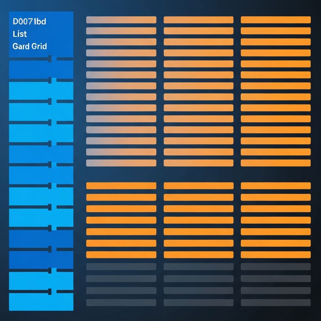
Several common list patterns exist. Bulleted lists highlight features or benefits. Numbered lists communicate sequence or priority. Definition lists pair terms with explanations. Card grids display product collections, blog posts, or team members. Tables compare structured data, while timelines visualize progress or history. Each pattern has a different purpose and different design considerations.
Visual Hierarchy in Lists
A well-designed list uses hierarchy to guide the eye. The list title should be visually distinct, items should follow a consistent style, and any primary action (like a CTA button) should stand out. Avoid making every item shout—contrast and rhythm matter more than decoration.
Spacing and Rhythm
Spacing within and between list items is critical. Tight spacing makes content feel cramped; excessive spacing breaks flow and forces unnecessary scrolling. Use a consistent spacing scale—such as multiples of 4 or 8 pixels—to create a calm, predictable rhythm.
Typography in List Design
Use one typeface for list titles and another (or a different weight of the same family) for descriptions. Keep line lengths comfortable, and pay attention to line height. Bold or color-coded labels can quickly communicate categories within a list, like "New", "Popular", or "Sale".
Iconography and Imagery
Icons can enhance lists by reinforcing meaning visually. Stick to a consistent icon style and size. For card grids, use uniformly cropped, high-quality images. Mismatched aspect ratios make lists feel chaotic. SVG icons remain the gold standard for clarity and performance.
Responsive List Patterns
A list that looks great on desktop may feel cramped or overwhelming on mobile. Use responsive grids that adapt the number of columns based on screen width. Consider horizontal scrolling for long item lists on mobile, but make scroll affordances clear with arrows, fades, or pagination dots.
Sorting, Filtering, and Search
Long lists need controls. Add filters for category, price, date, or rating. Provide sort options like "Newest", "Most Popular", or "Price (Low to High)". For very large datasets, integrate search with auto-complete. These controls drastically reduce friction in product, blog, or directory pages.
Accessibility in Lists
Use semantic HTML: <ul>, <ol>, and <dl> convey structure to assistive technologies. For card grids, group related items with appropriate ARIA roles. Ensure keyboard navigation works smoothly, and that focus states are clearly visible. Accessible lists are usable lists.
Performance Considerations
Long lists can hurt page speed if not handled carefully. Use lazy loading, virtualization (for thousands of items), and skeleton loaders during data fetches. Pagination or infinite scroll should be chosen based on context: pagination is better for SEO and direct linking, infinite scroll suits social or media-heavy experiences.
Empty States, Loading States, and Errors
What happens when there are no items, when data is loading, or when something fails? Thoughtful designs handle each scenario gracefully. An empty state can include an illustration and a friendly suggestion. A skeleton loader signals progress. An error state offers a retry option. These small details build trust.
List Design in CMS-Driven Sites
For content-heavy sites built on platforms like WordPress or Strapi CMS, list templates are reusable across categories, tags, archives, and search results. Designing flexible, scalable list components saves significant time and ensures consistency as content grows.
E-Commerce Product Lists
Product grids deserve special attention. Show clear images, prices, ratings, and availability. Add quick actions like "Add to Cart" and "Wishlist". Highlight discounts and stock status. Effective product list design directly affects revenue—every percentage point in conversion matters.
Common Pitfalls in List Design
Inconsistent item heights, missing alignment, weak hierarchy, walls of text, and poor empty states are among the most common issues. Lists should feel cohesive and rhythmic, not like a random pile of cards.
How AAMAX.CO Designs Smarter Lists
We build flexible, accessible, performant list components for clients across e-commerce, SaaS, media, and education. Our team handles everything from initial website design to long-term website maintenance and support to ensure your lists keep performing as your business grows.
Conclusion
Lists may seem mundane, but they are central to almost every web page. Design them with intention—use clear hierarchy, consistent rhythm, responsive layouts, and accessible markup. When you are ready to elevate your next project, hire AAMAX.CO for web design and development services that turn ordinary lists into delightful experiences.
Want to publish a guest post on aamax.co?
Place an order for a guest post or link insertion today.
Place an Order