Web Form UI Design
Understanding Web Form UI Design Fundamentals
The user interface design of web forms plays a pivotal role in determining whether visitors complete their intended actions or abandon the process in frustration. At AAMAX.CO, we recognize that exceptional form UI design goes far beyond aesthetics—it encompasses usability, accessibility, and psychological principles that guide users toward successful completion. Every element, from input field styling to button placement, contributes to the overall user experience.
Web form UI design has evolved significantly from the basic text fields and submit buttons of early websites. Today's forms incorporate sophisticated visual hierarchies, micro-interactions, real-time validation, and responsive layouts that adapt seamlessly across devices. Understanding these fundamentals is essential for anyone looking to create forms that not only look professional but also perform exceptionally well in terms of conversion rates and user satisfaction.
Visual Hierarchy and Form Layout
Creating a clear visual hierarchy ensures users understand the relationship between form elements and the order in which they should be completed. Labels should be positioned consistently—either above or to the left of their corresponding fields—with sufficient contrast to be easily readable. Grouping related fields with visual separators or containers helps users mentally organize the information being requested.
White space is a powerful tool in form UI design. Adequate spacing between elements prevents forms from feeling cluttered and overwhelming. The strategic use of margins and padding guides the eye through the form naturally, creating a rhythm that makes completion feel effortless. Our website design approach prioritizes these principles to create forms that feel intuitive from the first interaction.
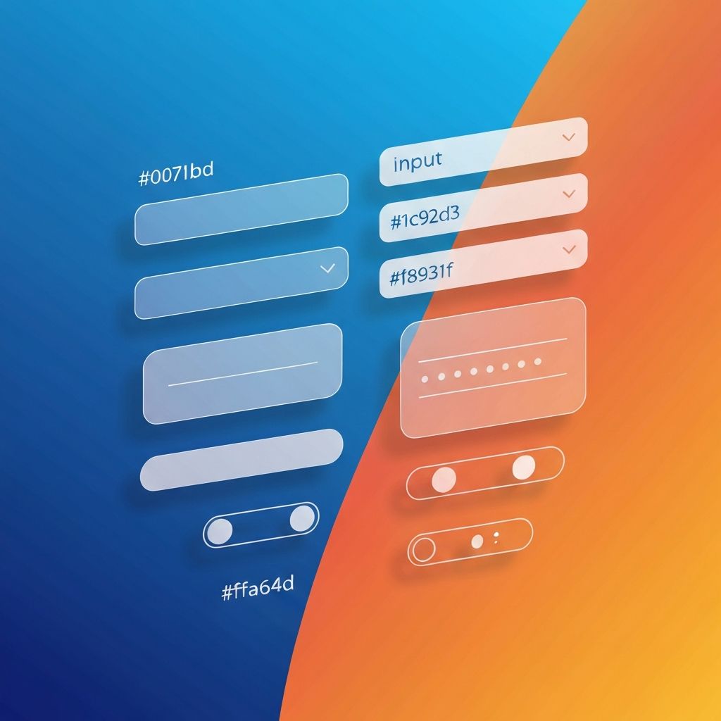
Input Field Styling and States
Input fields are the workhorses of any form, and their styling significantly impacts usability. Modern UI design calls for clearly defined field boundaries, whether through borders, background colors, or shadows. The active state should be immediately obvious, typically indicated by a change in border color, a subtle glow, or an increase in border width that draws attention to the focused field.
Different states require distinct visual treatments: default, focused, filled, disabled, error, and success states each communicate important information to users. Consistent styling across states builds familiarity and reduces cognitive load. Placeholder text should be styled differently from user input to prevent confusion, and it should disappear or move when the user begins typing to maintain context.
Typography and Readability in Forms
Typography choices profoundly affect form usability. Labels should use clear, legible fonts at sizes that are easily readable on all devices—typically no smaller than 14 pixels for body text. Consistent typography creates visual cohesion, while strategic weight variations can emphasize important elements like section headings or required field indicators.
Error messages and helper text require careful typographic treatment. These elements should be distinguishable from labels while remaining readable and unobtrusive. Color coding helps users quickly identify success messages, warnings, and errors, but typography should also support these distinctions for accessibility purposes. Our front-end web development expertise ensures typography serves both form and function.
Button Design and Call-to-Action Optimization
The submit button is arguably the most important element in any form UI. Its design should make it immediately recognizable as the primary action, typically through size, color, and positioning. High-contrast colors that stand out from the rest of the form draw attention, while sufficient size ensures easy clicking or tapping on any device.
Button text should be action-oriented and specific to the context. Instead of generic labels like "Submit" or "Send," effective buttons communicate value: "Get Your Free Quote," "Create My Account," or "Complete Purchase." Secondary actions like "Cancel" or "Clear" should be visually subordinate to prevent accidental clicks that disrupt the user journey.
Form Validation UI Patterns
Validation feedback is crucial for guiding users through successful form completion. Inline validation that checks input as users type provides immediate feedback, reducing the frustration of discovering errors only after attempting submission. Success indicators, such as checkmarks or green highlights, reinforce positive progress and motivate continued completion.
Error states must be clear and helpful. Red coloring is conventional but should be accompanied by icons and text for accessibility. Error messages should be specific—"Please enter a valid email address" is more helpful than simply "Invalid input." Positioning error messages near the relevant fields ensures users can quickly identify and correct issues without confusion.
Mobile-Responsive Form UI Design
Designing forms for mobile devices requires special attention to touch interactions. Touch targets should be at least 44 pixels in height to accommodate fingertips comfortably. Fields should stack vertically to maximize screen real estate, and scrolling behavior should feel natural and uninterrupted by form elements.
Input types should trigger appropriate mobile keyboards—email fields should bring up keyboards with @ symbols, phone fields should show numeric keypads, and date fields should invoke native date pickers when appropriate. These details dramatically improve the mobile form experience. Our website development services ensure your forms work flawlessly across all devices and screen sizes.
Micro-Interactions and Animation
Thoughtful micro-interactions elevate form UI from functional to delightful. Subtle animations when fields gain focus, smooth transitions between validation states, and satisfying feedback on successful submission create memorable experiences. These details signal quality and professionalism while providing valuable feedback to users.
However, animations should enhance rather than hinder usability. Loading indicators during submission prevent double-clicks and reassure users their data is being processed. Progress animations for multi-step forms provide visual interest while communicating movement through the process. The key is subtlety—animations should feel natural and not distract from the primary task.
Accessibility Considerations in Form UI
Accessible form UI design ensures all users can successfully interact with your forms regardless of ability. Color should never be the sole indicator of meaning—error states need icons and text in addition to red coloring. Focus indicators must be clearly visible for keyboard navigation, and all interactive elements should be reachable without a mouse.
Screen reader compatibility requires proper labeling, ARIA attributes, and logical tab order. Form elements should announce their purpose, state, and any validation feedback through assistive technologies. Testing with actual screen readers and keyboard-only navigation reveals issues that visual inspection alone might miss.
Conclusion: Elevating Your Form UI Design
Exceptional web form UI design combines visual appeal with functional excellence to create experiences users trust and enjoy. Every detail matters—from the styling of input fields to the wording of button text, from validation patterns to accessibility features. By applying these principles consistently, businesses can transform their forms from potential conversion obstacles into powerful engagement tools.
We bring deep expertise in form UI design to every web application development project we undertake. Our designers and developers collaborate closely to ensure forms not only look beautiful but also perform exceptionally well across all metrics that matter. Contact us today to discuss how we can enhance your form experiences and drive better results for your business.
Want to publish a guest post on aamax.co?
Place an order for a guest post or link insertion today.
Place an Order