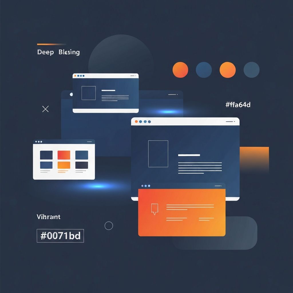
Web Design Glossary
Introduction to Web Design Terminology
Understanding web design terminology is essential for anyone involved in creating, managing, or commissioning websites. Whether you are a business owner looking to communicate effectively with your web development team, a marketing professional overseeing digital projects, or someone new to the industry, having a solid grasp of web design vocabulary will help you navigate conversations, make informed decisions, and ensure your projects succeed. At AAMAX.CO, we believe that knowledge empowers our clients, which is why we have compiled this comprehensive web design glossary to help you understand the terms that shape the digital landscape.
User Experience (UX) Terms
User experience, commonly abbreviated as UX, refers to the overall experience a visitor has when interacting with a website. This encompasses everything from how easy the site is to navigate to how satisfying it feels to accomplish tasks. A positive UX leads to higher engagement, better conversion rates, and increased customer loyalty. Key UX terms include user journey mapping, which visualizes the path users take through your website, and wireframing, which involves creating basic visual guides that represent the skeletal framework of a website.
Usability testing is another critical UX concept that involves evaluating a website by testing it with real users. This process helps identify pain points, confusing elements, and areas for improvement. Information architecture refers to how content is organized and structured on a website, ensuring users can find what they need quickly and intuitively. Accessibility ensures that websites are usable by people with disabilities, including those who rely on screen readers, keyboard navigation, or other assistive technologies.
User Interface (UI) Design Elements
While UX focuses on the overall experience, user interface (UI) design deals with the visual and interactive elements users engage with directly. This includes buttons, icons, typography, color schemes, and layouts. A call-to-action (CTA) is a button or link designed to prompt users to take a specific action, such as signing up for a newsletter, making a purchase, or contacting your business. Effective CTAs are visually distinct and use compelling language.
Navigation refers to the system that allows users to move through a website, typically including menus, breadcrumbs, and links. A hamburger menu is a collapsible navigation icon consisting of three horizontal lines, commonly used on mobile devices to save screen space. Hero sections are prominent areas at the top of a webpage, often featuring large images or videos, bold headlines, and primary CTAs. Our website design services focus on creating intuitive UI elements that guide users seamlessly through your digital experience.
Technical Web Design Terms
Understanding technical terminology is crucial for effective communication with developers and designers. HTML (HyperText Markup Language) is the standard language used to create and structure content on web pages. CSS (Cascading Style Sheets) controls the visual presentation, including colors, fonts, layouts, and responsive behavior. JavaScript adds interactivity and dynamic functionality to websites, enabling features like form validation, animations, and real-time content updates.
A content management system (CMS) is a software application that allows users to create, edit, and manage website content without needing extensive technical knowledge. Popular CMS platforms include WordPress, Strapi, and custom solutions. Speaking of which, our WordPress development and Strapi CMS website development services can help you choose and implement the right content management solution for your needs.
APIs (Application Programming Interfaces) allow different software systems to communicate with each other. They enable features like social media integration, payment processing, and third-party service connections. A database stores and organizes website data, including user information, content, and product details. Backend development handles server-side logic and database interactions, while frontend development focuses on the client-side elements users see and interact with.
Responsive Design and Mobile Terminology
Responsive design is an approach that ensures websites adapt seamlessly to different screen sizes and devices, from desktop computers to tablets and smartphones. Media queries are CSS techniques used to apply different styles based on device characteristics like screen width, height, and orientation. Breakpoints define the specific screen widths at which a website's layout changes to accommodate different devices.
Mobile-first design is a strategy where designers create the mobile version of a website first, then progressively enhance it for larger screens. This approach ensures optimal performance and usability on mobile devices, which now account for the majority of web traffic. Viewport refers to the visible area of a web page within a browser window. Touch targets are interactive elements sized appropriately for finger taps on touchscreen devices. Our front-end web development team specializes in creating responsive experiences that work flawlessly across all devices.
Performance and Optimization Terms
Website performance directly impacts user experience, search engine rankings, and conversion rates. Page load time measures how long it takes for a webpage to fully display its content. Core Web Vitals are a set of metrics defined by Google that measure loading performance, interactivity, and visual stability. These include Largest Contentful Paint (LCP), First Input Delay (FID), and Cumulative Layout Shift (CLS).
Caching stores copies of files locally to reduce server requests and speed up page loading. Minification removes unnecessary characters from code without changing functionality, reducing file sizes. Image optimization involves compressing and properly sizing images to balance visual quality with load speed. Lazy loading delays the loading of non-critical resources until they are needed, improving initial page load times.
SEO and Content Terms
Search engine optimization (SEO) encompasses strategies and techniques to improve a website's visibility in search engine results. Meta tags provide information about a webpage to search engines and browsers, including title tags, meta descriptions, and keyword tags. Alt text describes images for search engines and users who cannot see them, improving both SEO and accessibility.
Keywords are words and phrases that users type into search engines when looking for information, products, or services. Schema markup is structured data that helps search engines understand website content and can enhance search results with rich snippets. Internal linking connects pages within your website, helping users navigate and distributing page authority throughout your site.
E-Commerce Web Design Terms
For online stores, specific terminology applies to shopping and transaction functionality. A shopping cart is a virtual container where users collect items before purchasing. The checkout process guides users through payment and order completion. A product page displays detailed information about individual items, including images, descriptions, prices, and purchase options.
Payment gateway is a service that processes credit card and other electronic payments securely. SSL (Secure Sockets Layer) certificates encrypt data transmitted between users and servers, essential for protecting sensitive information. Our website development services include comprehensive e-commerce solutions that prioritize security and user experience.
Web Application Terminology
Web applications are interactive programs accessed through web browsers. Single-page applications (SPAs) load a single HTML page and dynamically update content as users interact, providing a smooth, app-like experience. Progressive web apps (PWAs) combine the best features of websites and mobile applications, offering offline functionality and push notifications.
State management refers to how an application handles and stores data that changes over time. Component-based architecture breaks interfaces into reusable, independent pieces. Our web application development and ReactJS web development expertise ensures your applications are built with modern, scalable architectures.
Design Process Terms
Understanding the design process helps you collaborate effectively with creative teams. A mood board is a collection of visual references that establish the aesthetic direction for a project. Style guides document the visual and brand standards for consistent design across all materials. Prototypes are interactive mockups that simulate the final product's functionality, allowing for testing and refinement before development.
Iteration refers to the process of refining designs through multiple rounds of feedback and improvement. A design sprint is a time-constrained process for solving problems and testing ideas. Version control tracks changes to designs and code, enabling collaboration and the ability to revert to previous versions when needed.
Conclusion
Mastering web design terminology empowers you to participate meaningfully in digital projects, communicate effectively with professionals, and make informed decisions about your online presence. At AAMAX, we are committed to transparency and education, ensuring our clients understand every aspect of their web projects. Whether you need web development consulting to guide your strategy or full-service MERN stack development for complex applications, our team is here to translate your vision into reality. Contact us today to start speaking the language of successful web design.
Want to publish a guest post on aamax.co?
Place an order for a guest post or link insertion today.
Place an Order