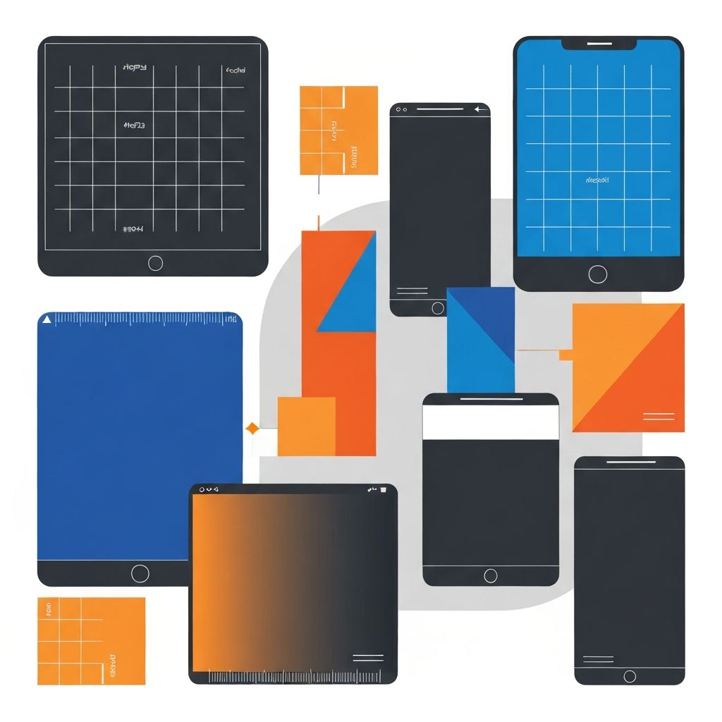
Web Design Dimensions
Understanding Web Design Dimensions: A Complete Guide
Web design dimensions encompass the sizing standards, viewport considerations, and responsive breakpoints that determine how websites appear across different devices and screen sizes. Getting dimensions right is fundamental to creating websites that provide excellent user experiences regardless of how visitors access them. At AAMAX.CO, we design every website with careful attention to dimensions and responsive behavior, ensuring optimal presentation across the full range of modern devices.
The landscape of web design dimensions has become increasingly complex as device diversity has exploded. Designers must now consider everything from small smartphone screens to large desktop monitors and even television displays. This guide will help you understand the essential dimensions and sizing considerations for modern web design.
The Evolution of Web Design Dimensions
Understanding how web design dimensions have evolved provides context for current practices. The journey from fixed-width layouts to responsive design reflects broader changes in how people access the web.
In the early days of the web, designers created fixed-width layouts, typically sized for common monitor resolutions like 800 by 600 or 1024 by 768 pixels. These dimensions worked well when most users accessed websites from similar desktop computers.
The introduction of smartphones and tablets shattered this assumption. Suddenly, websites needed to work on screens ranging from a few hundred pixels wide to thousands. This challenge led to the development of responsive web design, which adapts layouts to fit different viewport sizes.
Today, responsive design is standard practice, and designers must think in terms of flexible systems rather than fixed dimensions. However, understanding common device sizes and breakpoints remains essential for creating effective designs.
Common Device Dimensions
While responsive design adapts to any screen size, understanding common device dimensions helps inform design decisions. These dimensions serve as reference points rather than absolute targets.
Smartphone screens typically range from approximately 320 pixels wide on smaller devices to around 430 pixels on larger phones. Most designs target a minimum width of 320 to 360 pixels to ensure compatibility with common smartphones. Smartphone usage continues to grow, making mobile dimensions increasingly important for web design.
Tablet screens span a wide range from approximately 600 pixels wide in portrait orientation to over 1000 pixels in landscape mode. iPad dimensions of 768 by 1024 pixels in portrait orientation have long served as reference points for tablet-optimized designs.
Desktop and laptop screens range from approximately 1280 pixels wide on smaller laptops to 1920 pixels or more on larger monitors. Some users have ultra-wide or multi-monitor setups with even greater widths. Our website design process accounts for this full range of desktop dimensions.
Responsive Breakpoints
Breakpoints are the viewport widths at which layouts change to adapt to different screen sizes. Choosing appropriate breakpoints is essential for effective responsive design.
Common breakpoint approaches include device-based breakpoints that target specific device categories and content-based breakpoints that are determined by when the layout needs to change. Content-based breakpoints are generally preferred because they respond to actual design needs rather than arbitrary device categories.
Typical breakpoint ranges include small screens at 320 to 480 pixels, medium screens at 481 to 768 pixels, large screens at 769 to 1024 pixels, and extra-large screens at 1025 pixels and above. However, these should be adjusted based on specific design requirements.
Modern CSS frameworks like Tailwind CSS and Bootstrap provide default breakpoint systems that work well for most projects. These can be customized to match specific design needs while providing consistent, tested approaches.
Viewport and Layout Considerations
Beyond breakpoints, several viewport and layout considerations affect how dimensions impact user experience.
Viewport meta tags tell browsers how to scale content for different devices. The standard responsive viewport meta tag instructs browsers to set the viewport width equal to the device width and initial scale to one, enabling proper responsive behavior.
Maximum content width prevents text lines from becoming uncomfortably long on wide screens. Most designers limit content width to approximately 1200 to 1400 pixels, with centered alignment on larger screens. Research suggests that line lengths of 50 to 75 characters optimize readability.
Minimum touch target sizes ensure that interactive elements are usable on touchscreens. Guidelines recommend touch targets of at least 44 by 44 points for mobile interfaces, though 48 by 48 pixels or larger is preferable for important actions.
Image and Media Dimensions
Images and media require special attention in responsive web design. Providing appropriately sized assets optimizes performance while maintaining visual quality.
Hero images and full-width backgrounds typically require source images of 1920 pixels wide or larger to look sharp on high-resolution desktop displays. Multiple sizes should be provided using responsive image techniques to serve smaller files to devices that do not need full resolution.
Content images should be sized appropriately for their display context. Images displayed at smaller sizes do not need high-resolution source files, and providing oversized images wastes bandwidth and slows page loading.
Aspect ratios should be considered for responsive behavior. Images with inconsistent aspect ratios can create awkward layouts as viewports change. Establishing consistent aspect ratio systems helps maintain visual harmony across breakpoints.
Typography and Dimension Relationships
Typography dimensions interact with layout dimensions in important ways. Understanding these relationships helps create harmonious, readable designs.
Base font sizes should be comfortable for reading on target devices. A base size of 16 pixels works well for most body text, though this may be adjusted based on typeface characteristics and design goals. Avoid font sizes smaller than 14 pixels for body text.
Responsive typography scales text sizes across breakpoints to maintain appropriate proportions. Headings might be significantly larger on desktop than mobile, while body text sizes remain more consistent.
Line height and spacing should scale appropriately with viewport changes. Tighter spacing may be appropriate on mobile where screen space is limited, while more generous spacing improves readability on larger screens.
Grid Systems and Dimension Structure
Grid systems provide underlying structure that helps manage dimensions consistently throughout a design. Understanding grid fundamentals supports better dimension decisions.
Column-based grids divide the viewport into a set number of columns, typically 12 for desktop layouts and fewer for smaller screens. Content blocks span various numbers of columns, and column widths adjust proportionally as the viewport changes.
Gutter widths between columns typically range from 16 to 32 pixels, though these may scale with viewport size. Consistent gutter widths throughout a design create visual rhythm and organization.
Container widths set maximum bounds for content areas. Containers typically max out at 1200 to 1400 pixels wide, though some designs use narrower containers for better readability or wider containers for image-heavy layouts.
Testing Across Dimensions
Thorough testing across different dimensions ensures that responsive designs work as intended. Various approaches help verify proper behavior.
Browser developer tools include responsive design modes that simulate different viewport sizes. These tools allow quick testing across a range of dimensions without needing physical devices.
Physical device testing provides more accurate results than simulation, particularly for touch interactions and performance characteristics. Testing on representative devices from different categories ensures real-world usability.
Automated testing tools can check for layout problems across multiple viewport sizes. These tools are particularly useful for regression testing as designs evolve over time.
Performance Implications of Dimensions
Dimension decisions affect website performance, particularly on mobile networks. Understanding these implications helps balance visual quality with loading speed.
Image optimization for different dimensions significantly impacts page weight. Serving appropriately sized images through responsive image techniques can reduce page size by fifty percent or more compared to serving full-resolution images to all devices.
Layout complexity at different breakpoints affects rendering performance. Overly complex responsive behaviors can slow rendering, particularly on less powerful mobile devices. Our website development process includes performance optimization across all target dimensions.
Font loading strategies should consider mobile constraints. Subsetting fonts and using appropriate loading strategies help ensure text remains readable while custom fonts load.
Accessibility and Dimension Considerations
Dimension decisions affect website accessibility. Ensuring designs work for all users requires attention to how dimensions impact usability.
Zoom support must be maintained. Users with visual impairments often zoom content to larger sizes, and designs must remain functional at zoom levels up to 200 percent or more. Avoid viewport meta configurations that disable user scaling.
Touch target sizing affects users with motor impairments who may have difficulty tapping small targets precisely. Generous sizing improves usability for all users while being essential for some.
Reading distance varies between devices. Desktop users typically sit farther from screens than smartphone users, which affects appropriate text sizes and spacing. Responsive typography should account for these viewing distance differences.
Future Dimension Considerations
The landscape of web design dimensions continues to evolve. Staying aware of emerging trends helps prepare for future design challenges.
Foldable devices introduce new dimension considerations with screens that can expand and contract. Designs may need to adapt to dimension changes that occur during use, not just between different devices.
Wearable devices with small screens present new challenges for essential information display. While full websites may not be appropriate for these contexts, progressive enhancement approaches can provide useful experiences across the device spectrum.
Variable-width devices and new form factors continue to emerge. Flexible, content-driven responsive approaches adapt better to unknown future dimensions than device-specific targeting.
Conclusion
Web design dimensions encompass a complex set of considerations that affect every aspect of website creation. From choosing appropriate breakpoints to optimizing images for different screen sizes, dimension decisions shape user experience across the full range of devices. Success requires understanding common device sizes while building flexible systems that adapt to any viewport. By approaching dimensions systematically and testing thoroughly across different screen sizes, designers create websites that provide excellent experiences for all users. If you need help creating a website that works beautifully across all dimensions, our team has the expertise to deliver responsive designs that meet the highest standards of modern front-end web development.
Want to publish a guest post on aamax.co?
Place an order for a guest post or link insertion today.
Place an Order