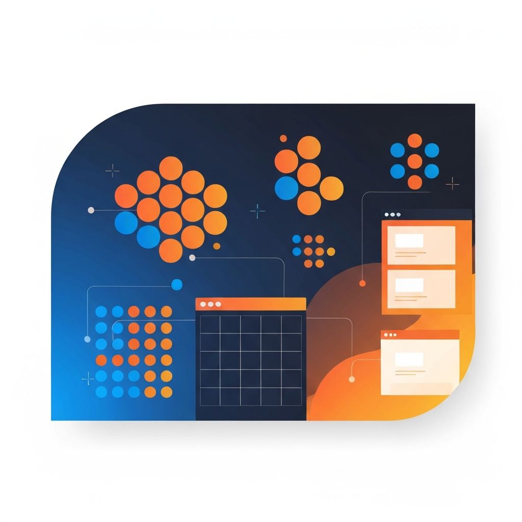
Proximity in Web Design
What Is Proximity in Web Design
Proximity is the Gestalt principle that says elements placed close together are perceived as related, while elements spaced further apart are perceived as separate. It sounds simple, but it is one of the most underused tools in modern web design. At AAMAX.CO, we apply proximity in every layout we ship, from product pages to dashboards to long-form blog templates.
When proximity is used well, users instantly understand structure without reading a single label. When it is ignored, even the most beautifully designed page can feel confusing.
Why the Brain Loves Proximity
Our visual system is constantly looking for patterns. Grouping related elements physically makes the brain's job easier, freeing up cognitive resources for the actual content. This matters more than ever in 2026, when users are bombarded with information and attention spans are short.
Proximity also reduces decision fatigue. When users see clearly grouped sections, they can quickly decide whether each one is relevant to them, scan accordingly, and move on. This is the foundation of a good information scent.
Proximity vs. Other Gestalt Principles
Proximity works alongside similarity, continuity, closure, and figure-ground. Similarity says elements that look alike are perceived as related, even when they are spaced apart. Continuity says the eye follows lines and curves. Closure says we mentally complete shapes that are not fully drawn.
Skilled designers combine these principles. For example, a pricing table might use proximity to group features within a tier and similarity to make all tier headers visually consistent. The interplay creates a layout that feels both organized and rhythmic.
Practical Applications in Layouts
One of the simplest applications of proximity is form design. Labels should sit close to their inputs, and inputs that belong together, such as first name and last name, should be grouped. Help text should sit near the field it describes, not floated to a sidebar.
Another application is navigation. Primary navigation items should be close together, while utility links like account or cart sit further away to signal their different role. Footers should group related links by category, with generous spacing between groups.
Spacing as a Design System Decision
Proximity only works if your spacing is intentional. We build design systems with a defined spacing scale, often based on a four or eight pixel grid. Designers and developers reach for tokens like xs, sm, md, lg, and xl rather than arbitrary values. This consistency makes proximity predictable across pages and components.
Tools like Tailwind CSS, which our Front-end Web Development team uses extensively, make these spacing tokens easy to apply. The result is a layout language that scales as the product grows.
Proximity in Typography
Typography is one of the most powerful places to apply proximity. The space between a heading and its paragraph should be tighter than the space between that paragraph and the next heading. This subtle hierarchy helps the eye understand which lines belong together.
Line height, paragraph spacing, and letter spacing all play a role. We tune these values for each project rather than relying on browser defaults. The difference between a good site and a great one often comes down to how typography breathes.
Proximity on Mobile Screens
Mobile design forces hard decisions about proximity. With less screen real estate, designers are tempted to compress everything, which destroys the grouping that proximity provides. The better approach is to remove or defer non-essential content rather than crowding it together.
Sticky headers, expandable sections, and progressive disclosure are all techniques that preserve proximity on small screens. Our team designs mobile experiences first and then enhances them for larger viewports, which forces clarity from the start.
Common Mistakes to Avoid
The most common proximity mistake we see is uniform spacing throughout a page. When every element is the same distance from every other element, nothing feels grouped. Another common mistake is relying on borders or boxes to create grouping that whitespace could create more elegantly.
Designers also sometimes forget that proximity applies to interactive states. A dropdown should appear close to its trigger. A tooltip should sit near the element it describes. Disconnected positioning breaks the user's mental model.
Hire AAMAX.CO for Thoughtful Web Design
If your website feels cluttered, confusing, or hard to scan, the issue is often proximity, not content. Our team can audit your existing site or design a new one from the ground up. Explore our Website Design service to learn how we apply proven principles like proximity to deliver clarity and conversions.
Want to publish a guest post on aamax.co?
Place an order for a guest post or link insertion today.
Place an Order