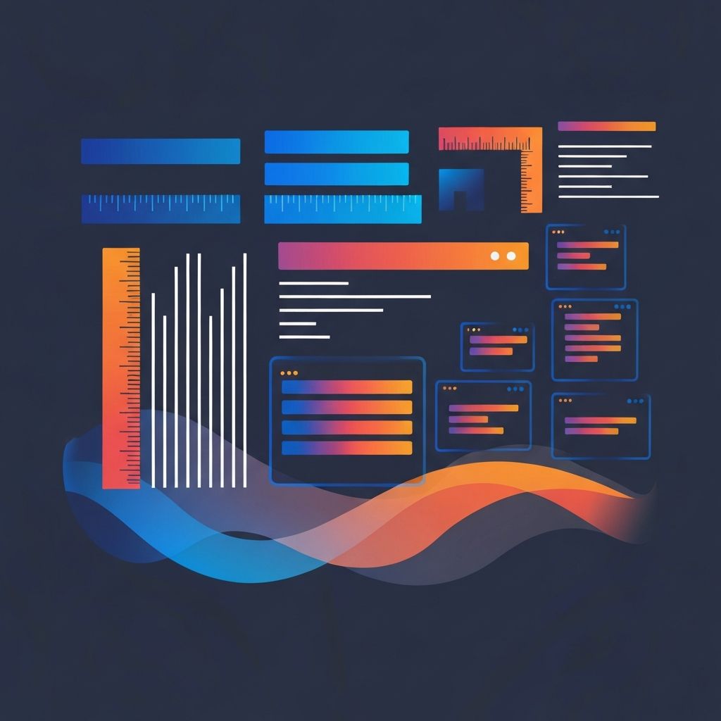
Responsive Web Design Font Size
Why Font Size Is The Most Underrated Decision In Responsive Web Design
Designers obsess over color palettes and layouts, but font size choices quietly determine whether your site is comfortable to read, easy to scan, and capable of converting visitors into customers. Get type sizing right and your content does the heavy lifting on every device. Get it wrong and even the most beautifully art-directed site will lose readers within seconds. At AAMAX.CO, we treat type scales as a foundational design system, not a finishing touch. This article walks through the modern approach to responsive font sizing and the principles we use to ship sites that read effortlessly from a phone to a 4K display.
The Old Way: Fixed Sizes And Awkward Breakpoints
Early responsive design relied on fixed pixel sizes that changed at hard breakpoints. A heading might be twenty-four pixels on mobile, thirty-two on tablet, and forty-eight on desktop. The problem with this approach is that the world has more than three screen sizes. Between breakpoints, type either felt cramped or oversized. On foldables, ultrawides, and unusual aspect ratios, the experience could collapse entirely. Modern responsive design has moved past this rigid model toward something more elegant.
The Modern Way: Fluid Typography With Clamp
The CSS clamp function changed everything. By accepting a minimum size, a preferred size, and a maximum size, clamp lets type scale smoothly with the viewport without ever becoming too small to read or absurdly large on a big monitor. A heading might be defined as clamp of two rem, four vw plus one rem, four rem, which means it grows linearly with the viewport between defined limits. The result is typography that feels intentional at every size without requiring dozens of media queries.
Establishing A Type Scale
Great responsive type starts with a deliberate scale. We typically work with a modular scale based on a ratio like 1.25 (major third) or 1.333 (perfect fourth). Body copy anchors the scale at sixteen to eighteen pixels, then headings step up by the chosen ratio. The scale is expressed in rem so that user font-size preferences are respected, which is critical for accessibility. Once the scale is set, every page on the site uses the same type tokens, which keeps the experience consistent and the codebase maintainable. Our Website Design team builds these systems into every project.
Body Copy Comes First
Most teams design hero typography first and treat body copy as an afterthought. Expert teams reverse that order. Body copy is what users actually read, and it is where most accessibility issues start. We default to a base font size of at least seventeen pixels on mobile and eighteen pixels on desktop, with a line-height between 1.5 and 1.65 for comfortable reading. Line lengths are capped around sixty-five characters using max-width on prose containers, because lines that are too long are tiring to track and lines that are too short break reading rhythm.
Headings That Establish Hierarchy
Responsive headings need to do double duty: they must look striking on a wide desktop and remain readable on a narrow phone. We use larger jumps between H1 and H2 on desktop and smaller jumps on mobile, often by adjusting the ratio in the clamp function. Letter-spacing and font-weight are also adjusted at different sizes, since type that looks crisp at sixty pixels can feel heavy at twenty-four pixels. The goal is a hierarchy that always feels right, not just one that scales mechanically.
Accessibility Considerations
Font size is an accessibility issue at its core. Users who increase the default font size in their browser or operating system must see the entire site scale gracefully. That is why we use rem instead of pixels for nearly all sizing, and why we test with two hundred percent zoom to make sure layouts do not break. We also avoid placing critical text on top of busy images and ensure color contrast meets WCAG AA at minimum, ideally AAA for body text. Accessible type is good type, period.
Performance Matters Too
Custom web fonts have a real cost. A site with five font weights across two families can ship hundreds of kilobytes of font data, much of which is never used. We subset fonts to the characters actually needed, preload the most critical weights, use font-display swap to avoid invisible text during loading, and serve modern formats like WOFF2. Variable fonts are an excellent option for projects that need many weights and styles in a single file, often saving sixty percent or more in payload.
Responsive Type In Different Contexts
Marketing pages benefit from larger, more expressive headings, while data-heavy applications often need denser type to fit more information per screen. News and blog sites prioritize long-form readability with generous line-heights and comfortable line lengths. Ecommerce sites need scannable product titles, clear pricing, and obvious calls to action. Each context calls for a different type scale, and our team tunes the system to match the goals of the project. For app-like interfaces, our Web Application Development and ReactJs Web Development services include type systems optimized for dense, interactive content.
Tools And Techniques We Use
To design responsive type, we rely on tools like Utopia for fluid scale generation, Type Scale calculators, and browser dev tools that visualize how type behaves at every viewport. We document the chosen scale in a living style guide so that designers, developers, and content authors all reference the same source of truth. When clients want a custom CMS that respects the type system, we often pair the front end with Strapi CMS Website Development or WordPress Development so editors can publish content that always looks great.
Common Mistakes To Avoid
Three mistakes show up over and over. First, using pixel-based sizes that ignore user preferences. Second, scaling all text at the same rate, which flattens hierarchy. Third, choosing dramatic type for hero sections without considering how it behaves on mobile, where the same heading often becomes overwhelming. Avoiding these mistakes is mostly a matter of testing on real devices and treating type as a system rather than a series of one-off decisions.
Hire Us To Build A Beautiful Responsive Type System
If your site reads awkwardly on phones, looks bloated on big screens, or lacks a clear hierarchy, we can help. Hire AAMAX.CO for responsive web design and development that puts typography at the center of the experience. We build fluid type systems, performance-optimized font stacks, and accessible reading experiences that make your content shine on every device.
Want to publish a guest post on aamax.co?
Place an order for a guest post or link insertion today.
Place an Order