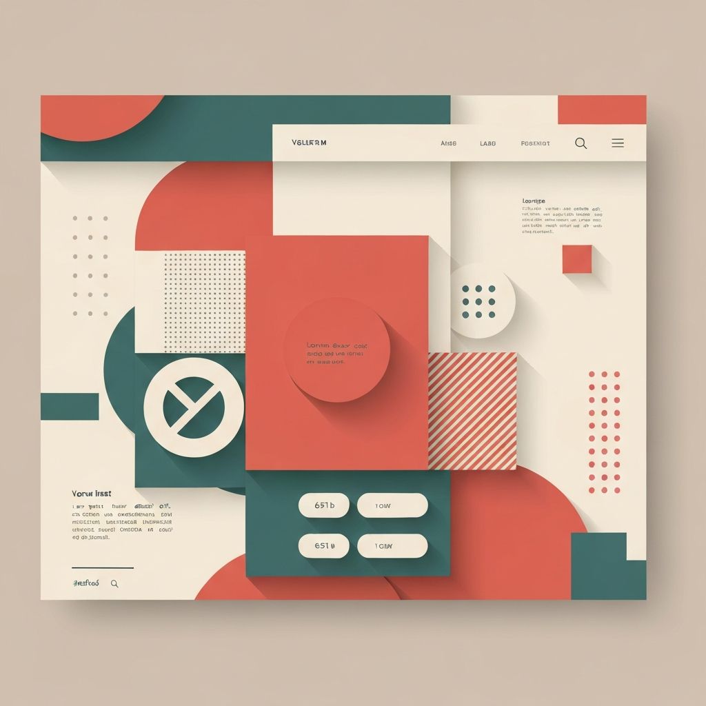
Modular Web Design
Introduction to Modular Web Design
Modular web design represents a paradigm shift in how websites are conceptualized, built, and maintained. Rather than designing pages as unique, monolithic entities, modular design breaks interfaces down into reusable components that can be combined and recombined to create consistent, scalable websites. At AAMAX.CO, we embrace modular design principles to create flexible, maintainable websites that grow with our clients' businesses.
The concept of modularity isn't new—it's borrowed from manufacturing, architecture, and software engineering, where modular approaches have long proven their value in efficiency and scalability. Applied to web design, modularity creates systems where individual components are designed once and reused across pages and projects, dramatically reducing development time while ensuring consistency.
Understanding Modular Design Principles
At its core, modular design is about creating self-contained units that function independently but work together harmoniously. Each module—whether it's a navigation bar, card component, form element, or content block—should be complete in itself, with clear boundaries and defined purposes. These modules then combine like building blocks to construct complete pages.
Consistency is a fundamental benefit of modular systems. When the same header component appears across all pages, users experience consistent navigation everywhere. When the same button styles are used throughout, the interface feels cohesive and professional. This consistency builds trust and improves usability.
Scalability becomes much easier with modular design. Adding new pages often requires simply combining existing modules in new arrangements rather than designing from scratch. As websites grow, modular systems accommodate expansion without the design debt that accumulates with bespoke page-by-page approaches.
Components of Modular Design Systems
Atomic design methodology, popularized by Brad Frost, provides a useful framework for organizing modular components. At the smallest level, atoms represent basic HTML elements—buttons, inputs, labels, and icons. These combine to form molecules—groups of atoms functioning together, like a search form combining an input field, label, and button.
Organisms are more complex components built from molecules and atoms—a complete header section, for example, might include navigation molecules, search molecules, and logo atoms. Templates combine organisms to create page layouts without real content, while pages are specific instances with actual content filled in.
This hierarchical organization creates clear relationships between components and guides decision-making about where new elements belong. Each level builds on the previous, creating systems that are both comprehensive and comprehensible.
Benefits for Design and Development Teams
Collaboration improves dramatically with modular systems. Designers and developers work from the same component library, reducing miscommunication and ensuring what's designed is what gets built. When everyone speaks the same component language, handoffs become smoother and faster.
Efficiency gains compound over time as component libraries grow. Initial investment in building the system pays dividends with every subsequent page and project that reuses components. Experienced modular teams can produce new pages in fractions of the time required for bespoke design approaches.
Quality control becomes easier when changes propagate across all instances. Fixing a bug in a button component fixes it everywhere that button is used. Improving a card design improves every card across the site. This propagation of improvements maintains quality without multiplied effort.
Design Patterns and Layout Systems
Grid systems are foundational to modular layout design. Consistent grid structures—typically 12-column systems—provide predictable foundations for placing modules. Components designed to fit grid units combine predictably, creating cohesive layouts without custom positioning for each configuration.
Spacing systems ensure consistent visual rhythm throughout modular designs. Rather than arbitrary margins and padding, modular systems define spacing scales that components use consistently. Common approaches use base units (like 8px) multiplied to create a scale (8, 16, 24, 32, etc.) applied throughout.
Responsive behavior should be built into components themselves. Each module should know how to adapt across breakpoints, so combining them creates responsive pages without additional responsive design work. This component-level responsiveness is essential for efficient modular systems. Our website design services incorporate robust modular design systems.
Component Libraries and Documentation
Successful modular design requires comprehensive documentation that explains how components work and when to use them. Component libraries—often built as living style guides—provide single sources of truth that design and development teams reference throughout projects.
Documentation should include visual examples of each component, code snippets for implementation, usage guidelines explaining when components are appropriate, and notes about variations and states. Interactive documentation where components can be manipulated helps teams understand flexibility and constraints.
Version control for component libraries ensures changes are tracked and teams can reference specific versions. As libraries evolve, clear versioning and change documentation help teams update implementations systematically rather than discovering breaking changes unexpectedly.
Implementation Technologies and Tools
Modern front-end frameworks naturally support modular approaches. React, Vue, and Angular all emphasize component-based architecture, making them ideal for implementing modular designs. Components built in these frameworks encapsulate structure, styling, and behavior in reusable units.
CSS methodologies like BEM (Block Element Modifier) provide naming conventions that support modularity. By clearly defining relationships between elements and their variations, BEM creates maintainable stylesheets where components' styles don't leak into each other.
Design tokens bridge design and development by defining core values—colors, typography, spacing—as variables used throughout both design tools and code. When a primary color changes, updating the token propagates the change everywhere automatically. Our ReactJS web development and Next.js web development services leverage these modern approaches.
Modular Design for Content Management
Content management systems benefit enormously from modular design approaches. Rather than rigid page templates, modern CMS implementations allow content creators to build pages by combining pre-built modules. This flexibility empowers marketing teams while maintaining design consistency.
Block-based editors like WordPress Gutenberg implement modular content creation, where blocks represent content modules that creators arrange to build pages. Each block type is designed once by developers, then reused unlimited times by content creators.
Headless CMS platforms take modularity further by separating content from presentation entirely. Content structured as modular pieces can be delivered to any front-end—websites, apps, kiosks—rendered using appropriate component libraries for each context.
Challenges and Considerations
Initial investment in building modular systems can be substantial. Creating comprehensive component libraries requires more upfront planning and development than diving straight into page design. Organizations must balance this investment against long-term efficiency gains.
Flexibility versus consistency presents an ongoing tension. Too rigid a system frustrates designers and limits creativity; too flexible a system loses the consistency benefits that justify modularity. Finding the right balance requires ongoing communication and willingness to evolve the system.
Component proliferation can become problematic if not managed. Without governance, teams create variations for every slight need, eventually producing bloated libraries that lose their efficiency benefits. Clear guidelines about when to create new components versus when to use existing ones with modifications are essential.
Building Effective Modular Systems
Start with audit and analysis before building new systems. Review existing designs to identify patterns and recurring elements. Most sites, even those not intentionally modular, have implicit patterns that can be formalized into explicit components.
Prioritize the most commonly used components for initial development. Headers, footers, buttons, cards, and forms typically appear throughout sites and deliver immediate value when modularized. Exotic, rarely-used components can be added later as needs arise.
Involve all stakeholders in system development. Designers, developers, content creators, and business owners all have perspectives on what the system needs. Collaborative development ensures the resulting system serves everyone rather than optimizing for just one group.
Conclusion
Modular web design transforms how websites are created and maintained, offering efficiency, consistency, and scalability that traditional approaches cannot match. While requiring initial investment in system development, modular approaches pay dividends throughout the lifecycle of websites and across multiple projects. At AAMAX.CO, we build modular design systems that empower our clients to grow their web presence efficiently while maintaining quality and consistency. Whether you're starting a new project or looking to systematize an existing site, our web development consulting team can help you implement effective modular design approaches.
Want to publish a guest post on aamax.co?
Place an order for a guest post or link insertion today.
Place an Order