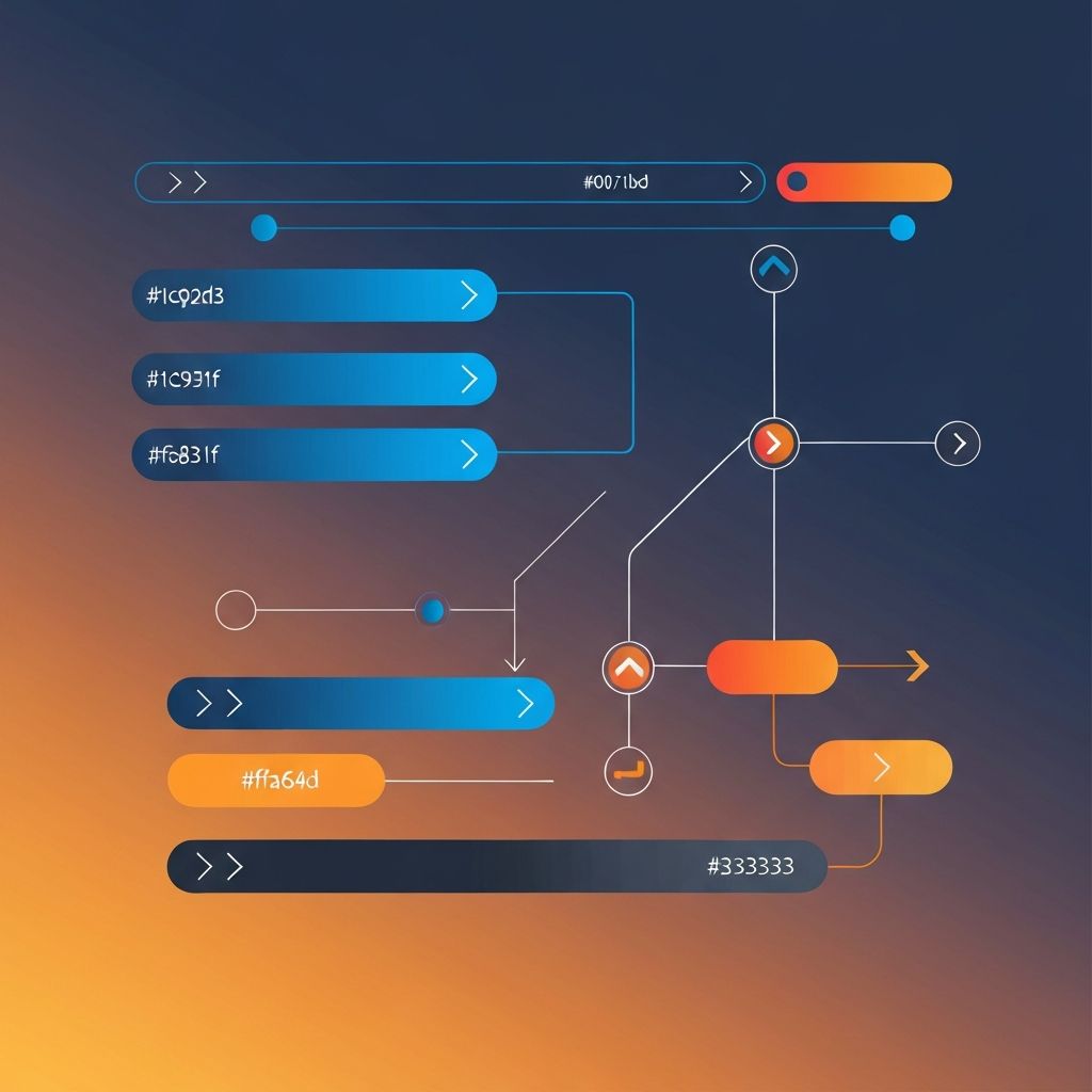
Designing Web Navigation
The Foundation of Web Navigation Design
Web navigation is the backbone of any successful website. It serves as the roadmap that guides visitors through your digital content, helping them find what they need quickly and efficiently. Designing web navigation is both an art and a science, requiring careful consideration of user behavior, information architecture, and visual design principles.
Poor navigation is one of the leading causes of high bounce rates and user frustration. When visitors cannot find what they're looking for within a few seconds, they leave—often never to return. Conversely, intuitive navigation creates a seamless user experience that encourages exploration, engagement, and conversion.
At AAMAX.CO, we understand that effective web navigation is fundamental to website success. Our approach to navigation design combines user research, industry best practices, and creative problem-solving to create intuitive pathways through even the most complex websites.
Understanding User Behavior in Navigation
Effective navigation design begins with understanding how users actually interact with websites. Eye-tracking studies and user research have revealed consistent patterns in how people scan and navigate web pages. The F-pattern reading behavior shows that users typically scan horizontally across the top of the page, then down the left side—making horizontal top navigation and left sidebar navigation particularly effective.
Users have developed expectations based on years of web browsing. They expect to find the logo in the top left (which typically links to the homepage), main navigation at the top or left side, and utility navigation (search, cart, account) in the top right. Violating these conventions can confuse users and increase cognitive load.
Understanding your specific users' needs through analytics, user testing, and feedback is essential. Different audiences may have different navigation preferences and priorities, and your navigation should reflect the primary tasks your users want to accomplish.
Types of Web Navigation Structures
Several navigation structures can be employed depending on your website's complexity and user needs. Horizontal navigation bars remain the most common pattern for main navigation, typically appearing at the top of every page. This pattern works well for websites with a manageable number of top-level sections and is instantly recognizable to users.
Vertical navigation, often in the form of sidebars, is effective for websites with many categories or deep hierarchies. This pattern is common in documentation sites, dashboards, and e-commerce platforms with extensive product catalogs.
Hamburger menus (the three-line icon) have become standard on mobile devices but remain controversial on desktop sites. While they conserve screen space, they also hide navigation options, potentially reducing discoverability and engagement.
Mega menus expand traditional dropdown menus to show multiple columns of links, often organized by category with supporting images or descriptions. These are particularly effective for large e-commerce sites and enterprise websites with extensive content.
Information Architecture and Navigation
Navigation design cannot be separated from information architecture—the structural design of your website's content organization. Before designing navigation elements, you must establish a clear hierarchy of information that makes sense to users, not just to your organization.
Card sorting exercises, where users organize content into categories that make sense to them, can reveal intuitive groupings that differ from internal organizational structures. Tree testing validates whether your proposed navigation structure allows users to find specific content efficiently.
The ideal navigation structure balances breadth and depth. Too many top-level items overwhelm users, while excessive depth requires too many clicks to reach content. Research suggests limiting main navigation to seven items or fewer, with clear pathways to deeper content.
Our website design services include thorough information architecture planning to ensure your navigation structure aligns with user expectations and business goals.
Visual Design of Navigation Elements
The visual design of navigation elements significantly impacts usability. Navigation should be visually distinct from surrounding content, clearly indicating its interactive nature. Sufficient contrast between navigation text and background ensures readability, while hover and active states provide feedback that confirms interactivity.
Typography choices in navigation deserve careful consideration. Navigation labels should be concise, using familiar terms that clearly indicate the content behind each link. Avoid jargon, internal terminology, or clever labels that sacrifice clarity for creativity.
Spacing and sizing of navigation elements affect both aesthetics and usability. Adequate padding around clickable areas makes navigation easier to use, particularly on touch devices. Consistent styling across all navigation levels creates visual harmony while helping users understand the hierarchical relationship between sections.
Mobile Navigation Best Practices
With mobile traffic often exceeding desktop, mobile navigation design is critical. The limited screen real estate of mobile devices necessitates different approaches than desktop navigation. Priority-based navigation shows only the most important items, with additional options accessible through menus.
Bottom navigation bars have gained popularity for mobile apps and progressive web apps, placing frequently accessed sections within easy thumb reach. This pattern works well for apps with a small number of primary destinations.
Touch-friendly navigation requires larger tap targets than desktop mouse navigation. Apple's Human Interface Guidelines recommend a minimum tap target size of 44x44 pixels, with adequate spacing between adjacent targets to prevent accidental taps.
Our front-end web development team specializes in creating responsive navigation systems that provide optimal experiences across all device sizes.
Search as Navigation
Search functionality serves as an essential navigation complement, particularly for content-rich websites. Many users prefer searching directly to browsing through navigation menus, especially when they know exactly what they're looking for.
Effective site search includes features like autocomplete suggestions, typo tolerance, and filtering options. Search results should be relevant, clearly presented, and easy to navigate. Analytics from site search queries can also inform navigation improvements by revealing what users are looking for.
The placement of search functionality affects its usage. Prominent search bars encourage search behavior, while hidden search icons may go unnoticed. Consider your users' preferences when deciding how prominently to feature search.
Secondary and Utility Navigation
Beyond main navigation, secondary navigation systems serve important functions. Breadcrumbs show users their location within the site hierarchy and provide one-click access to parent pages. These are particularly valuable for deep sites where users may arrive via search engines to inner pages.
Footer navigation often includes links to legal pages, contact information, and sitemap-style links to major sections. While less frequently used than header navigation, footers serve users who scroll to page bottoms seeking additional information or navigation options.
Utility navigation typically appears in the header and includes function-oriented links like account login, shopping cart, contact, and search. Keeping utility navigation separate from main content navigation reduces clutter and maintains focus on primary destinations.
Accessibility in Navigation Design
Accessible navigation ensures all users, including those using assistive technologies, can navigate your website effectively. Keyboard navigation must be fully functional, allowing users to tab through navigation items and activate links with the Enter key.
ARIA labels and roles help screen readers understand navigation structure. Skip navigation links allow keyboard users to bypass repetitive navigation and jump directly to main content. Proper heading hierarchy within mega menus and navigation panels aids screen reader navigation.
Color alone should never convey navigation state; combine color with other indicators like underlines or icons. Sufficient color contrast between text and backgrounds ensures navigation remains readable for users with visual impairments.
Testing and Iterating Navigation
Navigation design should be validated through testing before and after launch. Usability testing with representative users reveals whether navigation works as intended. Task-based testing asks users to find specific content, measuring success rates and time to completion.
Analytics provide ongoing insight into navigation effectiveness. High exit rates from navigation pages may indicate confusion, while heat maps show which navigation elements receive clicks. A/B testing different navigation designs can reveal which approaches perform better for your specific audience.
Our website development process includes comprehensive testing and analytics implementation to ensure navigation designs perform optimally.
Common Navigation Mistakes to Avoid
Several common mistakes undermine navigation effectiveness. Using too many navigation items overwhelms users with choices—research on choice paralysis suggests limiting options improves decision-making. Inconsistent navigation between pages confuses users and destroys trust in the interface.
Using vague or clever labels instead of clear, descriptive terms increases cognitive load. Navigation hidden behind unlabeled icons assumes user knowledge that may not exist. Dropdown menus that disappear too quickly frustrate users trying to access submenu items.
Neglecting mobile navigation is perhaps the most costly mistake in current web design. Assuming mobile users will tolerate desktop navigation squeezed onto small screens results in frustrated users and lost opportunities.
Future Trends in Web Navigation
Web navigation continues evolving with changing technologies and user expectations. Voice navigation is becoming increasingly relevant as voice assistants integrate with websites. Designing for voice requires clear, speakable navigation labels and logical conversational pathways.
Gesture-based navigation extends beyond swipes to include more complex interactions on touch devices. Progressive disclosure techniques reveal navigation options contextually, reducing initial complexity while maintaining access to advanced features.
AI-powered navigation that adapts to individual user behavior and preferences represents an exciting frontier, potentially creating personalized navigation experiences that prioritize each user's most likely destinations.
Conclusion
Designing web navigation is a critical discipline that directly impacts user experience and business outcomes. Effective navigation requires understanding user behavior, establishing sound information architecture, applying visual design principles, and ensuring accessibility for all users.
Navigation is not a set-it-and-forget-it element—it requires ongoing testing, analysis, and refinement as your website evolves and user needs change. Investing in professional navigation design pays dividends through improved user satisfaction, increased engagement, and higher conversion rates. Contact our team to discuss how we can optimize your website's navigation for maximum effectiveness.
Want to publish a guest post on aamax.co?
Place an order for a guest post or link insertion today.
Place an Order