Conversion Web Design
The Art and Science of Conversion Web Design
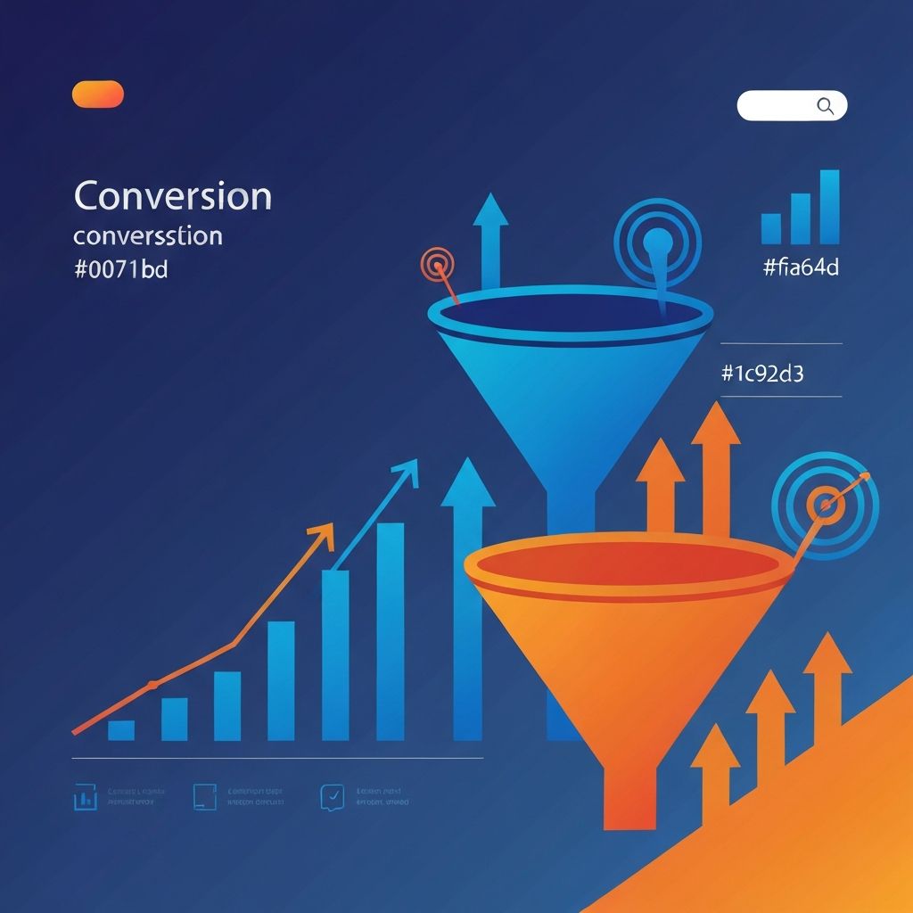
Conversion web design prioritizes turning visitors into customers, leads, or subscribers. While all web design considers user experience, conversion-focused design specifically optimizes for actions that drive business value. Every design decision—from color choices to button placement—is evaluated against its impact on conversion rates.
At AAMAX.CO, we design websites with conversion as a primary objective. Our data-driven approach combines design best practices with continuous optimization to maximize the return on your website investment.
Understanding Conversion Fundamentals
Conversion happens when visitors complete desired actions. Depending on your business, conversions might include purchases, form submissions, sign-ups, downloads, or phone calls. Clear definition of conversion goals is essential—you can't optimize what you haven't defined.
Conversion rate is the percentage of visitors who convert. Industry benchmarks vary widely, but most websites convert 1-3% of visitors. Even small improvements in conversion rate dramatically impact business results when applied to significant traffic.
Conversion paths describe the journey visitors take from arrival to conversion. Understanding these paths—which pages visitors see, in what order, and where they drop off—reveals optimization opportunities. Analytics tools illuminate these patterns.
Micro-conversions are smaller actions that indicate engagement and progress toward primary conversions. Email newsletter signups, video views, or content downloads may precede eventual purchases. Tracking micro-conversions provides optimization insights.
The Psychology Behind Conversion Design
Cognitive load affects conversion capacity. When websites require too much mental effort to understand, visitors abandon before converting. Simplicity in design reduces cognitive load and improves conversion rates.
Trust signals overcome conversion barriers. Testimonials, reviews, security badges, and professional credentials reassure visitors and reduce perceived risk. Without trust, visitors won't share information or make purchases.
Social proof leverages human tendency to follow others' behavior. Displaying customer counts, reviews, or recognizable client logos suggests others have trusted you successfully. People convert more readily when they see others have done so.
Scarcity and urgency create motivation to act now rather than later. Limited-time offers, low stock indicators, and deadline countdowns prevent visitors from postponing decisions indefinitely. Use these ethically and honestly.
Loss aversion makes people more motivated to avoid losses than achieve gains. Framing messages around what visitors might miss rather than what they might gain can improve conversion rates.
Visual Hierarchy for Conversions
Eye flow patterns determine what visitors see first and what path their eyes follow. In Western cultures, viewers typically scan from top-left to bottom-right (F-pattern for text-heavy pages, Z-pattern for designed pages). Position important elements along these natural paths.
Contrast draws attention to critical elements. Call-to-action buttons should visually stand out from surrounding content through color, size, or spacing. Our website design strategically applies contrast to guide visitor attention.
Size signals importance. Larger elements receive more attention. Headlines, hero images, and primary CTAs should be proportionally larger than secondary content.
Directional cues guide visitors toward conversion points. Arrows, images of people looking toward CTAs, and visual flow all direct attention where you want it.
Call-to-Action Optimization
Button design significantly impacts click rates. Size should be large enough to notice and easy to click, especially on mobile. Color should contrast with surroundings. Shape should be recognizable as clickable.
Copy on buttons affects conversion more than many realize. Generic "Submit" underperforms specific, benefit-oriented text like "Get My Free Quote" or "Start Saving Today." First-person language ("Get My...") often outperforms second-person ("Get Your...").
Placement determines whether visitors see CTAs at decision moments. Position calls to action where visitors have enough information to decide but haven't scrolled past. Multiple CTA placements often improve conversion.
Surrounding elements support or detract from CTAs. Nearby testimonials, benefit bullets, or reassurance text can improve conversion. Clutter or competing links can hurt it.
Form Design for Higher Conversions
Field count directly correlates with completion rates—fewer fields generally mean more completions. Include only truly necessary fields. Our front-end web development creates streamlined forms that minimize friction.
Field order should feel logical. Personal information (name, email) before address before payment details follows natural expectations. Unusual ordering creates confusion.
Input assistance through auto-complete, input masks, and smart defaults reduces effort and errors. Making forms easier to complete improves conversion rates.
Error handling should be immediate, specific, and helpful. Inline validation that catches errors as fields are completed prevents frustration of discovering errors after submission attempts.
Mobile form experience requires special attention. Touch targets must be appropriately sized. Numeric keyboards should appear for number fields. Our website development ensures forms work seamlessly on all devices.
Landing Page Conversion Principles
Message match between ads and landing pages builds trust and relevance. Visitors who click an ad about "affordable web design" should land on a page specifically about affordable web design, not a generic homepage.
Single focus prevents distraction. Effective landing pages limit navigation options and present one primary action. Every element should support or directly contribute to conversion.
Benefit-oriented content addresses visitor concerns. Features describe what your product does; benefits explain why that matters to visitors. Lead with benefits, support with features.
Proof elements substantiate claims. Case studies, specific results, and credible testimonials transform marketing claims into believable propositions.
Mobile Conversion Optimization
Mobile conversion challenges include smaller screens, shorter attention spans, and different contexts. Mobile visitors may be distracted, in public, or time-constrained. Design must accommodate these conditions.
Touch-friendly interfaces with appropriately sized tap targets prevent frustration. Buttons should be at least 44x44 pixels. Spacing between interactive elements prevents accidental taps.
Simplified content recognizes mobile reading constraints. Shorter paragraphs, more scannable formatting, and prioritized information improve mobile experience.
Click-to-call functionality enables immediate phone contact. For businesses where phone calls drive value, prominent click-to-call buttons significantly boost mobile conversions.
Speed and Conversion Correlation
Page speed directly impacts conversion rates. Studies consistently show that slower pages convert less. Even one-second delays measurably hurt conversion performance.
Performance optimization includes image compression, code efficiency, proper caching, and quality hosting. Our web application development prioritizes performance as a conversion factor.
Perceived performance can be improved even when actual speed can't. Loading indicators, progressive content display, and optimistic UI updates make waits feel shorter.
Testing and Optimization
A/B testing compares variations to identify what performs better. Test headlines, images, button colors, layouts, and copy to discover what resonates with your audience.
Statistical significance ensures test results are meaningful. Running tests until reaching significance prevents false conclusions based on random variation.
Iterative improvement compounds results over time. Small conversion rate improvements accumulate into significant business impact. Continuous testing should be ongoing, not a one-time effort.
Analytics inform testing priorities. Examine conversion funnels to identify highest-impact optimization opportunities. Focus testing on pages and elements with greatest conversion influence.
Conversion Across the Funnel
Awareness stage content attracts visitors and introduces your brand. Blog posts, educational content, and top-of-funnel offers capture attention without pushing for immediate conversion.
Consideration stage content helps visitors evaluate options. Comparison guides, detailed service descriptions, and case studies support decision-making.
Decision stage design removes friction from conversion. Streamlined checkout, clear pricing, and strong guarantees help ready-to-buy visitors complete purchases.
Post-conversion experience impacts lifetime value. Thank you pages, onboarding sequences, and follow-up communication turn one-time converters into repeat customers.
Conclusion
Conversion web design transforms websites from digital brochures into business assets that generate measurable returns. Through strategic design, psychological principles, and continuous optimization, websites can consistently turn visitors into customers.
We specialize in creating websites engineered for conversion. Our approach combines creative design with analytical rigor to maximize your website's business impact. Contact us to discuss how conversion-focused design can grow your business.
Want to publish a guest post on aamax.co?
Place an order for a guest post or link insertion today.
Place an Order