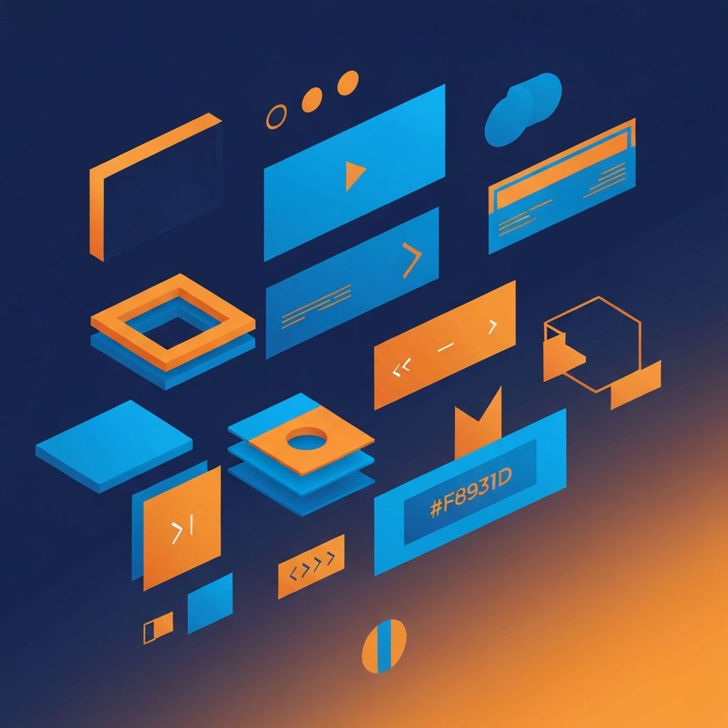
Web Design Elements
Understanding Web Design Elements
Web design elements are the building blocks that combine to create complete digital experiences. Like a chef understanding ingredients or a musician understanding notes, web designers must master individual elements before composing them into harmonious wholes. At AAMAX.CO, our designers demonstrate deep expertise in each element while understanding how they interact to create exceptional websites.
Each element serves functional and aesthetic purposes that contribute to user experience and business outcomes. Thoughtful application of these elements differentiates professional web design from amateur attempts. Understanding the elements also helps clients communicate more effectively about their preferences and goals.
Let's explore the essential web design elements and how to apply them effectively in modern website creation.
Typography: The Foundation of Communication
Typography encompasses all aspects of text presentation—font selection, sizing, spacing, and hierarchy. Since websites are primarily text-based communication tools, typography fundamentally shapes user experience.
Font selection communicates brand personality before a single word is read. Serif fonts suggest tradition and authority, while sans-serif fonts feel modern and approachable. Script fonts add elegance, and display fonts create impact. Most designs use two or three complementary fonts—more creates visual chaos.
Typographic hierarchy guides readers through content by establishing importance relationships. Headlines should be immediately distinguishable from body text, and readers should understand content structure at a glance. Size, weight, color, and spacing all contribute to effective hierarchy. Our website design services apply sophisticated typographic systems that enhance readability and brand expression.
Color: The Emotional Foundation
Color profoundly influences perception and emotion. Strategic color application creates visual interest, establishes brand identity, guides attention, and evokes specific feelings in visitors.
Color palettes typically include primary colors (dominant brand colors), secondary colors (complementary accents), and neutral colors (backgrounds and text). Effective palettes usually contain five to seven colors total, with clear guidelines for their application.
Color contrast impacts both aesthetics and accessibility. Sufficient contrast between text and backgrounds ensures readability for all users, including those with visual impairments. Web Content Accessibility Guidelines specify minimum contrast ratios that responsible designers follow.
Layout: Organizing the Experience
Layout determines how elements are arranged on pages. Effective layouts guide visitors through content logically while creating visual interest. Poor layouts confuse users and undermine communication.
Grid systems provide underlying structure for consistent, organized layouts. Whether using traditional 12-column grids or more flexible modern approaches, grids ensure alignment and proportion that create visual harmony.
White space (negative space) is a powerful layout element often underutilized by novice designers. Generous white space improves readability, creates focus, and conveys sophistication. Crowded layouts feel chaotic and overwhelming.
Imagery: Visual Storytelling
Images communicate instantly in ways text cannot. Photography, illustration, icons, and graphics all contribute to visual storytelling that engages visitors and reinforces messages.
Image selection should be purposeful, not decorative afterthought. Every image should serve a communication goal—demonstrating products, showing team personality, illustrating concepts, or setting emotional tone. Generic stock photography undermines authenticity.
Image optimization balances quality with performance. Large, unoptimized images significantly slow page loads. Modern formats like WebP and AVIF, along with responsive image techniques, deliver quality without performance sacrifice. Our website development process includes thorough image optimization.
Navigation: Wayfinding Systems
Navigation elements help visitors find what they need and understand where they are within a site. Primary navigation, secondary navigation, breadcrumbs, and in-page navigation work together to create intuitive wayfinding.
Clear, descriptive labels help users predict what they'll find when they click. Avoid clever or ambiguous navigation labels—clarity trumps creativity in wayfinding. Consistent navigation placement across pages builds familiarity and reduces cognitive load.
Mobile navigation requires special attention. Limited screen space necessitates patterns like hamburger menus, bottom navigation bars, or collapsible sections. Touch targets must be adequately sized for finger taps.
Calls-to-Action: Conversion Drivers
Calls-to-action (CTAs) prompt users to take desired actions—purchasing, subscribing, contacting, downloading. These elements directly impact conversion rates and business outcomes.
Effective CTAs combine compelling copy with attention-grabbing design. Action-oriented verbs, benefit-focused messaging, and urgency cues improve click-through rates. Visual distinction through color, size, and positioning ensures CTAs stand out from surrounding content.
CTA placement follows user behavior patterns. Primary CTAs should appear where attention naturally focuses—above the fold, at content conclusions, and at decision points. Secondary CTAs provide alternatives without competing with primary actions.
Forms: Interaction Gateways
Forms enable user interaction—contact forms, lead capture, account creation, checkout processes. Form design significantly impacts conversion rates since friction causes abandonment.
Form optimization principles include minimizing field count, using appropriate input types, providing clear labels and helpful error messages, and showing progress in multi-step forms. Smart defaults and autofill support reduce user effort.
Visual form design should make completion feel effortless. Adequate spacing, logical grouping, and clear visual hierarchy guide users through form completion. Our web application development expertise ensures forms function flawlessly while looking great.
Animation and Motion
Animation and motion design add life to websites, provide feedback, guide attention, and create delight. From subtle hover effects to complex animated sequences, motion enhances user experience when applied thoughtfully.
Purposeful animation improves usability. Loading indicators show system status, transitions clarify spatial relationships, and micro-interactions confirm user actions. Decorative animation without functional purpose often distracts or annoys.
Performance and accessibility considerations constrain animation choices. Heavy animations impact load times and can cause issues for users with vestibular disorders or motion sensitivity. Respect user preferences for reduced motion.
Icons and Symbols
Icons communicate concepts quickly and universally. They save space, enhance scannability, and add visual interest when used appropriately.
Icon consistency matters—mixing different icon styles creates visual discord. Whether using line icons, filled icons, or illustrated icons, maintain stylistic consistency across the site.
Icons should support rather than replace text labels. While some icons are universally recognized (home, search, menu), many are ambiguous without text clarification. Accessibility requires text alternatives for meaningful icons.
Background and Texture
Background treatments create visual foundation and depth. Solid colors, gradients, patterns, textures, and images can all serve as backgrounds depending on design goals.
Background choices impact readability and mood. Busy backgrounds compete with content, while appropriate backgrounds enhance without distraction. Subtle textures add visual interest without overwhelming.
Video backgrounds and animated backgrounds create impact but carry performance costs and accessibility implications. Use these sparingly and purposefully.
Putting Elements Together
Mastering individual elements is prerequisite to composing them effectively. Great design emerges from thoughtful combination where elements support each other and serve the whole.
Design systems document how elements combine, ensuring consistency across pages and over time. These systems include component libraries, pattern documentation, and usage guidelines that maintain quality as sites grow.
Professional designers at agencies like ours bring years of practice in combining elements effectively. Our front-end web development team implements designs with the precision these carefully composed elements deserve. Understanding the elements helps you appreciate and participate in the design process more effectively.
Want to publish a guest post on aamax.co?
Place an order for a guest post or link insertion today.
Place an Order