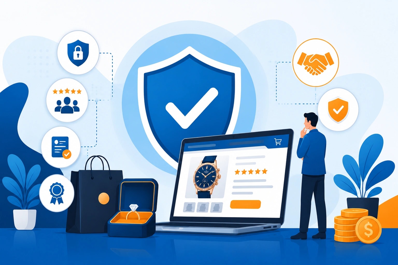
Why Trust Signals Matter for High-Value Purchase Websites
High-value purchases make people cautious. Fair enough. Nobody wants to spend serious money on a website that feels thin, vague, or thrown together over a weekend.
A visitor might like the product. They might even need it. But if the site doesn't feel credible within the first few seconds, doubt starts doing the talking. Is this business legitimate? Will the order arrive? What happens if something goes wrong? Why is the checkout page asking for so much information?
That hesitation matters.
For websites selling expensive products or services, design is not just about looking polished. It's about reducing anxiety. A luxury furniture brand, financial service provider, home builder, specialist equipment supplier, or investment-related ecommerce site has to work harder than a low-cost online store. The stakes feel higher because the purchase feels heavier.
Trust signals help bridge that gap. They reassure visitors that the business is real, the product is worth considering, and the process is safe enough to continue.
Trust Is Built Before the Checkout Page
Many businesses focus on trust only at the final stage. Secure checkout badge. Payment logos. Maybe a short refund note near the button.
That's too late.
Trust starts much earlier. It starts when someone lands on a homepage and scans the layout. It continues when they read product descriptions, check reviews, compare pricing, look for contact details, and click through policy pages. Every small detail either builds confidence or chips away at it.
A high-value website should answer silent objections before the visitor has to ask them. Clear pricing helps. So does detailed product information. Real photography helps even more. Generic stock images can work in some cases, but when someone is about to make a serious purchase, they want proof that the product, team, and business actually exist.
The last time a digital team reviewed a high-ticket ecommerce site, one issue stood out fast: the company had strong products but hid its contact details in the footer. That one small choice made the brand feel less accessible. Not dishonest. Just distant. And distance can cost conversions.
Proof Beats Pretty Words
Claims are easy. Proof is harder.
That's why testimonials, reviews, case studies, certifications, and third-party mentions matter so much. They give the visitor something solid to lean on. "Trusted by thousands" sounds nice, but a specific review from a named customer carries more weight. A before-and-after project story does even more.
For industries where risk feels personal, proof becomes essential. Think about buyers comparing bullion stores in major financial hubs like Sydney, London, or New York. They're not just looking for a clean website. They want signs of security, transparency, pricing accuracy, storage options, delivery processes, and business credibility. One unclear policy can make them close the tab. Fast.
The same applies to premium home services, custom technology, medical equipment, legal support, and business finance. When the cost is high, vague copy feels risky. Details feel safe.
Specificity wins.
Security Signals Should Feel Visible, Not Buried
A secure website should not make visitors hunt for reassurance. SSL protection, trusted payment methods, privacy details, warranty information, returns policies, and support channels should be easy to find.
This doesn't mean filling every page with badges until the site looks like a sticker book. That can feel desperate. The better approach is clean placement. A short note near forms. A privacy reassurance beside account creation. Clear payment information near checkout. Helpful FAQ sections on product and service pages.
Visitors don't always read every policy, but they notice whether policies exist. That alone matters.
A good trust signal says, "This business has thought through the customer experience." A bad one says, "Please don't look too closely."
There's a difference.
Transparency Makes Expensive Choices Feel Easier
High-value buyers usually compare options. They open tabs. They read reviews. They look for red flags. Sometimes they overthink it because spending a lot of money online still feels a little weird, even now.
Transparency helps them move forward.
A strong product page should explain what is included, what is not included, how delivery works, what the timeline looks like, and what support is available after purchase. If pricing varies, explain why. If a quote is needed, say what affects the final cost. If the product requires special handling, don't hide that part.
For example, a product description for a bullion storage box should not stop at size and material. A serious buyer may want to know about lock quality, fire resistance, portability, insurance considerations, and whether it suits home storage or professional vault use. That level of detail doesn't slow buyers down. It helps them decide.
Clear beats clever almost every time.
Real People Make a Website Feel Safer
A website with no human presence can feel cold. That's especially true when the purchase requires trust, consultation, or after-sales support.
Team photos, founder notes, expert profiles, office addresses, phone numbers, live chat, and named support contacts all help. They remind visitors that there are real people behind the screen. Not just a logo floating in space.
Even a short "About" page can do a lot of work when it sounds human. It should explain who runs the business, why the company exists, what experience the team brings, and who they help. Skip the corporate fog. Nobody needs another paragraph about "delivering innovative solutions in a dynamic marketplace." Say something useful instead.
People trust people.
Reviews Need Context, Not Just Stars
Five-star ratings are helpful, but they're not the whole story. A review that says "Great service" is nice. A review that explains what the customer bought, what problem they had, and how the business handled it is stronger.
Context turns praise into proof.
High-value websites should highlight reviews that answer real buying concerns. Was delivery smooth? Did support respond quickly? Was the product as described? Did the service save time, reduce risk, or improve results? These details matter because they mirror the questions new visitors already have in their heads.
Don't bury the best reviews on a separate page nobody visits. Place them near decision points. Product pages. Quote forms. Pricing sections. Booking pages.
That's where trust has to show up.
Trust Signals Help Search and Conversions Work Together
Traffic alone doesn't build revenue. A website can attract the right visitors and still lose them if the trust experience feels weak.
SEO can bring people in. Paid ads can drive attention. Social media can create awareness. But the website has to finish the job. For high-value purchases, that job is not just persuasion. It's reassurance.
Trust signals support both users and search performance because they improve content quality, demonstrate expertise, and create a better page experience. Detailed service pages, clear author information, useful FAQs, genuine reviews, and transparent policies can all strengthen credibility.
The best high-value purchase websites don't shout. They guide. They answer questions before doubt grows. They make risk feel manageable.
And that's the point. When people feel safe, they're more willing to take the next step.
Want to publish a guest post on aamax.co?
Place an order for a guest post or link insertion today.
Place an Order