Web Page List Design
The Art and Science of Web Page List Design
Lists are fundamental building blocks of web page design, appearing in navigation menus, product catalogs, article feeds, search results, and countless other contexts. Despite their ubiquity, list design often receives insufficient attention, resulting in interfaces that frustrate users rather than serving them. At AAMAX.CO, we recognize that thoughtful list design significantly impacts user experience and conversion rates.
This comprehensive guide explores list design principles, patterns, and best practices that create effective, user-friendly interfaces.
Understanding List Types and Their Uses
Different list types serve different purposes, and selecting the appropriate format is the first design decision.
Unordered lists present items without inherent sequence. Navigation menus, feature lists, and collections typically use unordered lists, as item order doesn't convey meaning.
Ordered lists indicate sequence or ranking. Step-by-step instructions, rankings, and prioritized content benefit from numbered presentation that communicates order significance.
Definition lists pair terms with descriptions. Glossaries, FAQ sections, and specification tables effectively use definition list structures.
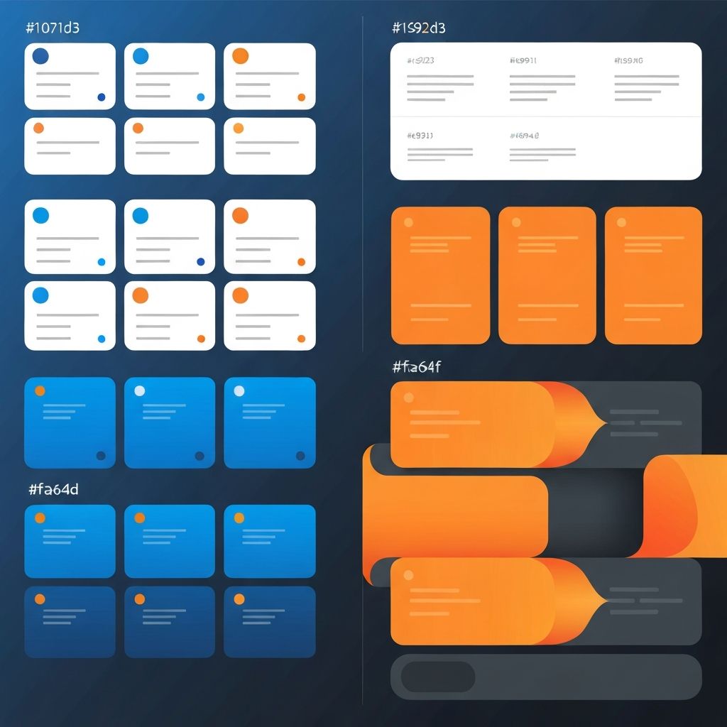
Card-based lists present items as distinct visual units. Product catalogs, portfolio galleries, and content feeds often employ card layouts for visual impact and touch-friendly interactions.
Table lists organize complex information with multiple attributes per item. Comparison pages, data-heavy applications, and administrative interfaces rely on table structures.
Visual Hierarchy in List Design
Effective lists establish clear visual hierarchies that guide user attention.
Typography differentiation distinguishes primary content from secondary details. Larger, bolder text for titles and smaller, lighter text for descriptions creates scannable structures.
Spacing creates separation and grouping. Adequate space between items prevents visual confusion, while tight spacing within items groups related information.
Color and contrast highlight important elements. Action buttons, status indicators, and key information benefit from color treatment that draws attention.
Icons and imagery provide visual anchors. Thumbnails, category icons, and status indicators help users identify items quickly while adding visual interest.
Alignment creates order and professionalism. Consistent alignment throughout lists establishes rhythm that improves comprehension.
Scannability and Readability
Users typically scan lists rather than reading every word. Design must support this behavior.
Front-loading important information places key content where eyes naturally land. Beginning list items with distinctive, relevant terms improves scanning efficiency.
Consistent structure across items enables pattern recognition. When users understand item structure, they scan more efficiently, finding needed information quickly.
Appropriate density balances information access with visual comfort. Too little information requires excessive clicking; too much information overwhelms and slows comprehension.
Truncation strategies handle variable-length content gracefully. Ellipsis, expand/collapse patterns, and detail views manage content that exceeds available space.
Whitespace prevents items from blurring together. Generous spacing improves scannability, even at the cost of showing fewer items without scrolling. Our website design services emphasize these user-centered principles.
Navigation and Interaction Design
Interactive lists require careful attention to usability patterns.
Click targets must be appropriately sized. On touch devices, minimum target sizes of 44 pixels prevent frustrating mis-taps. Generous padding extends clickable areas beyond visible content.
Hover states provide feedback on desktop. Visual changes on hover confirm interactivity and indicate boundaries of clickable regions.
Active and selected states communicate current context. Highlighting selected items within lists maintains user orientation during navigation.
Keyboard accessibility ensures lists work for all users. Focus indicators, logical tab order, and keyboard activation support accessible navigation.
Loading states communicate system activity. When lists load dynamically, appropriate loading indicators prevent user confusion about empty states or system responsiveness.
Filtering and Sorting Functionality
Complex lists benefit from user controls that help find specific items.
Filter interfaces enable narrowing large sets. Checkbox filters, dropdown selectors, and toggle controls help users reduce lists to manageable, relevant subsets.
Sort options change list order. Alphabetical, chronological, price, relevance, and other sort criteria help users find items or compare options.
Search functionality provides direct access. When lists contain many items, search fields offer efficient alternatives to browsing.
Active filter indication shows current state. Users must understand which filters are applied to interpret visible results correctly.
Reset functionality enables starting fresh. Clear buttons help users remove all filters when they've narrowed too far or want new perspectives.
Responsive List Design
Lists must adapt to different screen sizes while maintaining usability.
Column adjustments respond to available width. Multi-column layouts on desktop might reduce to single columns on mobile, maintaining item visibility without horizontal scrolling.
Information prioritization may change across breakpoints. Details visible on desktop might collapse into expandable sections on mobile, preserving essential information while managing space.
Touch-friendly adjustments increase target sizes and spacing on mobile. Interactions designed for mouse pointers require modification for finger navigation.
Horizontal scrolling patterns work for certain list types on mobile. Image carousels and card collections sometimes benefit from horizontal scrolling rather than vertical stacking.
Table lists present particular responsive challenges. Horizontal scrolling, stacked rows, or progressive disclosure patterns address table width issues on narrow screens. Our front-end web development team expertly handles these responsive challenges.
Performance Considerations
Long lists can impact performance, requiring optimization strategies.
Pagination breaks large lists into manageable pages. Traditional pagination works well when users expect to browse systematically through complete sets.
Infinite scroll loads additional items as users scroll. This pattern suits discovery-oriented browsing where item count is less important than continuous exploration.
Virtual scrolling renders only visible items, enabling smooth performance with thousands of items. Complex applications with large datasets benefit from this technique.
Lazy loading defers image and content loading until needed. Items below the fold don't impact initial load time, improving perceived performance.
Caching strategies reduce redundant loading. Previously viewed lists load instantly when revisited, improving user experience during navigation.
Empty States and Error Handling
Well-designed lists account for edge cases that disrupt normal patterns.
Empty states communicate absence meaningfully. When lists have no items—whether initially or after filtering—helpful messages explain the situation and suggest actions.
Loading failures require graceful handling. Error messages that explain problems and offer solutions maintain user confidence despite technical issues.
No results states differ from empty states. Search or filter combinations producing no matches need specific messaging that suggests adjustments.
Skeleton screens improve perceived performance. Placeholder layouts that indicate upcoming content structure feel faster than blank screens during loading.
Accessibility in List Design
Accessible lists serve all users regardless of abilities.
Semantic HTML provides structural meaning. Using appropriate list elements—ul, ol, dl—enables assistive technologies to communicate structure to users.
Proper heading hierarchy organizes list sections. Screen reader users navigate by headings, making proper hierarchy essential for orientation.
ARIA attributes enhance complex widgets. Interactive lists, filters, and dynamic content benefit from ARIA roles and properties that communicate behavior.
Color independence ensures meaning doesn't rely solely on color. Status indicators and categorization need additional visual cues for colorblind users.
Focus management maintains context during interactions. When list actions modify content, focus handling prevents user disorientation.
Partnering for Exceptional List Design
Effective list design requires attention to numerous details that collectively create seamless user experiences. At AAMAX.CO, our website development and web application development teams bring deep expertise to list design challenges across diverse applications. From simple navigation menus to complex data-driven interfaces, we create lists that serve users effectively while achieving business objectives. Let us help you design list experiences that engage users and drive results.
Want to publish a guest post on aamax.co?
Place an order for a guest post or link insertion today.
Place an Order