Web Design UI
What Web Design UI Really Means
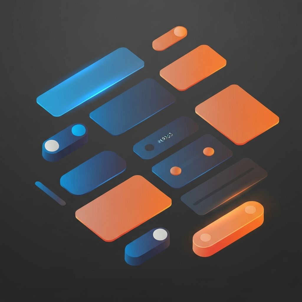
User interface, commonly shortened to UI, is the visual layer where your audience meets your brand. Every button, input, card, icon, and animation is part of UI. Strong UI design is not about making things pretty; it is about making things clear, usable, and on-brand. At AAMAX.CO, we approach UI as a system of decisions that compound to create trust, ease, and conversion. In this guide, we explain the principles, components, and practices that define excellent web design UI.
1. The Role of UI in Modern Web Design
UI sits at the intersection of design and engineering. It is what users see and interact with, but it is also a product of how your front-end is structured. A great UI looks effortless because it is the result of careful choices about layout, color, type, motion, and feedback.
Modern UI design also has to consider performance, accessibility, responsive behavior, and integration with backend systems. This is why the best UI work happens when designers and developers collaborate from the very beginning.
2. Visual Hierarchy and Layout
Every screen tells a story, and hierarchy decides which sentence comes first. Effective UI uses size, weight, color, and spacing to guide the eye toward the most important action. On a landing page, that might be a single CTA. On a dashboard, it might be a key metric. The principle is the same: make the most important thing the most obvious thing.
Layout systems based on grids, flexbox, and consistent spacing scales make hierarchy easier to maintain. Without a system, every page becomes a custom decision, which is expensive and inconsistent.
3. Components and Design Systems
Modern UI is built from components: buttons, inputs, modals, cards, and so on. A design system documents these components along with their usage rules, variants, and states. Once a design system exists, your team can ship faster and more consistently.
Popular design systems like Material, Apple HIG, and shadcn/ui have raised the baseline expectation for what good UI looks like. Customizing these foundations to match your brand is a strong starting point for most businesses.
4. Color and Contrast
Color in UI is functional first, decorative second. Primary, secondary, success, warning, and error colors should each have a clear job. Contrast ratios must meet accessibility standards so that text and controls are readable for everyone.
Limit your palette. Three to five core colors plus a few neutrals usually deliver more cohesive results than a rainbow of competing tones. The goal is for users to feel oriented at every step.
5. Typography Within UI
UI typography is different from editorial typography. UI text is often short, dense, and read while scanning. It demands clarity at small sizes, generous spacing, and predictable hierarchy. Pair a body family with one accent family, and define sizes that scale cleanly across devices.
6. Interaction and Feedback
Every action a user takes deserves feedback. Hover states, focus rings, loading indicators, and success messages tell the user the system heard them. Without feedback, even fast interfaces feel broken or unresponsive.
Subtle motion is one of the most powerful UI tools. A button that gently scales on press, a list that fades in as it loads, or a toast that slides up from the bottom can make a product feel alive without becoming distracting.
7. Forms and Inputs
Forms are where many sites lose conversions. Good UI design for forms includes clear labels, sensible defaults, inline validation, accessible error messages, and obvious progress indicators. Reduce required fields whenever possible, and group related questions together.
If your business depends on lead generation or sign-ups, optimizing your forms is one of the highest-ROI UI projects you can run.
8. Navigation Patterns
Navigation is the spine of any UI. Top navs, sidebars, breadcrumbs, mega menus, and tabs each have a place. Choose the pattern that matches your information architecture, not the trend of the month. The goal is for users to know where they are, where they have been, and where they can go next.
9. Mobile-First UI
Most users will see your UI on a phone first. Mobile-first design forces you to prioritize ruthlessly. What is essential on a 4-inch screen tends to also be essential on a 27-inch one. Touch targets, thumb zones, and gesture support all matter on mobile and translate into cleaner desktop experiences as well.
10. Performance Is a UI Concern
Slow UI is bad UI. A button that takes a second to respond, an image that loads in three stages, or a page that jumps as it renders all damage the user experience. Performance budgets, code-splitting, image optimization, and a strong front-end architecture protect the quality of your UI.
Our front-end web development team builds UIs with performance baked in from the first commit, often using Next.js for the best balance of speed, SEO, and developer experience.
Building a UI That Converts
The best UIs do more than look good; they drive measurable results. Run usability tests, watch session recordings, and measure key flows. Small UI improvements often deliver outsized gains in conversion, retention, and customer satisfaction.
Hire AAMAX.CO for Web Design and Development
We are a full-service digital marketing company offering web development, digital marketing, and SEO services. Whether you need a UI audit, a redesign, or a full custom build, our team can help. Explore our website design and website development services to start the conversation.
Want to publish a guest post on aamax.co?
Place an order for a guest post or link insertion today.
Place an Order