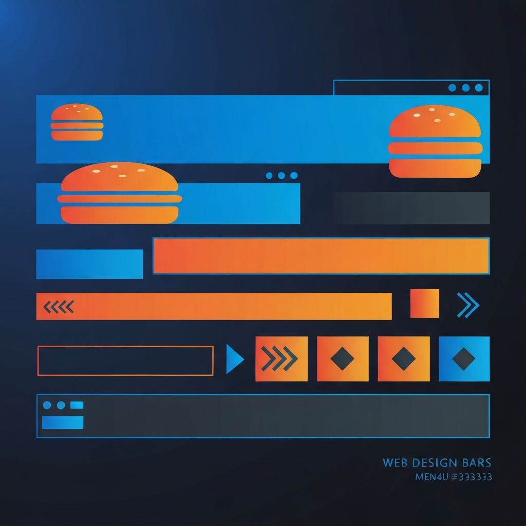
Web Design Navigation Bar
Why the Navigation Bar Is the Most Important UI Element
The navigation bar may occupy only a small slice of screen real estate, but it carries an outsized burden. It is the primary wayfinding tool for visitors, the most clicked element on most websites, and a critical signal of brand professionalism. A great navigation bar can guide users effortlessly to their goals, while a poor one can drive visitors away within seconds. At AAMAX.CO, we treat navigation design as a strategic discipline, not an afterthought.
The principles of great navigation design have been studied for decades, yet many websites still get the basics wrong. Cluttered menus, unclear labels, inconsistent behavior, and poor mobile adaptation are common failures. Avoiding these pitfalls requires a thoughtful, user-centered approach.
The Anatomy of a Great Navigation Bar
A well-designed navigation bar typically includes a logo or brand mark, a primary set of links representing main site sections, a clear call to action, and often utility elements like search, account access, or language selection. The arrangement, hierarchy, and styling of these elements all communicate brand personality.
The most effective navigation bars feel almost invisible. Users find what they need without thinking about the navigation itself. This invisibility is the hallmark of great design and requires significant intentionality to achieve.
Primary Navigation: Less Is More
One of the most common navigation mistakes is overcrowding. Too many top-level links create decision paralysis and visual clutter. Research suggests that humans struggle to scan more than five to seven items at a glance, making the case for restraint.
Effective primary navigation usually contains four to seven main links, with secondary content organized into dropdowns, mega menus, or dedicated section pages. The discipline of cutting links is harder than adding them but pays dividends in clarity and conversion.
Mega Menus Done Right
For content-rich sites, mega menus offer a way to expose deep navigation without overwhelming the primary bar. A well-designed mega menu organizes content into clear categories, includes visual elements like icons or imagery when helpful, and remains scannable.
Poorly designed mega menus, on the other hand, become walls of text that overwhelm users. The key is grouping, hierarchy, and editorial discipline. Our Website Design team has built mega menus for clients ranging from B2B software to global e-commerce, applying these principles consistently.
Mobile Navigation Patterns
Mobile navigation requires fundamentally different thinking than desktop navigation. The hamburger menu became the default solution but has known usability issues. Hidden navigation reduces engagement compared to visible navigation. Best practices have evolved toward hybrid approaches that show key links while tucking secondary navigation behind a menu icon.
Bottom navigation bars are increasingly popular on mobile, mirroring native app conventions and improving thumb reach. Sticky headers ensure navigation remains accessible during long scrolls. Each pattern has trade-offs that must be evaluated against the specific site's content and goals.
Sticky vs Static Navigation
Sticky navigation, which remains visible as users scroll, offers convenience by keeping wayfinding tools always accessible. However, it consumes valuable screen space, especially on mobile. Hybrid approaches that hide on scroll-down and reveal on scroll-up offer the best of both worlds.
The decision between sticky and static navigation depends on site length, content type, and user behavior. Long-form content sites benefit more from sticky navigation than single-page marketing sites.
Search as Navigation
For content-heavy websites, search is often the primary navigation method. Prominently placed search, ideally with autocomplete and intelligent suggestions, can dramatically improve user satisfaction. Modern search-as-you-type implementations require both frontend finesse and backend power.
Our Back-end Web Development team builds intelligent search systems with relevance ranking, faceted filtering, and personalization for complex content sites and e-commerce platforms.
Navigation Accessibility
Accessible navigation is non-negotiable. Keyboard users must be able to access every navigation item without a mouse. Screen reader users need semantic HTML and ARIA attributes that communicate structure and state. Skip-to-content links allow users to bypass navigation when desired.
Focus indicators must be clearly visible. Touch targets must meet minimum size guidelines. Dropdowns must support keyboard interaction. Each of these considerations is foundational, not optional.
Navigation Performance
Despite its visual simplicity, navigation can become a performance bottleneck. Unoptimized icon fonts, excessive JavaScript, and complex CSS animations all add up. Modern best practices include using SVG icons inline rather than icon fonts, minimizing JavaScript dependencies, and optimizing critical CSS.
Our Front-end Web Development team prioritizes navigation performance because slow navigation breaks the entire experience.
Visual Design and Branding
The navigation bar is one of the most visible expressions of brand identity. Color, typography, logo treatment, and spacing all communicate brand personality. Subtle details like underline animations on hover, custom focus rings, and smooth transitions can elevate the entire site.
Consistency matters enormously. Navigation that behaves differently on different pages erodes user confidence. Establishing clear navigation patterns and maintaining them rigorously is a hallmark of professional sites.
Mega-Footer Navigation
While the header navigation gets most attention, footer navigation deserves consideration too. Comprehensive mega-footers serve as a sitemap, exposing deep content without cluttering the header. They are particularly valuable for SEO and accessibility.
Navigation Analytics and Iteration
Great navigation is the result of iteration based on real user behavior. Heatmaps reveal which links get clicked. Analytics show which pages users navigate to. User testing exposes confusion points. The best navigation evolves over time based on this evidence.
Our Website Maintenance and Support services include ongoing analytics review and navigation optimization to keep your wayfinding effective as your site grows.
Navigation Patterns for E-Commerce
E-commerce navigation has unique requirements: large product taxonomies, faceted filtering, account access, cart visibility, and search prominence. Mega menus, sidebar filters, and breadcrumbs all play essential roles in helping shoppers find what they want.
Modern Navigation Trends
Recent trends include minimalist navigation that hides until invoked, full-screen overlay menus on click, contextual navigation that changes based on page section, and AI-powered navigation that personalizes link prominence based on user behavior. The key is using these trends only when they genuinely improve user experience.
Build Better Navigation with AAMAX.CO
At AAMAX.CO, we design navigation bars that feel inevitable, the kind users barely notice because they just work. Whether you need a complete site redesign or focused navigation improvements, our team brings deep expertise to every engagement. Hire us to transform your most important UI element into a competitive advantage.
Want to publish a guest post on aamax.co?
Place an order for a guest post or link insertion today.
Place an Order