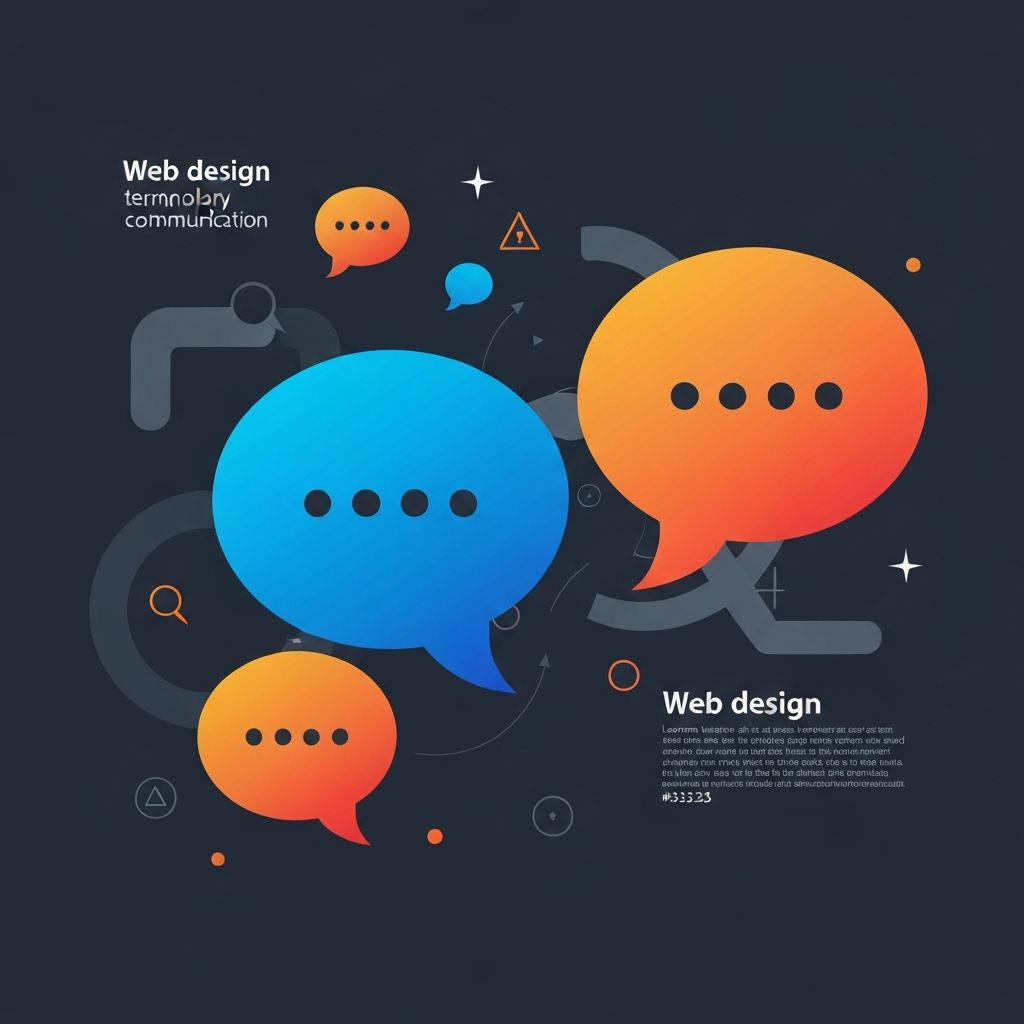
Web Design Lingo
Why Understanding Web Design Lingo Matters
The web design industry has developed its own extensive vocabulary—a specialized language that professionals use to communicate efficiently and precisely. Whether you are entering the field, working with designers, or advancing your existing career, mastering this terminology accelerates your effectiveness and credibility.
At AAMAX.CO, clear communication is fundamental to our success in delivering website design and website development services. We ensure our team and clients share common understanding through consistent use of industry terminology.
Visual Design Terminology
Visual design lingo encompasses the aesthetic elements that make websites visually appealing. Understanding these terms enables precise discussion of design choices and their effects.
Above the fold refers to content visible without scrolling when a page first loads. This prime real estate demands careful consideration of what users see immediately upon arrival.
White space (or negative space) is the empty area between design elements. Despite its name, white space can be any color—the term describes the breathing room that makes designs feel organized rather than cluttered.
Visual hierarchy describes the arrangement of elements to show their importance. Through size, color, position, and contrast, designers guide users' attention to the most critical information first.
Typography encompasses all aspects of type design and arrangement—font selection, sizing, spacing, and alignment. Good typography enhances readability and reinforces brand personality.
Color palette refers to the specific colors chosen for a design project. Palettes typically include primary colors, secondary colors, and accent colors that work harmoniously together.
Layout and Structure Terms
Understanding layout terminology helps communicate how page elements are organized and how users navigate through content.
Grid system provides the underlying structure that organizes page elements into columns and rows. Grids create visual consistency and make responsive design more manageable.
Responsive design ensures websites adapt appropriately to different screen sizes and devices. Responsive sites rearrange content and adjust proportions to provide optimal experiences on phones, tablets, and desktops.
Breakpoint marks the screen width at which a responsive design changes its layout. Common breakpoints correspond to typical device sizes—mobile, tablet, and desktop.
Hero section refers to the large banner area typically found at the top of web pages. Heroes often contain key messaging, calls-to-action, and striking imagery designed to make strong first impressions.
Footer is the bottom section of a webpage, typically containing navigation links, contact information, legal notices, and secondary content that appears on every page.
User Experience (UX) Terms
UX terminology focuses on how users interact with and experience websites. These concepts are central to creating effective, user-centered designs.
User flow maps the path users take to complete tasks on a website. Understanding user flows helps designers remove obstacles and streamline journeys toward conversion goals.
Wireframe is a low-fidelity representation of a page layout showing structure and functionality without visual design details. Wireframes communicate information architecture and element placement early in the design process.
Prototype is an interactive model that simulates how a design will function. Prototypes range from simple clickable mockups to high-fidelity simulations used for user testing.
Usability measures how easily users can accomplish their goals using a website. High usability means intuitive navigation, clear content, and minimal friction in completing tasks.
Accessibility ensures websites can be used by people with disabilities. Accessible design considers visual impairments, motor limitations, cognitive differences, and other factors that affect how people interact with digital content.
User Interface (UI) Terms
UI terminology describes the specific elements users interact with directly. These terms enable precise discussion of interface components and behaviors.
Call-to-action (CTA) is an element prompting users to take specific action—buttons, links, or other interactive elements that drive conversions and engagement.
Navigation encompasses the system of menus, links, and other elements that help users move through a website. Effective navigation is intuitive and consistently organized.
Breadcrumbs show users their current location within a website's hierarchy. These navigational aids appear as a trail of links leading from the homepage to the current page.
Modal (or lightbox) is a dialog box that appears over page content, requiring user interaction before returning to the underlying page. Modals focus attention on specific actions or information.
Dropdown is a menu element that reveals additional options when activated. Dropdowns conserve space while providing access to extensive navigation or selection options.
Technical Design Terms
Technical terminology bridges design and development, essential for collaboration between designers and programmers working on projects like front-end development or back-end development.
HTML (HyperText Markup Language) provides the structural foundation of web pages, defining content elements like headings, paragraphs, images, and links.
CSS (Cascading Style Sheets) controls the visual presentation of HTML elements—colors, fonts, spacing, and layout are all defined through CSS.
JavaScript enables interactive functionality on websites. This programming language powers dynamic content, animations, form validation, and countless other features.
API (Application Programming Interface) allows different software systems to communicate. APIs enable websites to integrate with external services and data sources.
CMS (Content Management System) is software that enables non-technical users to create and manage website content. WordPress and Strapi are popular CMS platforms.
Performance and Optimization Terms
Performance terminology addresses how quickly and efficiently websites function—critical factors for user experience and search rankings.
Page speed measures how quickly a page loads and becomes usable. Faster page speeds correlate with better user experience and higher search rankings.
Image optimization reduces file sizes without unacceptable quality loss. Optimized images load faster while maintaining visual appeal.
Caching stores frequently accessed data for faster retrieval. Proper caching significantly improves page load times for returning visitors.
Minification removes unnecessary characters from code files without changing functionality. Minified files transfer faster, improving page speed.
Lazy loading delays loading of off-screen content until users scroll to it. This technique improves initial page load times by prioritizing visible content.
Process and Methodology Terms
Process terminology describes how design work is organized and executed. Understanding these concepts helps you work effectively within professional environments.
Design sprint is a time-constrained process for rapidly developing and testing design solutions. Sprints typically run five days and produce validated concepts quickly.
Iteration refers to cycles of refinement where designs are improved based on feedback and testing. Iterative processes recognize that good design emerges through progressive improvement.
Design system is a collection of reusable components, guidelines, and standards that ensure consistency across digital products. Systems improve efficiency and maintain brand coherence.
Style guide documents the visual and written standards for a brand or project. Style guides ensure consistency when multiple people contribute to a project.
A/B testing compares two versions of a design element to determine which performs better. This data-driven approach removes guesswork from design decisions.
Client and Business Terms
Business terminology helps designers communicate with clients and stakeholders who may not share technical backgrounds.
Stakeholder refers to anyone with interest in a project's outcome—clients, users, team members, and executives who are affected by design decisions.
Requirements document the specific needs and constraints a design must satisfy. Clear requirements prevent misunderstandings and scope creep.
Deliverable is any work product provided to clients or stakeholders. Design deliverables might include wireframes, mockups, prototypes, or production-ready assets.
Scope defines the boundaries of what a project includes and excludes. Scope management prevents projects from expanding beyond agreed parameters.
Staying Current with Industry Language
Web design vocabulary evolves continuously as new technologies and methodologies emerge. Stay current by reading industry publications, participating in design communities, and engaging with peers.
At AAMAX.CO, our work across MERN stack development, ReactJS, and Next.js development keeps us engaged with evolving technical terminology that becomes part of standard design vocabulary.
Conclusion
Mastering web design lingo empowers you to communicate effectively with colleagues, clients, and collaborators. This shared vocabulary enables precise discussion of complex concepts and demonstrates professional credibility. Whether you are beginning your design journey or deepening existing expertise, continued learning of industry terminology supports your professional growth. The language of web design continues to evolve—staying curious and engaged ensures you remain fluent in the vocabulary that shapes our industry.
Want to publish a guest post on aamax.co?
Place an order for a guest post or link insertion today.
Place an Order