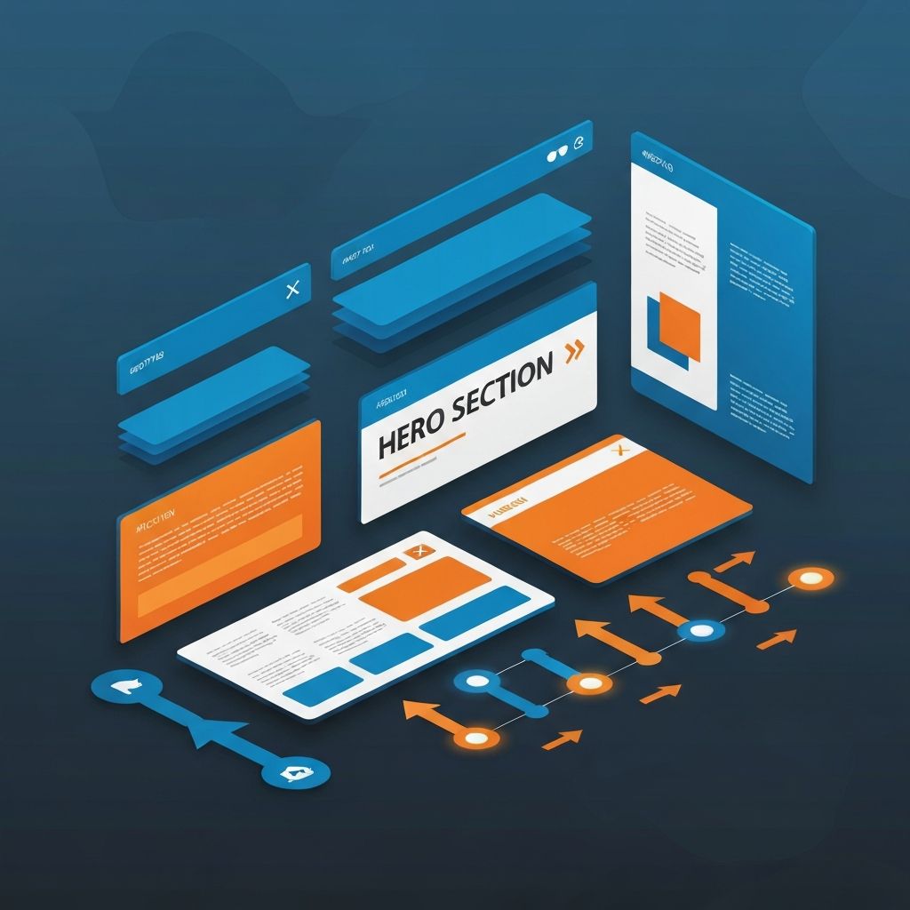
Web Design Inspiration 2015
Why 2015 Was a Pivotal Year for Web Design
2015 was a turning point in web design. Flat design had matured into Google's Material Design, parallax scrolling was at its peak, hero videos were exploding in popularity, and mobile-first thinking was finally becoming non-negotiable. Looking back at that year is not a nostalgia exercise—it is a way to understand the foundations of modern web design and identify which ideas have stood the test of time. At AAMAX.CO, we believe that studying past trends sharpens judgment about today's choices.
Many websites today still echo decisions that were popularized in 2015. Understanding which trends became enduring patterns and which became dated fads is invaluable for anyone designing or commissioning a website now.
The Rise of Flat and Material Design
By 2015, flat design had largely replaced skeuomorphism. Material Design, introduced by Google in 2014, gained massive adoption in 2015, blending flat aesthetics with subtle depth via shadows and motion. The lasting lesson: clarity beats decoration. Today's design systems—including the ones we build for clients—still rely on the principles of consistent elevation, predictable interaction, and clean iconography that 2015 helped solidify.
Full-Screen Hero Sections
2015 made the full-bleed hero section ubiquitous. A massive image or video, a single bold headline, and a prominent call to action became the default opening for thousands of sites. The pattern endures because it works: it focuses attention and communicates value instantly. Modern variations swap heavy videos for optimized animations and lighter assets, but the structural idea is unchanged. Our website design team still uses this pattern, refined for today's performance budgets.
Parallax Scrolling—Lessons Learned
Parallax was the darling of 2015, then quickly became a cliché. The takeaway is nuanced: parallax can still be effective when it serves a narrative, but it should never be applied just because it looks impressive. Excessive parallax hurts performance, accessibility, and clarity. The 2015 era taught the industry to treat motion as a feature, not a flourish.
Card-Based Layouts
Pinterest popularized cards, and by 2015 nearly every content-heavy site had adopted them. Cards remain one of the most useful layout primitives because they package related content into self-contained, scannable units. Modern frameworks make them trivial to build, and component-based architectures—which we use in our front-end web development work—are essentially card libraries scaled up.
Long-Form Single-Page Sites
Single-page sites with anchored navigation peaked in 2015, especially for product launches and portfolios. While most businesses still benefit from traditional multi-page architectures, the long-form single-page format remains a strong choice for focused stories. The key is treating it as a narrative, not a dump of information.
Hamburger Menus on Desktop
2015 saw hamburger menus migrate from mobile to desktop, often controversially. Hindsight tells us that hiding navigation on desktop frequently hurts discoverability. Today, we recommend visible primary navigation on desktop and reserving hamburger patterns for genuinely mobile contexts or secondary menus.
Hero Videos and Background Loops
Background videos defined 2015's premium aesthetic. They still work, but with stricter performance requirements. Compressed formats, autoplay-with-mute defaults, and lazy loading are now standard. We frequently revisit the 2015 hero-video pattern in modern builds, especially for our Next.js web development projects, where we can leverage automatic optimization.
Mobile-First Becomes Mandatory
Google's "Mobilegeddon" update in April 2015 made mobile friendliness a ranking factor. Suddenly, responsive design was not a nice-to-have. Every modern best practice—mobile-first CSS, fluid typography, touch-friendly tap targets—has roots in this shift. It is one of the most consequential changes in the history of the web.
Applying 2015 Lessons to Modern Sites
The best way to use 2015 inspiration is selectively. Keep the structural patterns that proved their worth (clean typography, hero sections, cards, mobile-first thinking). Update the surface details (performance, motion, accessibility, modern frameworks). The result is a site that feels timeless rather than trendy. Our web development consulting services help clients separate enduring patterns from passing fads.
Hire Us to Build a Site That Will Age Well
Trends come and go—craft endures. Hire AAMAX.CO for web design and development services that draw on more than a decade of evolving best practices. We help you choose patterns that will still feel modern five years from now, not just five months.
Want to publish a guest post on aamax.co?
Place an order for a guest post or link insertion today.
Place an Order