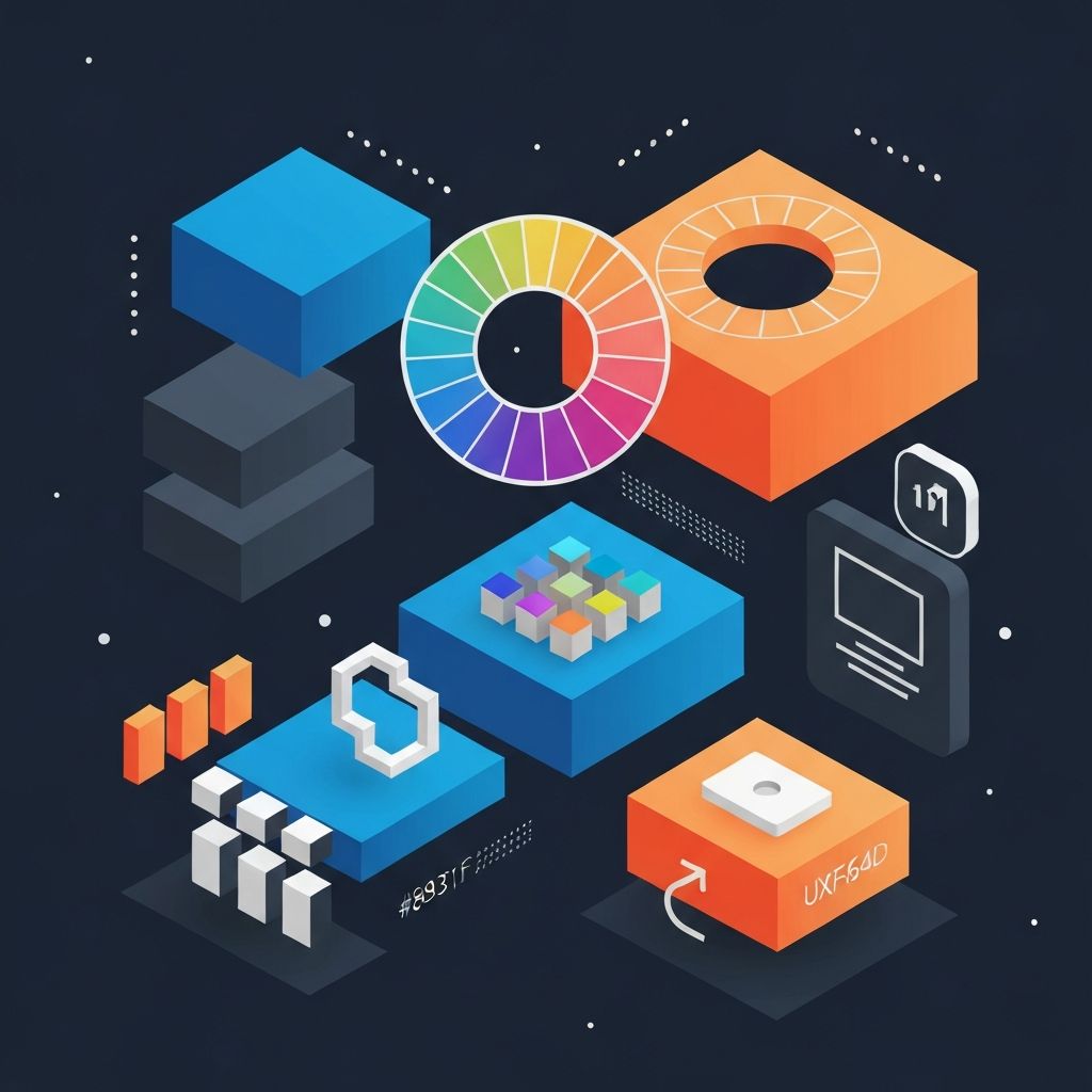
Web Design Concepts
Understanding the Fundamentals of Web Design
Web design encompasses the visual appearance, layout, and user experience of websites. It's a multidisciplinary field combining graphic design, user interface design, coding, and psychology. Understanding core concepts enables designers to create websites that are not only beautiful but also functional, accessible, and effective at achieving business goals.
At AAMAX.CO, we apply these fundamental concepts across all our web development, digital marketing, and SEO services. Our approach to website creation is rooted in proven design principles that have guided effective communication design for decades while embracing modern technologies and user expectations.
Visual Hierarchy and Layout
Visual hierarchy guides users' attention through a design in order of importance. By manipulating size, color, contrast, and position, designers ensure that the most important elements receive the most attention. Effective hierarchy makes complex information digestible and guides users toward desired actions.
Layout structures information on the page. Grid systems provide consistent alignment and proportions that create visual harmony. Modern web design typically uses flexible grids that adapt to different screen sizes while maintaining structural integrity. Understanding layout principles is essential for creating organized, professional-looking websites.
White space, or negative space, is the empty area between and around elements. Far from wasted space, it improves readability, reduces visual clutter, and draws attention to important content. Generous white space is a hallmark of sophisticated, modern design.
Typography in Web Design
Typography significantly impacts both aesthetics and usability. Font choices convey personality and tone before users read a single word. A legal firm and a creative agency might communicate very different values through their typography choices alone.
Web-safe fonts and web fonts have expanded typographic possibilities online. Services like Google Fonts provide access to hundreds of professional typefaces that work reliably across browsers and devices. This variety allows designers to achieve unique visual identities while ensuring consistent rendering.
Readability depends on more than font selection. Line height, line length, and contrast between text and background all affect how easily users can consume content. Optimal typography settings vary based on context, with body text requiring different treatment than headlines or navigation.
Color Theory and Application
Color evokes emotional responses and conveys meaning. Understanding color psychology helps designers choose palettes that support brand messaging and user goals. Blue suggests trust and professionalism, while orange conveys energy and enthusiasm. Strategic color use reinforces the intended impression.
Color systems for web design typically include primary brand colors, secondary accent colors, and neutral backgrounds. Limiting palettes to a few colors creates cohesion while providing enough variety for hierarchy and emphasis. Too many colors create chaos; too few can feel monotonous.
Accessibility requirements affect color choices. Sufficient contrast between text and backgrounds ensures readability for users with visual impairments. Tools like contrast checkers help verify that color combinations meet Web Content Accessibility Guidelines (WCAG) standards.
Responsive and Adaptive Design
Responsive design ensures websites work well across all device sizes and orientations. Using flexible grids, flexible images, and CSS media queries, responsive sites adapt their layout to the viewing environment. This approach has become standard as mobile traffic continues to grow.
Mobile-first design starts with the mobile experience and progressively enhances for larger screens. This approach ensures mobile users, often the majority of visitors, receive optimal experiences. It also enforces content prioritization, as small screens allow no room for unnecessary elements.
Breakpoints are the screen widths where layouts shift to accommodate different devices. Strategic breakpoint selection ensures smooth transitions between layouts. Testing across multiple device sizes during development catches issues before they affect real users.
User Experience (UX) Design Concepts
User experience encompasses all aspects of user interaction with a website. Good UX design makes websites intuitive, efficient, and satisfying to use. It considers user needs, business goals, and technical constraints to create optimal experiences.
User research informs UX decisions with data rather than assumptions. Techniques including interviews, surveys, usability testing, and analytics reveal how real users behave and what they need. Research-driven design produces better outcomes than designer intuition alone.
Information architecture organizes and structures content for findability and understanding. Well-designed navigation, clear labeling, and logical content organization help users accomplish their goals efficiently. Poor information architecture frustrates users even when visual design is excellent.
User Interface (UI) Design Elements
UI design focuses on the visual elements users interact with. Buttons, forms, menus, and other interface components must be both attractive and functional. Consistent UI design creates predictable experiences that users can navigate confidently.
Design patterns are proven solutions to common UI challenges. Using established patterns for navigation, forms, and other interactions leverages users' existing knowledge. Innovation has its place, but unnecessary deviation from conventions confuses users.
Microinteractions are small animations and feedback mechanisms that enhance usability. Button hover states, loading indicators, and form validation feedback all provide information that helps users understand system responses. Thoughtful microinteractions make interfaces feel responsive and polished.
Performance and Technical Considerations
Page speed affects both user experience and search rankings. Optimizing images, minimizing code, and leveraging caching improve load times. Designers must balance visual richness with performance, understanding that slow sites drive users away regardless of their beauty.
Browser compatibility ensures websites work consistently across different browsers and versions. While modern browsers are more standardized than in the past, testing remains essential. Progressive enhancement builds basic functionality that works everywhere, then adds advanced features for capable browsers.
Technical SEO integrates with design decisions. Semantic HTML, proper heading structure, and image optimization all affect search visibility. Designers working on website design should understand how their choices impact discoverability.
Accessibility in Web Design
Accessible design ensures websites work for users with disabilities. This includes visual, auditory, motor, and cognitive impairments. Beyond ethical obligations, accessibility often improves usability for all users and may be legally required.
Semantic HTML provides meaningful structure that assistive technologies can interpret. Using proper heading levels, landmarks, and form labels enables screen readers to present content coherently. Semantic markup is foundational to accessible websites.
Keyboard navigation must be possible for all functionality. Users who cannot use mice depend on keyboard access. Ensuring all interactive elements are reachable and operable via keyboard is a fundamental accessibility requirement.
Modern Design Trends and Technologies
Dark mode has become increasingly popular, with many users preferring it for reduced eye strain and battery savings on OLED screens. Supporting both light and dark modes adds complexity but meets growing user expectations.
Motion and animation enhance engagement when used purposefully. Subtle animations provide feedback and guide attention. However, excessive or gratuitous animation distracts and can cause accessibility issues for users with vestibular disorders.
Variable fonts and advanced typography features enable more sophisticated text treatment. New CSS capabilities allow creative typography effects that previously required images, improving both aesthetics and performance.
Putting Concepts into Practice
Understanding concepts is only the beginning; applying them requires practice and iteration. Every project provides opportunities to deepen your understanding and refine your skills. Study websites you admire to understand how they apply design principles effectively.
Feedback accelerates growth. Seek critique from peers, mentors, and users. Understanding how others perceive your work reveals blind spots and opportunities for improvement that self-assessment might miss.
Stay current with evolving standards and tools. The concepts discussed here are foundational and enduring, but their application evolves with technology and user expectations. Continuous learning is essential for designers working in website development and related fields.
Whether you're building sites with MERN stack development or traditional approaches, these design concepts remain relevant. Technical implementation methods change, but the principles of effective visual communication endure.
Want to publish a guest post on aamax.co?
Place an order for a guest post or link insertion today.
Place an Order