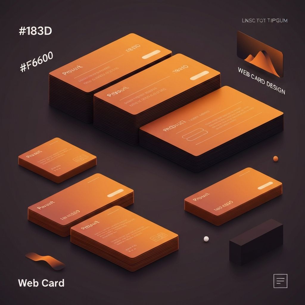
Web Card Design
The Rise of Card-Based Web Design
Card-based design has become one of the most prevalent and effective patterns in modern web interfaces. Cards—self-contained modules that present related information in a visually distinct container—offer an elegant solution for organizing diverse content in scannable, engaging formats. At AAMAX.CO, we frequently employ card design patterns in our website design work, recognizing their versatility and effectiveness across numerous applications.
The popularity of card design stems from several factors. Cards align naturally with how people consume content in the digital age—in discrete chunks rather than continuous streams. They work exceptionally well in responsive layouts, reorganizing elegantly across screen sizes. They provide natural boundaries for content grouping, making complex interfaces more comprehensible. And they offer familiar, tactile metaphors that users intuitively understand.
Anatomy of Effective Card Design
Well-designed cards share common structural elements that balance visual appeal with functional clarity. Understanding these elements enables designers to create cards that communicate effectively and serve user needs.
The card container establishes boundaries through background color, borders, shadows, or spacing that visually separates the card from surrounding elements. Subtle drop shadows are popular for creating depth, though borderless cards work well in some contexts. The container should be immediately recognizable as a distinct, interactive unit.
Within the container, content typically follows a hierarchical structure. A prominent visual element—often an image or icon—draws initial attention. A headline communicates the card's subject at a glance. Supporting text provides additional context without overwhelming. Action buttons or links enable users to engage further. This structure guides users from attraction through understanding to action.
Card Types and Use Cases
Different card types serve different purposes, and selecting the appropriate card format for specific content is essential. Product cards display merchandise with images, prices, and purchase options. Article cards preview content with titles, excerpts, and publication information. Profile cards present people with photos and key details. Dashboard cards display metrics and data visualizations.
E-commerce applications rely heavily on product cards to present inventory in browsable formats. These cards must balance information density—price, availability, ratings, variants—with visual appeal. Image quality and consistency significantly impact the shopping experience. Our website development work includes numerous e-commerce implementations that optimize product card design for conversion.
Social media platforms popularized content cards that combine user-generated media with engagement metrics and actions. These cards must handle diverse content types gracefully—text-only posts, single images, image galleries, videos, and links to external content all require appropriate treatment within the card framework.
Visual Design for Cards
Card visual design requires balancing multiple considerations: brand alignment, content hierarchy, scannability, and aesthetic appeal. Successful card design creates visual consistency across the card system while accommodating diverse content.
Image treatment significantly impacts card appearance. Consistent aspect ratios create orderly grids, while cropping and sizing ensure images display well regardless of source dimensions. Image overlays, gradients, or tints can enhance text readability when text appears over images. Placeholder graphics handle loading states and missing images gracefully.
Typography within cards must remain readable while respecting space constraints. Headlines typically use limited lines with truncation for overflow. Body text may be constrained to a specific number of lines. Font sizes must work across card sizes while maintaining hierarchy. Our front-end web development expertise ensures these typographic details are implemented precisely.
Interactive Card Behaviors
Cards as interactive elements require thoughtful attention to hover, focus, and active states. Users must understand that cards are clickable or tappable, and the interface must respond appropriately to their interactions.
Hover effects on desktop indicate interactivity and current focus. Subtle scale increases, shadow deepening, or background color shifts all work effectively. Transitions should be quick and smooth—typically 150-200 milliseconds. Effects must be noticeable without being distracting or disorienting.
Touch interfaces lack hover states, requiring alternative approaches to communicating interactivity. Visual affordances like chevrons, buttons, or card styling that suggests physicality help users recognize interactive cards. Tap states provide immediate feedback that the touch registered, important for maintaining perceived responsiveness.
Card Layout and Grid Systems
Cards naturally organize into grid layouts that adapt to available space. Well-designed card grids maintain visual order while accommodating varying card counts and viewport sizes. The relationship between card dimensions, gaps, and container width requires careful calibration.
Masonry layouts, where cards of varying heights stack to minimize gaps, work well for content with unpredictable dimensions like Pinterest-style image boards. Standard grids with uniform card heights create more orderly appearances appropriate for structured content like product catalogs.
Responsive card grids typically reduce column counts as viewport width decreases—perhaps four columns on desktop, two on tablet, and one on mobile. The transition points and animations between these states affect perceived quality. CSS Grid and Flexbox provide powerful tools for implementing responsive card layouts efficiently.
Cards in Web Applications
Web applications use cards for various purposes beyond content display. Dashboard widgets, settings panels, notification items, and task cards all employ card patterns adapted to specific functional needs.
Kanban-style task boards use draggable cards that users move between columns representing workflow stages. These cards require additional interaction design for drag handles, drop targets, and reordering feedback. The card itself may expand to reveal additional details or editing capabilities.
Data display cards present metrics, charts, or status information in dashboard contexts. These cards often include interactive elements like time range selectors or drill-down capabilities. Loading states, error handling, and data refresh indicators all require consideration. Our web application development services frequently implement sophisticated card-based dashboard interfaces.
Accessibility Considerations
Card accessibility ensures that all users can perceive, understand, and interact with card content. This requires attention to semantic structure, keyboard navigation, and screen reader compatibility.
Semantic HTML provides the foundation for accessible cards. Cards should be structured with appropriate heading levels, meaningful link text, and proper image alt attributes. The entire card may be wrapped in a link or button element for click/tap interactivity, or individual interactive elements within the card may serve this purpose.
Keyboard users must be able to navigate through cards and their interactive elements in logical order. Focus indicators must be clearly visible against card backgrounds. When cards contain multiple interactive elements, focus should move through them sensibly. Cards that expand or reveal additional content require accessible state communication.
Performance Optimization
Card-heavy interfaces can present performance challenges, particularly when displaying many cards with images. Optimization techniques ensure that card interfaces remain responsive and fast-loading.
Lazy loading defers image loading for cards outside the viewport, reducing initial page load time and bandwidth consumption. Intersection Observer API enables efficient lazy loading without scroll event listeners. Placeholder images or skeleton cards maintain layout stability during loading.
Virtualization techniques render only cards currently visible in the viewport, enabling smooth performance even with thousands of cards. This approach is essential for infinite scroll implementations or large data sets. React and other frameworks offer virtualization libraries that simplify implementation.
Card Design Systems
Organizations benefit from establishing card design systems that codify card types, variants, and usage guidelines. Systematic approaches ensure consistency across products and enable efficient design and development.
Card component libraries provide reusable building blocks with documented APIs. Developers can compose cards from standard elements—headers, images, body sections, action bars—ensuring consistency while accommodating diverse content needs. Storybook or similar tools enable browsing and testing card variations.
Design tokens enable theming and customization while maintaining consistency. Colors, spacing, border radii, and shadows defined as tokens can be adjusted globally without modifying individual card implementations. This systematic approach supports brand variations and dark mode with minimal effort.
Testing Card Interfaces
Card interface testing validates that cards perform effectively across various conditions and content scenarios. Testing should cover visual rendering, interactive behaviors, responsive adaptation, and accessibility compliance.
Content stress testing examines how cards handle edge cases: very long titles, missing images, extreme numeric values, or empty states. Cards should degrade gracefully when content doesn't match ideal specifications, maintaining usability even in adverse conditions.
A/B testing can optimize card design for specific metrics. Image sizes, information density, call-to-action placement, and visual styling all impact engagement and conversion. Data-driven iteration progressively improves card effectiveness based on actual user behavior.
Conclusion
Web card design represents a powerful pattern for organizing and presenting content in modern interfaces. From e-commerce product grids to application dashboards, cards provide flexible, user-friendly modules that adapt to diverse needs and contexts. At AAMAX.CO, we bring expertise in card design patterns to every project, whether we're building marketing websites, e-commerce platforms, or complex web applications. Our website development services implement card interfaces that combine visual appeal with functional excellence, creating experiences that users find both attractive and easy to navigate.
Want to publish a guest post on aamax.co?
Place an order for a guest post or link insertion today.
Place an Order