Web App Dashboard Design
The Art and Science of Dashboard Design
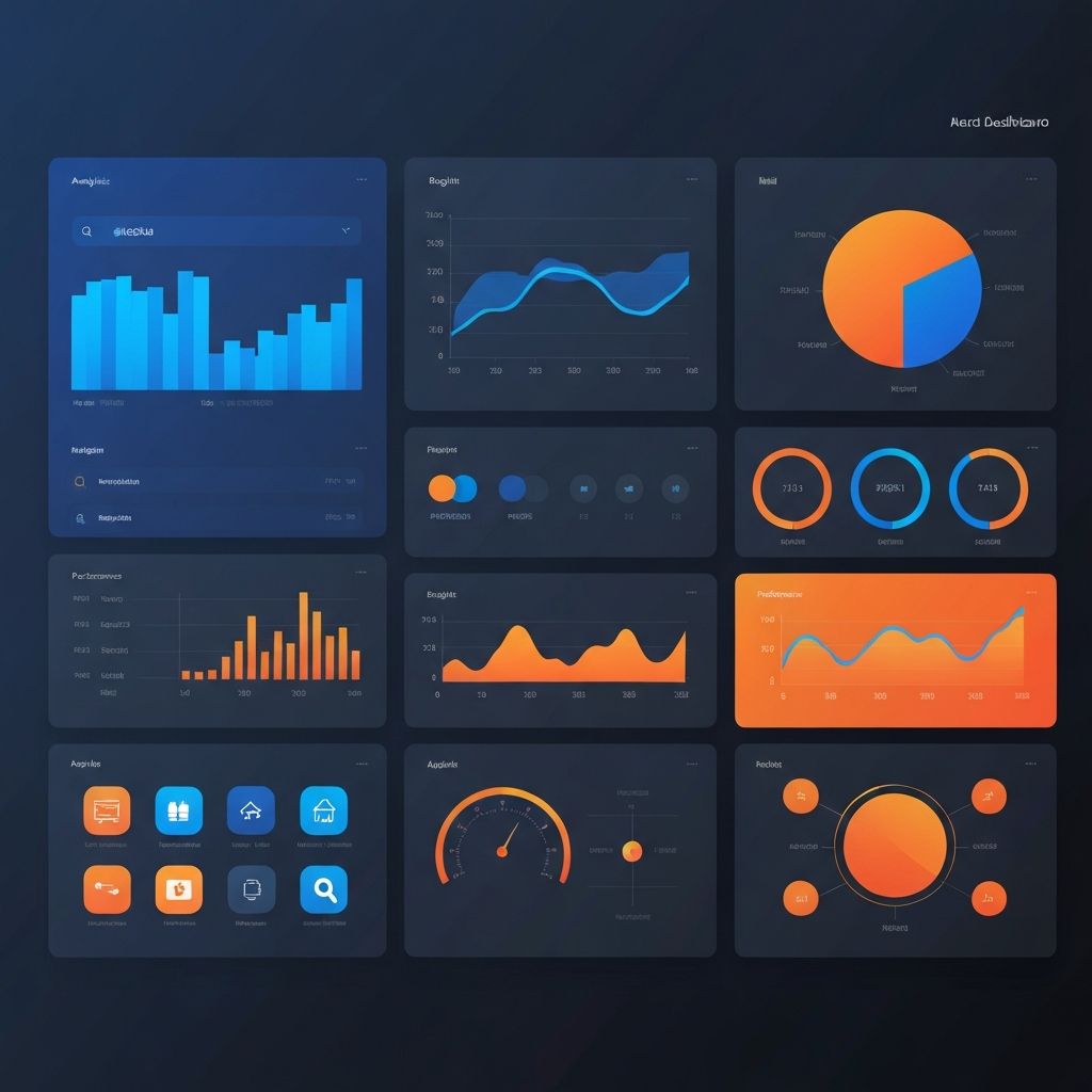
Web app dashboard design represents one of the most challenging and impactful areas of user interface design. Dashboards must distill complex data into understandable visualizations, support diverse user tasks, and maintain clarity while presenting potentially overwhelming amounts of information. Effective dashboard design transforms data into actionable insights that drive better decisions.
At AAMAX.CO, we specialize in creating dashboard interfaces that balance information density with usability. Our approach combines data visualization expertise with deep understanding of user needs to create dashboards that users actually want to use.
Understanding Dashboard Users and Contexts
Effective dashboard design begins with understanding who will use the dashboard, what decisions they need to make, and in what contexts they will access it. Different users have different information needs—executives need high-level summaries, analysts need detailed drill-down capabilities, and operators need real-time monitoring with alert capabilities.
Usage contexts also vary significantly. Some dashboards are glanced at briefly for status checks, while others support extended analysis sessions. Mobile access requirements, refresh frequency needs, and collaboration features all depend on understanding how the dashboard fits into users' workflows.
User research through interviews, observation, and analysis of existing tools informs design decisions that serve actual needs rather than assumptions about what users want.
Information Architecture for Dashboards
Dashboard information architecture determines how data is organized, categorized, and accessed. Effective architectures create clear hierarchies from overview to detail, logical groupings of related metrics, and intuitive navigation between different views.
Progressive disclosure principles help manage complexity—showing summary information by default with options to access details on demand. This approach serves users who need quick status checks without hiding detailed information from those who need it.
Card-based layouts have become popular for dashboard organization, grouping related metrics in visually distinct containers that users can scan efficiently. Our website design services include developing information architectures optimized for dashboard usability.
Data Visualization Best Practices
Choosing appropriate visualizations for different data types is fundamental to effective dashboard design. Line charts excel at showing trends over time, bar charts compare categories, and pie charts show composition—but each visualization type has specific use cases where it works best.
Avoiding visualization pitfalls improves data comprehension. Three-dimensional effects, truncated axes, and inappropriate chart types can mislead users or make data harder to understand. Clean, honest visualizations that accurately represent underlying data build trust and enable better decisions.
Color usage in data visualization requires careful attention to accessibility, emotional associations, and visual hierarchy. Consistent color coding across dashboard elements helps users quickly interpret information without re-learning conventions.
Real-Time Data and Performance
Many dashboards display real-time or frequently updated data, creating performance challenges that affect user experience. Efficient data fetching, intelligent caching, and optimized rendering ensure dashboards remain responsive even with constant updates.
Visual indicators showing data freshness help users understand the currency of displayed information. Timestamps, refresh status indicators, and live update animations communicate whether users are seeing the latest data or cached information.
Our ReactJS web development expertise enables efficient real-time dashboard implementations that maintain smooth performance while keeping data current.
Interactive Features and Drill-Down
Static dashboards provide limited value compared to interactive interfaces that let users explore data, filter views, and drill down into details. Interactive features transform dashboards from passive displays into active analysis tools.
Effective interactions include filtering by date ranges, categories, or custom criteria; sorting and re-ordering data; drilling down from summaries to detail views; and comparing different time periods or segments. Each interaction should feel immediate and intuitive.
Linking between dashboard elements—clicking a chart segment to filter a table, or selecting a metric to see related details—creates coherent analytical experiences where users can follow questions to answers naturally.
Responsive Dashboard Design
Dashboard access increasingly occurs on mobile devices, creating challenges for interfaces originally designed for large displays. Responsive dashboard design adapts layouts, prioritizes information, and adjusts interactions for different screen sizes.
Mobile dashboard views often require different approaches than simple scaling—showing key metrics prominently, using progressive disclosure more aggressively, and adapting complex visualizations for touch interaction. Some features may be desktop-only while ensuring mobile users can access essential information.
Our front-end web development services include creating responsive dashboards that deliver excellent experiences across all devices.
Customization and Personalization
Different users often need different views of the same underlying data. Customization features let users configure dashboards to match their specific needs—selecting which metrics to display, arranging elements to match workflows, and setting default filters or time ranges.
User preferences should persist across sessions, remembering customizations without requiring reconfiguration. Role-based defaults can provide appropriate starting points while allowing individual adjustments.
Shareable dashboard configurations enable teams to collaborate around common views while maintaining flexibility for individual needs.
Alerts and Notifications
Proactive alerting transforms dashboards from pull-based information sources to push-based monitoring systems. Configurable thresholds, anomaly detection, and scheduled reports ensure users learn about important changes without constant dashboard watching.
Alert design requires careful calibration—too many alerts create noise that users ignore, while too few miss important events. User-configurable thresholds, alert grouping, and escalation paths help balance alerting effectiveness.
Multiple notification channels—in-app alerts, email, SMS, chat integrations—ensure alerts reach users through appropriate channels based on urgency and preferences.
Accessibility in Dashboard Design
Dashboard accessibility ensures users with disabilities can access data and insights. Screen reader compatibility, keyboard navigation, sufficient color contrast, and alternatives to purely visual information presentations make dashboards inclusive.
Data tables as alternatives to visualizations serve users who cannot perceive charts visually. Descriptive labels, clear headings, and logical reading order enable assistive technology users to navigate and understand dashboard content.
Dashboard Development Technologies
Modern dashboard development leverages specialized libraries and frameworks for data visualization, state management, and real-time updates. Choosing appropriate technologies affects both development efficiency and end-user experience.
Our MERN stack development expertise provides flexible, powerful foundations for dashboard applications, while our experience with visualization libraries ensures polished, performant data displays.
Testing and Iteration
Dashboard effectiveness should be measured and improved over time. Analytics showing which features are used, user feedback about missing capabilities, and observation of dashboard usage in context inform iterative improvements.
A/B testing different visualization approaches, layout options, or feature implementations helps optimize dashboards based on actual user behavior rather than assumptions.
Integration With Data Sources
Dashboards are only as valuable as the data they display. Integration with databases, APIs, third-party services, and real-time data streams requires robust backend development and data pipeline management.
Our back-end web development capabilities enable reliable data integrations that power effective dashboards with accurate, timely information.
Conclusion
Effective web app dashboard design combines visual design skills, data visualization expertise, technical implementation capabilities, and deep user understanding. Creating dashboards that genuinely help users make better decisions requires attention to all these dimensions.
Investing in professional dashboard design delivers returns through improved decision-making, increased user engagement, and reduced time spent searching for information. Partner with experienced dashboard designers to create interfaces that transform your data into actionable intelligence.
Want to publish a guest post on aamax.co?
Place an order for a guest post or link insertion today.
Place an Order