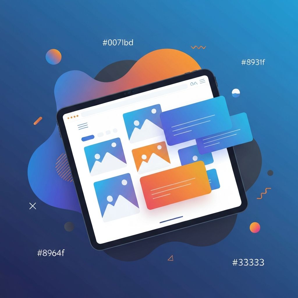
Tablet Web Design
Why Tablet Web Design Deserves Its Own Strategy
Tablet usage continues to be significant for shopping, reading, streaming, and productivity. Yet many websites treat tablets as an afterthought, simply scaling down a desktop layout or stretching a mobile design upward. The result is often awkward spacing, oversized hero sections, and broken navigation. At AAMAX.CO, we believe tablet web design deserves intentional thought, just like desktop and mobile, because it represents a unique context with its own user behaviors.
Understanding the Tablet User Context
Tablet users tend to be in relaxed, lean-back environments. They might be on a couch, in bed, in a meeting room, or in a coffee shop. They often hold the device with two hands or rest it on a stand, which means touch targets need to be sized appropriately and content should feel comfortable to consume at a closer reading distance. Sessions are usually longer than mobile sessions but more casual than desktop sessions.
This context informs design choices. Imagery can be larger and more immersive, but key actions still need to feel reachable for thumbs. Navigation should be touch-friendly without sacrificing the discoverability that desktop users expect. Our designers always begin with this user context when creating tablet experiences as part of Website Design projects.
Responsive Breakpoints That Actually Work
One of the most common mistakes in tablet web design is using a single breakpoint between mobile and desktop. Tablets come in many sizes, from compact 7-inch devices to large 13-inch models. A responsive system should account for this variation by introducing intermediate breakpoints, often around 600px, 768px, and 1024px. Each breakpoint should serve a specific layout shift, not just a font-size change.
Combine these breakpoints with fluid typography and flexible grids so that the design feels natural at any width. Container queries, now widely supported in modern browsers, take this further by allowing components to adapt based on their own size rather than the viewport. This creates layouts that feel custom-tailored on every device.
Touch-First Interactions for Tablets
Hover states do not exist on touch devices, so any interaction that depends on hover must have a touch alternative. Buttons, dropdowns, and menus should be at least 44 pixels in size, with adequate spacing to prevent mis-taps. Swipe gestures, pinch-to-zoom, and long-press menus are all expected by tablet users, especially in image galleries and product catalogs.
Interactive elements should give immediate feedback, whether through subtle animations, color changes, or haptic-style microinteractions. These small details make a tablet experience feel premium and responsive. Our team integrates these touch-first patterns into every project we deliver through Front-end Web Development.
Typography and Imagery for Tablet Screens
Tablet screens give designers a wonderful canvas for typography and imagery. Use larger heading sizes than mobile but slightly smaller than desktop, ensuring strong visual hierarchy. Line lengths should stay between 50 and 75 characters for optimal readability. Choose fonts that are crisp at high resolutions and pair them carefully with imagery.
High-quality images are particularly impactful on tablets, but they must be optimized for performance. Use modern formats such as WebP or AVIF, and serve responsive images that match the actual display resolution. This delivers a rich visual experience without slowing down the page.
Performance Optimization for Tablet Web Design
Tablets are powerful, but their network connections are often mobile-grade, especially when used outside the home. That means performance optimization remains critical. Lazy-load images and videos, minimize JavaScript bundles, and use techniques like prefetching and code splitting to ensure fast navigation between pages.
Frameworks like Next.js make this easier through built-in image optimization, route-based code splitting, and server-side rendering. Our experts in Next.js Web Development consistently deliver tablet experiences that feel instant, even on slower networks.
Designing Forms and Checkout Flows for Tablets
Forms and checkout flows are among the most important screens on any website, and tablets present unique challenges. Onscreen keyboards take up significant space, so forms should be designed to remain usable when only the top half of the screen is visible. Use input types like email, tel, and number to trigger the appropriate keyboard layout, and avoid placing critical buttons too close to keyboard edges.
Multi-step forms work especially well on tablets because they reduce visual clutter and feel like a guided experience. Combine them with autosave and validation messages that appear immediately so users always know where they stand.
E-commerce and Tablet Web Design
Tablets are particularly popular for e-commerce browsing. Shoppers often use them in the evening to research products, compare prices, and complete purchases. Designing for this audience means using larger product images, clear filtering, and quick-view modals that reduce the need to navigate between pages. Wishlists, saved carts, and persistent navigation help convert casual browsers into buyers.
Whether you sell physical products, digital goods, or services, our team can build tailored e-commerce solutions through Web Application Development and WordPress Development that perform brilliantly across all devices, including tablets.
Accessibility on Tablet Devices
Accessibility on tablets includes everything from screen reader support to dynamic font sizes and color contrast. Many tablet users adjust their system text size, so your design must scale gracefully without breaking layouts. Provide alternative text for images, captions for videos, and keyboard support for users who connect external keyboards.
Hire Us for Outstanding Tablet-Optimized Websites
If you want a website that delivers a truly excellent tablet experience without sacrificing desktop or mobile, hire AAMAX.CO for Web Design and Development services. We design responsive, accessible, fast, and visually striking websites tailored to your audience and your business goals.
Conclusion
Tablet web design is no longer optional. With millions of tablet users browsing, shopping, and working every day, treating tablets as a unique context rather than a fallback is essential. By focusing on user behavior, responsive breakpoints, touch interactions, performance, and accessibility, you can create tablet experiences that delight users and grow your business.
Want to publish a guest post on aamax.co?
Place an order for a guest post or link insertion today.
Place an Order