Skeuomorphism Web Design
Understanding Skeuomorphism in Digital Design
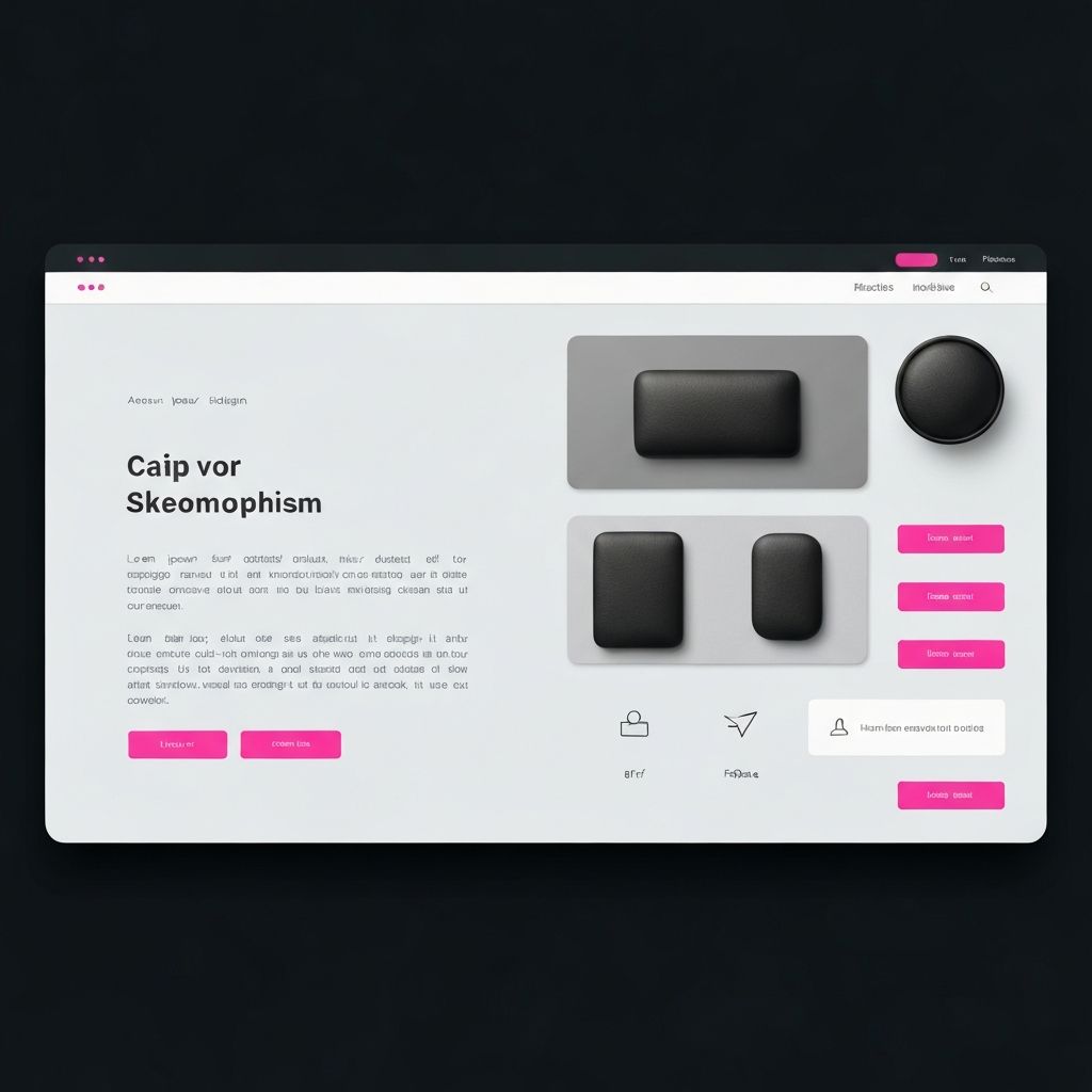
Skeuomorphism is a design approach that incorporates realistic visual elements mimicking physical objects or materials. In digital interfaces, this might include buttons that appear three-dimensional with shadows and highlights, textures resembling leather or wood, or interface elements designed to look like their real-world counterparts. While the design world has moved through various trends, understanding skeuomorphism remains valuable for designers seeking to create engaging, intuitive interfaces.
At AAMAX.CO, we appreciate the full spectrum of design approaches and select techniques based on project requirements and user needs. Our website design expertise encompasses both skeuomorphic elements and contemporary flat design, allowing us to recommend the most appropriate approach for each unique project.
The History of Skeuomorphic Design
Skeuomorphism has roots extending far before digital interfaces. The term originally described physical objects that retained design elements from earlier versions made with different materials or techniques. Ceramic vases mimicking woven baskets or plastic items designed to look like wood exemplify traditional skeuomorphism.
In digital design, skeuomorphism became prominent during the early smartphone era. Apple's iOS interfaces featured heavily skeuomorphic designs with leather textures in calendars, wooden shelves in bookstores, and realistic toggle switches. These familiar visual metaphors helped users understand new digital interactions by connecting them to familiar physical experiences.
The approach reached peak popularity around 2010-2012 before a significant shift toward flat design began, led by Microsoft's Metro design language and later Apple's iOS 7 redesign. This transition sparked extensive debate about design philosophy and user experience that continues to influence design thinking today.
Core Principles of Skeuomorphic Design
Understanding the principles underlying skeuomorphic design helps designers apply these techniques effectively when appropriate. These principles connect to fundamental aspects of human perception and cognition.
Affordance is central to skeuomorphism. By making digital elements resemble physical objects, designers communicate how those elements should be used. A button that appears raised suggests it can be pressed. A slider that looks like a physical control indicates it can be dragged. These visual cues reduce the learning curve for new interfaces. Our website development considers affordance carefully.
Familiarity creates comfort and confidence for users. When interface elements look like objects people already understand, the interface feels more approachable. This emotional response can be particularly valuable for audiences less comfortable with technology or when introducing genuinely novel interactions.
Depth and dimension created through shadows, highlights, and textures make interfaces feel tangible and real. This visual richness can increase engagement and make interactions feel more satisfying. The tactile quality of skeuomorphic design appeals to human preferences for physical experience.
Criticisms of Skeuomorphic Design
The shift away from skeuomorphism was driven by various criticisms that designers should understand when considering these techniques.
Visual complexity can overwhelm and distract from content. Heavy textures, gradients, and shadows add visual noise that may not serve functional purposes. This complexity can slow performance, increase development time, and make interfaces harder to modify or maintain.
Metaphor limitations become problematic as digital capabilities exceed their physical inspirations. Digital calendars can do things paper calendars cannot, and constraining the interface to physical metaphors may limit functionality. As users became more digitally fluent, the training wheels of familiar metaphors became less necessary.
Inconsistency across interfaces creates confusion when different applications use different metaphors or interpretations of physical objects. Unlike systematic design languages, skeuomorphic designs can lack the consistency that helps users transfer learning between applications.
The Rise of Flat Design
Flat design emerged as a reaction to skeuomorphism's perceived excesses. Characterized by minimal use of gradients, shadows, and textures, flat design emphasizes simplicity, clarity, and content focus.
Microsoft's Metro design language, introduced with Windows Phone 7, pioneered mainstream flat design with bold colors, simple typography, and geometric shapes. Apple's iOS 7 redesign in 2013 marked a dramatic shift from skeuomorphism to flatter aesthetics, influencing design trends across the industry.
Flat design offered advantages including faster performance, easier maintenance, better scalability across devices, and stronger content focus. However, critics noted that removing dimensional cues sometimes compromised usability by making interactive elements less distinguishable.
Modern Approaches: Flat Design 2.0
Contemporary design has evolved toward approaches sometimes called flat design 2.0, semi-flat, or almost-flat design. These approaches retain flat design's simplicity while reintroducing subtle dimensional elements for improved usability.
Subtle shadows and layering create hierarchy and indicate interactivity without heavy textures. This approach, sometimes called material design following Google's influential design system, balances simplicity with necessary visual cues for effective interaction.
Strategic color variation and micro-interactions provide feedback and guidance that pure flat design sometimes lacked. These refinements address usability concerns while maintaining the clean aesthetics that flat design established. Our front-end web development implements these nuanced approaches skillfully.
When Skeuomorphism Works Well
Despite trends toward flatter design, skeuomorphic elements remain valuable in specific contexts. Understanding when these techniques enhance user experience helps designers make appropriate choices.
Digital tools mimicking physical instruments often benefit from skeuomorphic design. Music production software, calculators, and specialized professional tools may use realistic knobs, faders, and controls that connect to users' existing knowledge and muscle memory.
Luxury and premium brands may use rich textures and dimensional elements to convey quality and craftsmanship. The visual richness of skeuomorphic design can support brand positioning when simplicity might feel utilitarian or cheap.
Applications targeting audiences less comfortable with technology may benefit from familiar metaphors that reduce intimidation. Educational applications, products for older users, or interfaces for specialized professional contexts might use skeuomorphic elements to ease adoption.
Implementing Skeuomorphic Elements
When skeuomorphic approaches are appropriate, thoughtful implementation ensures effectiveness. Several considerations guide successful skeuomorphic design.
Selective application works better than comprehensive skeuomorphism. Using realistic elements for key interactive components while maintaining cleaner aesthetics elsewhere balances engagement with usability. This targeted approach avoids the visual overwhelm that pure skeuomorphism can create.
Consistency in lighting, texture quality, and dimensional treatment maintains believability. Inconsistent shadows or mixing incompatible visual styles breaks the illusion and appears unprofessional. Attention to detail distinguishes quality skeuomorphic design from amateurish attempts.
Performance optimization is essential given the additional graphical resources skeuomorphic designs require. Image optimization, efficient CSS techniques, and careful asset management ensure visual richness does not compromise page speed. Our ReactJS web development capabilities enable optimized implementation of complex visual designs.
CSS Techniques for Skeuomorphic Effects
Modern CSS enables many skeuomorphic effects without image dependencies. Understanding these techniques allows efficient implementation of dimensional design elements.
Box shadows create depth and dimension when layered thoughtfully. Multiple shadow layers with varying blur, spread, and color values can simulate realistic lighting conditions. Inner shadows can create inset effects suggesting physical indentation.
Gradients simulate curved surfaces and lighting effects. Subtle gradients across buttons or panels create three-dimensional appearances. Radial gradients can suggest light sources and reflections for more sophisticated effects.
Border techniques including multiple borders, border-radius combinations, and border images contribute to dimensional appearances. These techniques can create beveled edges, raised frames, and other physical-seeming elements efficiently.
Skeuomorphism in Modern Context
The design landscape has moved beyond the stark skeuomorphism versus flat design debate toward more nuanced approaches. Understanding where skeuomorphic thinking fits in contemporary design helps create more effective solutions.
Neuomorphism, also called soft UI, emerged as a modern interpretation combining skeuomorphic depth with flat design simplicity. Using subtle shadows and highlights on soft, minimal interfaces, this approach creates gentle dimensionality without heavy textures or realistic metaphors.
Contextual application of dimensional elements based on user needs and content requirements represents mature design thinking. Rather than following style trends dogmatically, thoughtful designers select approaches based on what best serves users and business objectives.
Accessibility considerations influence appropriate use of dimensional design. Sufficient contrast, clear interactive affordances, and compatibility with assistive technologies must be maintained regardless of visual style choices.
Future of Dimensional Design
Emerging technologies and interfaces may revive aspects of skeuomorphic thinking in new contexts. Understanding potential applications prepares designers for evolving opportunities.
Extended reality interfaces including AR and VR benefit from dimensional design that feels natural in three-dimensional spaces. As these platforms mature, skills in creating realistic, dimensional interfaces may prove increasingly valuable.
Touch and haptic interfaces on various devices may benefit from visual design that suggests tactile qualities. Connecting visual appearance to haptic feedback creates coherent experiences that skeuomorphic thinking naturally supports.
Personal expression and customization trends may create space for richer visual aesthetics that flat design constrained. Users seeking distinctive experiences may appreciate options beyond minimal, flat interfaces.
Conclusion
Skeuomorphism represents an important chapter in digital design history and remains relevant in specific contexts today. Rather than dismissing it as outdated or embracing it uncritically, skilled designers understand when dimensional, realistic elements enhance user experiences and when simpler approaches serve better.
The most effective design approach depends on user needs, brand requirements, technical constraints, and contextual factors. Designers who understand the full spectrum of available techniques, including skeuomorphic approaches, can make informed decisions that serve projects effectively.
We approach each project with open-minded consideration of all available design techniques. Whether your project calls for skeuomorphic richness, flat simplicity, or thoughtful combinations, our team can recommend and implement appropriate solutions.
Want to publish a guest post on aamax.co?
Place an order for a guest post or link insertion today.
Place an Order