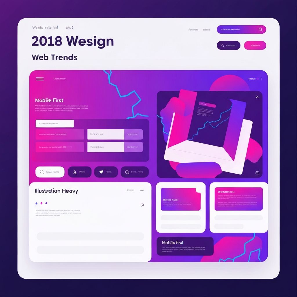
Web Design Trends 2018
Web Design Evolution in 2018
By 2018, web design had reached a level of sophistication that enabled increasingly creative and nuanced approaches. Mobile-first design was standard practice, CSS Grid was mainstream, and designers had accumulated years of experience creating responsive, user-centered experiences. This foundation enabled the trends of 2018 to focus on refinement, expression, and pushing creative boundaries. At AAMAX.CO, we continue to apply the lessons learned during this period to create compelling digital experiences for our clients.
Vibrant Gradients and Bold Colors
Gradients returned with a vengeance in 2018, but these weren't the skeuomorphic gradients of the pre-flat design era. Modern gradients were bold, vibrant, and often used unexpected color combinations. They appeared in backgrounds, buttons, illustrations, and overlays, adding depth and visual interest to interfaces.
Instagram's gradient branding had normalized colorful gradients in digital contexts. The technique spread through tech industry design and beyond. Gradients provided visual richness while maintaining the cleanliness that flat design had established.
Successful gradient implementation required attention to color theory. Harmonious gradients typically used analogous colors or colors from the same color family. Clashing color combinations, while sometimes used for intentional effect, could create visual discomfort if not handled carefully.
Organic Shapes and Fluid Design
Hard-edged geometric shapes gave way to organic, fluid forms in 2018. Soft blobs, wavy lines, and rounded elements created friendlier, more approachable aesthetics. This trend humanized digital interfaces and provided contrast to the angular precision that had dominated earlier years.
These organic shapes often appeared as background elements, section dividers, or decorative accents. They added visual interest without competing with content. The softness of organic shapes could make interfaces feel more welcoming and less intimidating.
From a technical perspective, CSS capabilities for creating complex shapes had improved, making organic forms more practical to implement. SVG and CSS clip-paths enabled shapes that would have been difficult or impossible to create with earlier techniques.
Asymmetry and Intentional Imbalance
The trend toward asymmetric layouts that emerged in 2017 continued and matured in 2018. Designers became more skilled at creating intentional imbalance that felt dynamic rather than chaotic. Elements overlapped, extended beyond expected boundaries, and broke conventional grid structures.
This approach required strong understanding of visual weight and balance. The most effective asymmetric designs maintained overall equilibrium through careful placement of elements, even while individual sections broke conventional patterns.
Asymmetric layouts worked particularly well for creative portfolios, editorial designs, and brands wanting to project innovation. They required more design skill than traditional layouts and weren't appropriate for every context, but could create memorable experiences when executed well.
3D Elements and Depth
Three-dimensional elements appeared throughout 2018 web design, from illustrated 3D objects to isometric graphics to actual WebGL implementations. These treatments added depth and visual interest while differentiating from the flat aesthetics that had dominated recent years.
Illustrated 3D elements—often geometric shapes with visible depth—provided the appearance of dimensionality without the technical complexity of actual 3D rendering. This approach was popular for hero sections, feature illustrations, and brand graphics.
For more ambitious projects, WebGL and Three.js enabled genuinely interactive 3D experiences within browsers. These implementations required significant development effort and careful performance optimization but created unforgettable experiences. Our web application development capabilities include advanced WebGL implementations.
Particle Backgrounds and Generative Design
Particle systems and generative backgrounds added dynamic interest to hero sections and loading states. These JavaScript-driven effects created ever-changing visual elements that felt alive and engaging. Particles could be interactive, responding to cursor movement or scroll position.
Performance was crucial for these techniques. Heavy particle systems could consume significant resources, affecting page performance on lower-powered devices. Successful implementations balanced visual impact against computational cost, often reducing particle density on mobile devices.
Generative design extended beyond particles to include procedurally created patterns, colors, and shapes. These techniques enabled unique visual outputs for each visitor, though this novelty had to be balanced against brand consistency requirements.
Sophisticated Animations
Animation matured beyond simple transitions to become a sophisticated design tool. Carefully choreographed animations guided user attention, provided feedback, and created memorable moments throughout the user journey. Animation became a design consideration from the start rather than an afterthought.
Scroll-based animations remained popular, revealing content and triggering effects as users progressed through pages. Parallax effects, though less prominent than their peak years, continued providing depth and engagement when used thoughtfully.
CSS animation capabilities continued expanding, reducing reliance on JavaScript for common effects. This improved performance and made animation more accessible to designers without programming expertise. Animation libraries like GreenSock provided powerful tools for more complex requirements.
Mobile Experience Refinement
With mobile-first design well established, 2018 focused on refining mobile experiences beyond basic responsiveness. Thumb-zone considerations influenced interface element placement. Gesture-based interactions became more common. Mobile experiences were designed as first-class experiences rather than desktop adaptations.
Navigation patterns evolved to be more thumb-friendly. Bottom navigation bars, popularized by native apps, appeared more frequently in mobile web design. Important actions were placed within easy reach of one-handed use.
Performance on mobile networks remained a critical concern. Despite improving connectivity, many users still accessed the web on slower connections. Performance-conscious design choices—lazy loading, optimized images, efficient code—remained essential for serving all users well.
Design Systems Maturity
Design systems moved from trend to standard practice in 2018. Comprehensive systems documenting components, patterns, colors, typography, and usage guidelines became essential for maintaining consistency across complex products and teams.
These systems represented significant investment but paid dividends through faster development, greater consistency, and easier onboarding of new team members. Major tech companies published their design systems, providing inspiration and education for the broader community.
Component-based development, enabled by frameworks like React and Vue, aligned naturally with design systems thinking. Design and development workflows increasingly converged, with shared understanding of component-based architecture.
Accessibility Advancement
Accessibility received growing attention in 2018, driven by legal developments, ethical awareness, and recognition that accessible design benefits all users. WCAG 2.1 was published, adding requirements related to mobile accessibility, cognitive disabilities, and low vision.
Design tools began incorporating accessibility checking features, making it easier to identify contrast issues and other problems early in the design process. Automated testing tools improved, though manual testing remained necessary for complete accessibility assurance.
The conversation shifted from "checking the box" compliance toward genuinely inclusive design thinking. Forward-thinking designers incorporated accessibility considerations throughout their process rather than treating it as final verification. Our website design services prioritize accessibility from the start.
Variable Fonts Adoption
Variable fonts achieved meaningful browser support in 2018, enabling single font files to contain continuous ranges of weights, widths, and other variations. This technology improved performance while expanding typographic possibilities.
Creative applications of variable fonts explored animations that smoothly transitioned between weights, responsive typography that adjusted continuously rather than at breakpoints, and expressive treatments that would have required multiple font files previously.
Adoption was gradual as designers learned new capabilities and variable font libraries expanded. Early adopters demonstrated creative possibilities that hinted at typography's future direction.
Chatbot Integration Matures
After initial hype, chatbot implementations became more realistic and useful in 2018. Businesses learned which applications genuinely benefited from conversational interfaces versus those where traditional approaches worked better.
Customer service chatbots found their niche handling common queries, freeing human agents for complex issues. The technology worked best when expectations were managed appropriately—chatbots positioned as helpful assistants rather than human replacements met with better user reception.
Conversational UI design became a specialized skill. Designing effective chat flows required understanding user intent, crafting clear responses, and handling error cases gracefully. Poor chatbot experiences could damage brand perception significantly.
Performance as Feature
Performance optimization became not just a technical requirement but a design feature. Fast-loading sites were perceived as more professional and trustworthy. Google's emphasis on page speed as a ranking factor created business urgency around performance.
The JavaScript framework community began addressing performance concerns more seriously. Code-splitting, lazy loading, and other optimization techniques became standard practices. Server-side rendering returned to prominence for content-heavy sites.
Design decisions were increasingly evaluated through performance lenses. Large background videos, while visually impressive, faced scrutiny for their bandwidth requirements. Design choices had to justify their performance costs.
Lessons for Today
2018 demonstrated that sophisticated, expressive web design could coexist with performance, accessibility, and usability requirements. The key was intentionality—understanding why design choices were being made and evaluating them against multiple criteria.
We apply these lessons to every project, creating websites that are visually compelling, technically excellent, and genuinely effective for users. Contact us to discuss how our expertise can help your business succeed online.
Want to publish a guest post on aamax.co?
Place an order for a guest post or link insertion today.
Place an Order