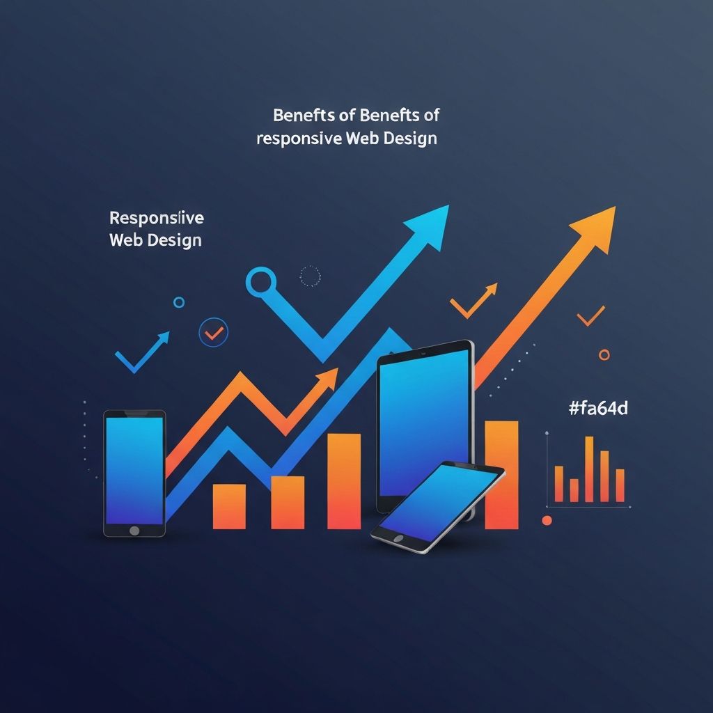
Responsive Web Design Benefits
Why Responsive Web Design Matters More Than Ever
Responsive web design has moved from being a competitive advantage to being the bare minimum for any serious online presence. In 2026, every business—regardless of size or industry—needs a website that works flawlessly on smartphones, tablets, laptops, and large desktop monitors. The benefits of getting responsive design right extend far beyond aesthetics. They reach into search engine rankings, conversion rates, customer satisfaction, brand perception, and even operational efficiency. At AAMAX.CO, we have seen clients double their organic traffic, triple their lead volume, and dramatically improve customer satisfaction scores after migrating from non-responsive to expertly built responsive sites.
Understanding these benefits in detail helps decision makers justify the investment in quality responsive design and choose the right partner to deliver it. Below we walk through the most important benefits, with practical examples and recommendations for each.
Improved Search Engine Rankings
Google's mobile-first indexing means the mobile version of your site is the primary version Google uses to rank your pages. A responsive site delivers the same high-quality experience on mobile that desktop users enjoy, eliminating the SEO penalties that come from low-quality mobile experiences, intrusive interstitials, or content that is hidden on mobile. Sites that rank well in 2026 are sites that work beautifully on phones.
Beyond mobile-first indexing, responsive design improves SEO in several other ways. A single responsive site avoids the duplicate content issues that historically plagued separate mobile subdomains. Page speed improvements that come from modern responsive techniques directly improve Core Web Vitals, which are explicit ranking factors. Our website development team builds every site with these SEO factors in mind from day one.
Higher Conversion Rates
Conversion is the ultimate test of any website. A responsive design removes the friction that drives mobile visitors away. Tap targets sized for human fingers, forms that work with mobile keyboards, checkout flows optimized for one-handed use, and content that loads quickly all add up to dramatically higher conversion rates. We routinely see conversion rate improvements of fifty to two hundred percent after launching a thoughtfully designed responsive site.
The improvement is not just about removing friction. Responsive design also enables more sophisticated personalization. Content can be tailored not just to user preferences but also to device context. Mobile visitors might see streamlined navigation focused on click-to-call and directions, while desktop visitors see detailed product comparisons. This contextual relevance translates directly into higher conversion rates.
Better User Experience
User experience is the foundation of brand perception. A site that adapts gracefully to a user's device feels respectful and professional. A site that forces users to pinch, zoom, scroll horizontally, or squint at tiny text feels careless and amateurish. Users form impressions within seconds, and a poor mobile experience can damage brand trust for months or years.
Responsive design also improves accessibility. Larger tap targets, clearer typography, and content that flows naturally help users with visual impairments, motor difficulties, and cognitive challenges. When combined with proper semantic HTML and ARIA attributes, a responsive site can serve users across the full spectrum of abilities and contexts.
Lower Long-Term Costs
Maintaining a single responsive codebase is far cheaper than maintaining separate desktop and mobile sites. Every content update, design change, or feature addition only needs to happen once. Bugs are fixed in one place. Analytics are unified, making it easier to understand user behavior and make data-driven improvements.
Total cost of ownership over a typical five-year website lifespan is often dramatically lower for responsive sites than for fragmented multi-site approaches. The upfront investment pays off many times over in saved maintenance hours and faster time-to-market for new initiatives. Our website maintenance and support services help clients realize these long-term cost savings.
Future-Proofing Against New Devices
The variety of devices accessing the web continues to grow. Foldable smartphones, dual-screen tablets, in-car infotainment systems, smart TVs, and even refrigerator displays now connect to the internet. A responsive design system handles all of these gracefully because it adapts based on screen characteristics rather than specific device assumptions.
This future-proofing is especially valuable for businesses that expect to grow internationally. Different regions favor different devices and screen sizes. A responsive site naturally adapts to a market dominated by budget Android phones just as well as it adapts to a market dominated by high-end iPhones. There is no need to build separate sites for separate regions.
Faster Page Load Times
Modern responsive design techniques are inherently performance-friendly. Responsive images served via the picture element or srcset deliver appropriately sized images to each device, dramatically reducing data transfer on mobile. Modern image formats like WebP and AVIF reduce file sizes further. Code splitting ensures that only the JavaScript needed for the current view is loaded.
Frameworks like Next.js take this even further with automatic optimizations including image optimization, font optimization, route prefetching, and incremental static regeneration. Our Next.js web development services consistently deliver Core Web Vitals scores in the top five percent of the web.
Stronger Brand Consistency
A unified responsive site reinforces brand identity at every touchpoint. Typography systems, color palettes, motion design, and component libraries are applied consistently across screen sizes, creating a cohesive impression no matter how a customer encounters the brand. Compare this to fragmented multi-site experiences where the mobile site might feel like an afterthought or use a different visual language altogether.
Better Analytics and Insights
A single responsive site produces unified analytics. You can see exactly how visitors flow through your site, which content resonates, where they drop off, and which devices and contexts drive the highest-value actions. This data is the foundation of informed optimization. Without unified analytics, you are flying blind.
Combined with tools like heatmaps, session recordings, and A/B testing platforms, unified analytics enable a continuous improvement loop that compounds over time. Each iteration produces measurable improvements that build on the last. We help clients establish these analytics foundations as part of every website design engagement.
Easier Marketing and Content Operations
Marketing teams move faster when they only need to update one site. Content management systems built on responsive frameworks let editors publish once and trust that the content will look great everywhere. Email campaigns and social media posts can confidently link to landing pages knowing that mobile visitors—who often represent the majority of traffic—will have a great experience.
Hire Us to Unlock the Benefits of Responsive Design
If you are ready to capture the full benefits of responsive web design, hire AAMAX.CO. We deliver beautiful, fast, and conversion-focused responsive websites that drive measurable business results. Our full-service team handles strategy, design, development, content, SEO, and ongoing optimization. Contact us today to start your project.
Want to publish a guest post on aamax.co?
Place an order for a guest post or link insertion today.
Place an Order