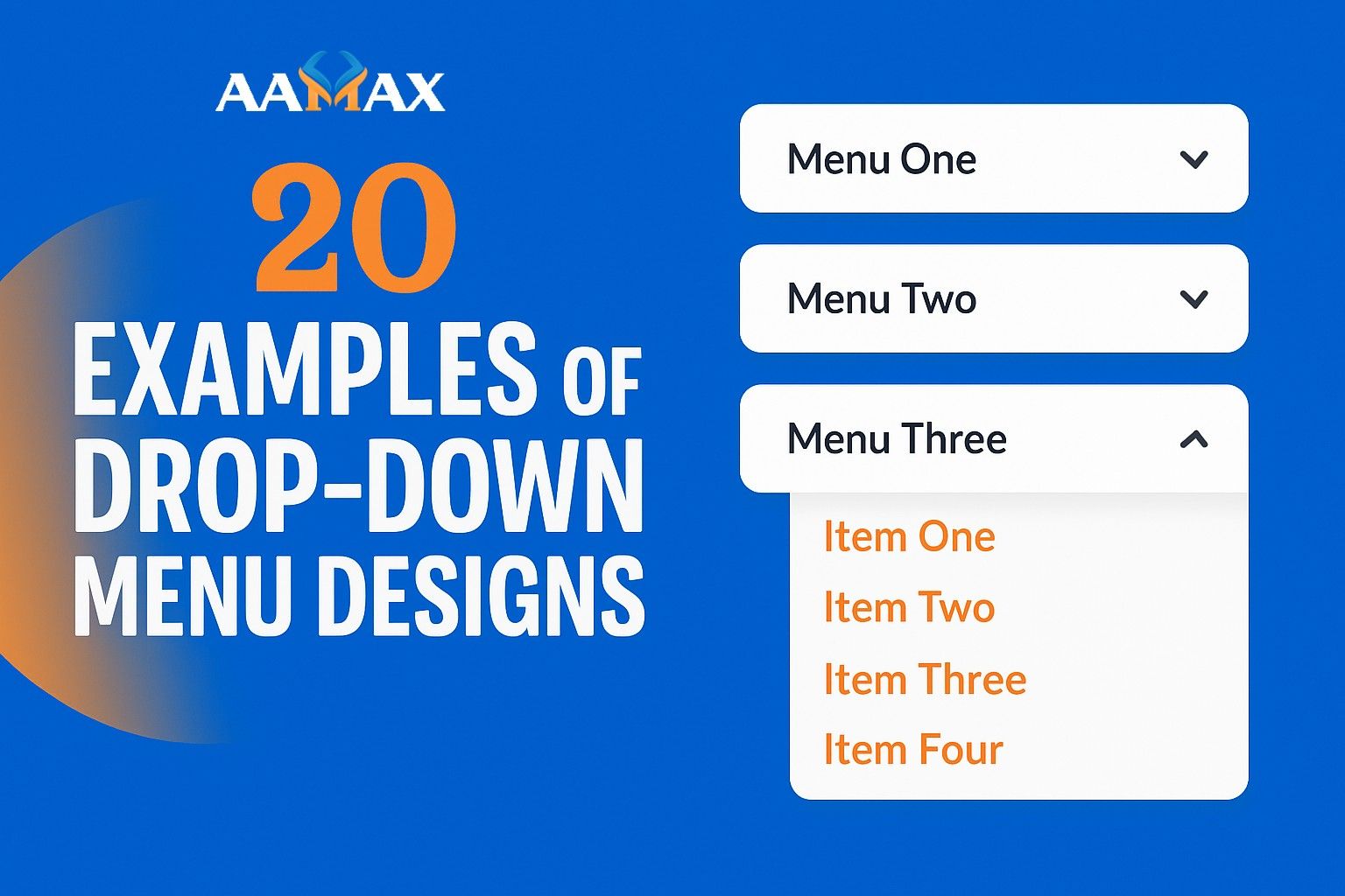
20 Examples of Drop-Down Menu Designs
When it comes to website navigation, drop-down menus are one of the most widely used elements. They help users find what they are looking for quickly without overwhelming them with too many choices on the screen at once. A well-designed drop-down menu can improve usability, streamline navigation, and enhance the overall user experience.
In this article, we’ll explore 20 creative and effective drop-down menu designs, showcasing how different brands and designers have leveraged this tool to balance functionality with aesthetics.
Hire AAMAX For Website Development and Digital Marketing Services
Why Drop-Down Menus Matter in Graphic Design
Drop-down menus are more than just graphic design elements—they are functional navigation solutions. Here’s why they matter:
- Organized Navigation: They help categorize content logically.
- Better User Experience: Quick access to subpages reduces friction.
- Responsive Design: Drop-down menus adapt well to mobile and desktop.
- Improved Engagement: Clean navigation keeps users exploring.
1. Apple’s Minimalist Mega Menu
Apple’s website uses a clean, minimalist drop-down design with subtle hover effects. Each product line has a dedicated drop-down with icons and clear typography.
2. Amazon’s Department Menu
Amazon employs a massive mega menu to categorize hundreds of product categories. Despite its complexity, the hierarchy and structure keep it usable.
3. Nike’s Interactive Hover Menu
Nike uses large visuals in its drop-down menus. Hovering over categories displays product images, making navigation more engaging.
4. Airbnb’s Simple Location-Based Menu
Airbnb features a minimal drop-down navigation with city and property type suggestions, ensuring quick user journeys.
5. Microsoft’s Service-Oriented Drop-Down
Microsoft organizes its products and services into structured drop-downs. The design uses typography and whitespace effectively to separate categories.
6. Dropbox’s Clean Two-Level Menu
Dropbox uses a straightforward drop-down menu with clear divisions between “Individuals,” “Teams,” and “Business,” creating a clean user flow.
7. Uber’s Functional Drop-Down
Uber’s navigation focuses on simplicity, offering a small yet effective drop-down with direct links for riders, drivers, and business solutions.
8. Spotify’s Music Category Menu
Spotify organizes playlists, premium options, and help pages into drop-downs with bold text and clear labeling for quick access.
9. Google Workspace’s App Grid Menu
Instead of a traditional menu, Google uses an app grid drop-down that displays icons for Gmail, Drive, Docs, and more.
10. LinkedIn’s Professional Tools Menu
LinkedIn’s drop-down menus highlight career tools, business services, and learning resources, all neatly structured.
11. Etsy’s Handcrafted Category Menu
Etsy’s drop-down menu emphasizes creativity, with illustrated icons and vibrant colors reflecting its brand identity.
12. Slack’s Resource Menu
Slack uses a simple drop-down to direct users to resources like pricing, support, and integrations, keeping navigation efficient.
13. Target’s Retail Drop-Down
Target uses a mega menu to display retail categories such as clothing, groceries, and electronics, making browsing easier for shoppers.
14. HubSpot’s Learning-Focused Menu
HubSpot includes resources, tools, and blog links in its drop-down menus, enhancing its role as both a product and education hub.
15. Netflix’s Genre-Based Menu
Netflix organizes movies and TV shows by genre using a vertical drop-down menu. This ensures fast content discovery.
16. Canva’s Design Tools Menu
Canva highlights its design tools and templates in a colorful drop-down, blending function with creativity.
17. Shopify’s Solutions Menu
Shopify uses a clean drop-down with links for merchants, partners, and developers, helping each user group navigate effectively.
18. Mailchimp’s Service Menu
Mailchimp organizes its marketing tools into structured categories within drop-down menus, keeping services easy to find.
19. Trello’s Feature Menu
Trello’s drop-down organizes its features into categories like templates, solutions, and resources, aligning with user goals.
20. Asana’s Productivity Menu
Asana uses drop-down menus to highlight workflows, integrations, and use cases, supporting its productivity-focused brand identity.
Best Practices for Drop-Down Menu Design
After reviewing these 20 examples, here are some best practices you can apply:
- Keep It Simple: Avoid clutter and ensure easy scanning.
- Use Visual Cues: Icons and images help users navigate.
- Focus on Mobile Responsiveness: Ensure drop-downs adapt to all devices.
- Organize Logically: Group similar items together.
- Test Usability: Ensure menus are intuitive and easy to use.
Common Mistakes to Avoid
- Overloading menus with too many options.
- Using small fonts or poor color contrast.
- Failing to make menus mobile-friendly.
- Ignoring accessibility for keyboard navigation.
Final Thoughts
Drop-down menus are essential for effective website navigation, and when designed thoughtfully, they enhance both functionality and aesthetics. From minimalist menus to visually rich mega menus, the examples we’ve reviewed demonstrate the versatility of this design element.
If you want to create a modern website with user-friendly navigation, consider partnering with AAMAX. AAMAX is a full-service digital marketing company offering Web Development, Digital Marketing, and SEO Services, helping businesses design seamless digital experiences that engage users and drive results.
Want to publish a guest post on aamax.co?
Place an order for a guest post or link insertion today.
Place an Order