Colorful Web Design Landing Page Inspiration
Colorful Web Design Landing Page Inspiration: Bold Approaches That Captivate
In an era where many websites default to safe, minimal aesthetics, colorful landing pages offer a powerful way to stand out and make memorable impressions. When executed skillfully, vibrant color choices can communicate brand personality, evoke emotions, and guide user attention more effectively than restrained palettes. At AAMAX.CO, we help brands discover their unique visual voice—whether that calls for subtle sophistication or bold, colorful expression.
Color is one of the most powerful tools in a designer's arsenal. It influences perception, affects mood, and shapes behavior in ways both obvious and subtle. Landing pages, as crucial first impressions and conversion-focused experiences, can benefit tremendously from thoughtful, bold color application. Let's explore how to harness the power of color for landing pages that truly pop.
The Psychology Behind Colorful Design
Understanding color psychology helps create purposeful, effective color choices.
Emotional associations with colors influence visitor responses. Warm colors like red, orange, and yellow create energy and urgency. Cool colors like blue and green convey calm and trust. Bold color combinations can communicate creativity, innovation, and confidence.
Attention and hierarchy are shaped by color contrast. Vibrant colors naturally draw the eye, making them powerful tools for highlighting important elements. Strategic color placement guides visitors through landing pages toward conversion points.
Brand differentiation through distinctive colors builds recognition. When competitors share similar palettes, bold color choices can set you apart. Memorable color combinations become associated with your brand over time.
Cultural context affects color perception. Colors carry different meanings across cultures. Understanding your audience's cultural context ensures color choices resonate appropriately.
Principles for Effective Colorful Design
Bold color use requires skill to execute effectively.
Strategic restraint prevents overwhelming visitors. Even colorful designs need moments of rest. Balanced layouts include neutral spaces that let vibrant colors breathe and make bold elements more impactful.
Purposeful color choices align with brand and goals. Color shouldn't be bold just for boldness's sake. Each color choice should serve strategic purposes: reinforcing brand personality, creating appropriate mood, or guiding user behavior.
Accessibility considerations ensure everyone can experience your design. High contrast between text and backgrounds ensures readability. Don't rely on color alone to convey important information. Test designs with accessibility tools to verify usability.
Cohesive palettes create harmony amid variety. Even colorful designs need palette discipline. Establish a defined palette and use it consistently. Too many colors without relationship create chaos rather than vibrancy.
Inspiring Colorful Landing Page Approaches
Several design strategies effectively employ bold color.
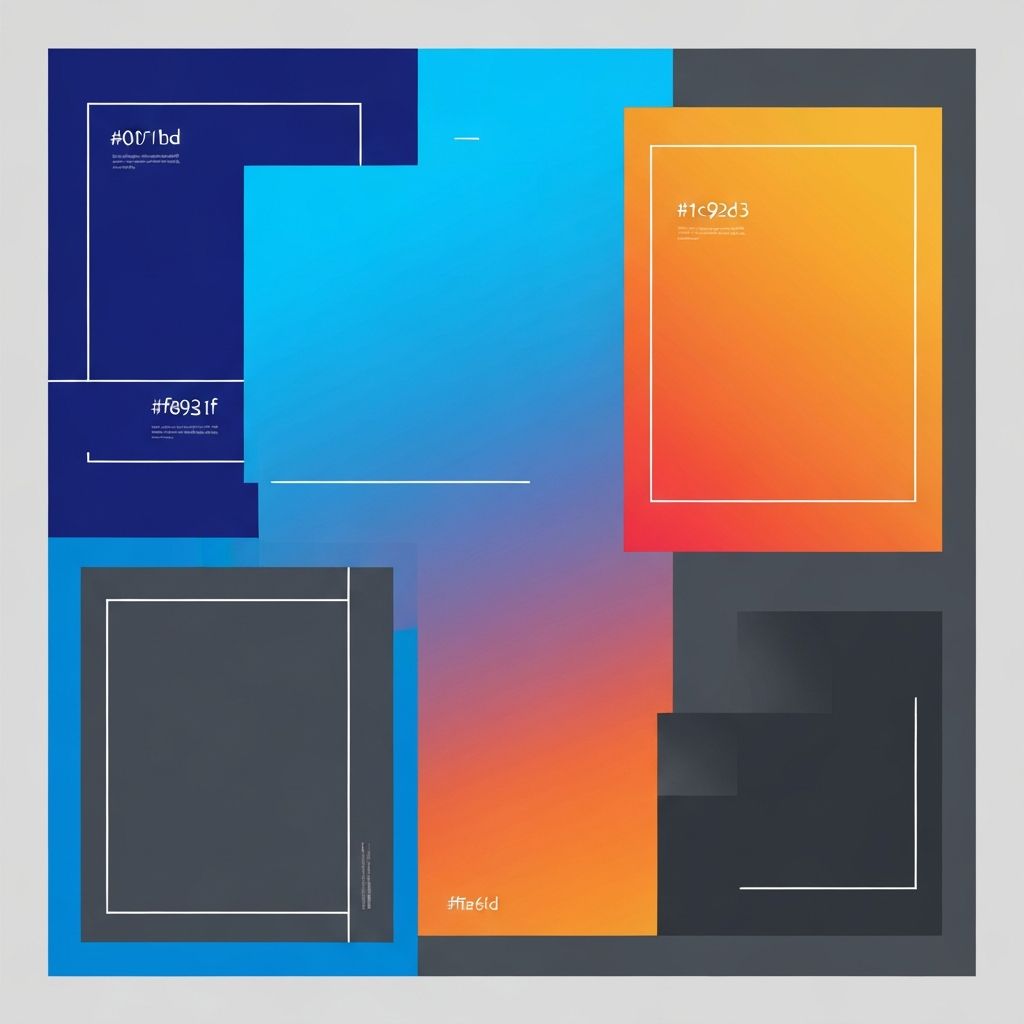
Gradient backgrounds add depth and interest while maintaining sophistication. Modern gradients often transition between analogous colors or vary a single hue. Subtle gradients add richness without overwhelming, while bolder gradients make dramatic statements.
Split compositions use contrasting colors to divide layouts. A common approach splits the page between a vibrant image area and a contrasting content area. This technique creates visual interest while maintaining clear content hierarchy.
Color blocking creates bold sections with distinct colors. Different page sections receive different background colors, creating a dynamic, engaging scroll experience. Careful color selection ensures sections feel cohesive despite their variety.
Accent color drama pairs neutral backgrounds with vibrant accents. This approach lets bold colors shine without overwhelming. Key elements like CTAs, icons, or illustrations pop against restrained surroundings.
Our Website Design services help brands explore these approaches to find the perfect expression of their visual identity.
Color Combinations That Work
Certain color relationships produce harmonious, effective combinations.
Complementary combinations pair colors from opposite sides of the color wheel. Blue and orange, purple and yellow, red and green create high contrast and energy. Use carefully to avoid visual tension.
Analogous combinations use colors adjacent on the color wheel. Blue, teal, and green or red, orange, and yellow create harmonious, sophisticated palettes. These combinations feel natural and easy on the eyes.
Triadic combinations space three colors evenly around the color wheel. More complex but visually dynamic when balanced well. Often one color dominates while others accent.
Duotone effects limit palettes to two colors, often applied to photography. This technique creates striking, cohesive visuals with strong brand association. Particularly effective for hero images and backgrounds.
Colorful Typography and Text
Bold color extends beyond backgrounds and graphics to text itself.
Gradient text applies color transitions to headlines for dramatic effect. CSS now enables gradient text without images, making this technique accessible and performant.
Highlighted text uses color backgrounds behind key phrases. This approach draws attention to important messages within longer copy. Use sparingly for maximum impact.
Multi-color headings break headlines across colors. Each word or phrase might appear in a different hue. When done well, this creates playful, memorable headlines.
Color-coded sections use different text colors for different content types. This technique helps organize information and creates visual variety while maintaining readability.
Illustration and Imagery in Colorful Design
Visual elements contribute significantly to colorful landing pages.
Custom illustrations in brand colors create unique, memorable experiences. Illustrations can incorporate colors that might overwhelm in other contexts. They add personality and visual interest while reinforcing brand identity.
Color-treated photography through overlays, filters, or duotone effects integrates photos into colorful palettes. Consistent treatment across images creates cohesion even with diverse photography.
Vibrant iconography adds functional color throughout pages. Icon sets in bold colors serve both utilitarian and decorative purposes. Consistent icon styling reinforces the overall aesthetic.
Animated color creates dynamic, engaging experiences. Color transitions, gradient animations, and color-changing interactions add life to landing pages without requiring heavy graphics.
Colorful UI Elements
Interface components benefit from thoughtful color application.
Button design uses color to drive action. CTAs in vibrant, contrasting colors naturally draw attention. Button hover states can introduce additional colors or effects.
Form styling makes functional elements feel part of the design. Colorful focus states, progress indicators, and confirmation messages extend the palette into interactions.
Cards and containers with colored borders or backgrounds add visual interest to content organization. Varying colors across card series creates dynamic layouts while maintaining structural consistency.
Navigation elements can incorporate brand colors prominently. Colored navigation bars, active state indicators, and dropdown styling contribute to the overall colorful experience.
Technical Considerations for Colorful Design
Implementing colorful designs effectively requires technical attention.
Color management ensures consistency across browsers and devices. Define colors precisely and test across platforms. What looks perfect on your monitor may appear differently elsewhere.
Dark mode compatibility has become increasingly important. Consider how colorful designs adapt when users prefer dark interfaces. Some vibrant colors need adjustment for dark contexts.
Performance optimization keeps colorful pages fast. Large gradient backgrounds, complex animations, and many colorful images can impact load times. Optimize carefully to maintain speed.
Responsive color may need to adapt across screen sizes. Color that works in large hero sections may overwhelm on mobile. Consider how palettes scale to smaller contexts.
When to Use Colorful Design
Bold color isn't appropriate for every situation.
Brand alignment should guide color boldness. Some brands suit vibrant expression while others require restraint. Color choices should feel authentic to brand personality.
Audience expectations vary by industry and context. Creative industries may expect and appreciate bold color. Financial services clients might find it jarring. Understand your audience's context.
Content requirements affect color appropriateness. Content-heavy pages may need more neutral treatments for readability. Pages focused on emotional connection or brand impression can go bolder.
Competitive context influences differentiation strategy. If competitors use restrained palettes, bold color differentiates. If everyone's using bold color, restraint might stand out more.
Testing and Optimization
Colorful design benefits from data-driven refinement.
A/B testing color variations reveals what resonates with your audience. Test hero colors, button colors, and overall palette intensity to optimize for your specific context.
Heatmap analysis shows how color affects attention. Verify that your color hierarchy guides eyes as intended. Adjust if important elements aren't receiving attention.
Conversion data ultimately determines success. Monitor how colorful designs affect key metrics. Beautiful color that doesn't convert isn't serving business goals.
Bring Your Vision to Life
At AAMAX.CO, we love helping brands explore bold visual directions. Whether your vision calls for vibrant color expression or refined restraint, our Website Design team has the expertise to bring it to life beautifully and effectively.
Our Front-end Web Development capabilities ensure colorful designs are implemented with technical excellence—optimized for performance, accessible to all users, and consistent across platforms.
Ready to create a landing page that truly stands out? Contact us to discuss how we can help your brand make a bold, colorful impression.
Want to publish a guest post on aamax.co?
Place an order for a guest post or link insertion today.
Place an Order