Color Theory and Web Design
The Science and Art of Color in Web Design
Color is one of the most powerful tools in a web designer's arsenal. Beyond aesthetics, color influences emotions, guides attention, communicates brand personality, and affects user behavior. Understanding color theory transforms arbitrary color choices into strategic decisions that serve both design goals and business objectives.
At AAMAX.CO, we approach color as both science and art. Our designers combine understanding of color psychology with creative vision to develop palettes that elevate brands and drive results.
Fundamentals of Color Theory
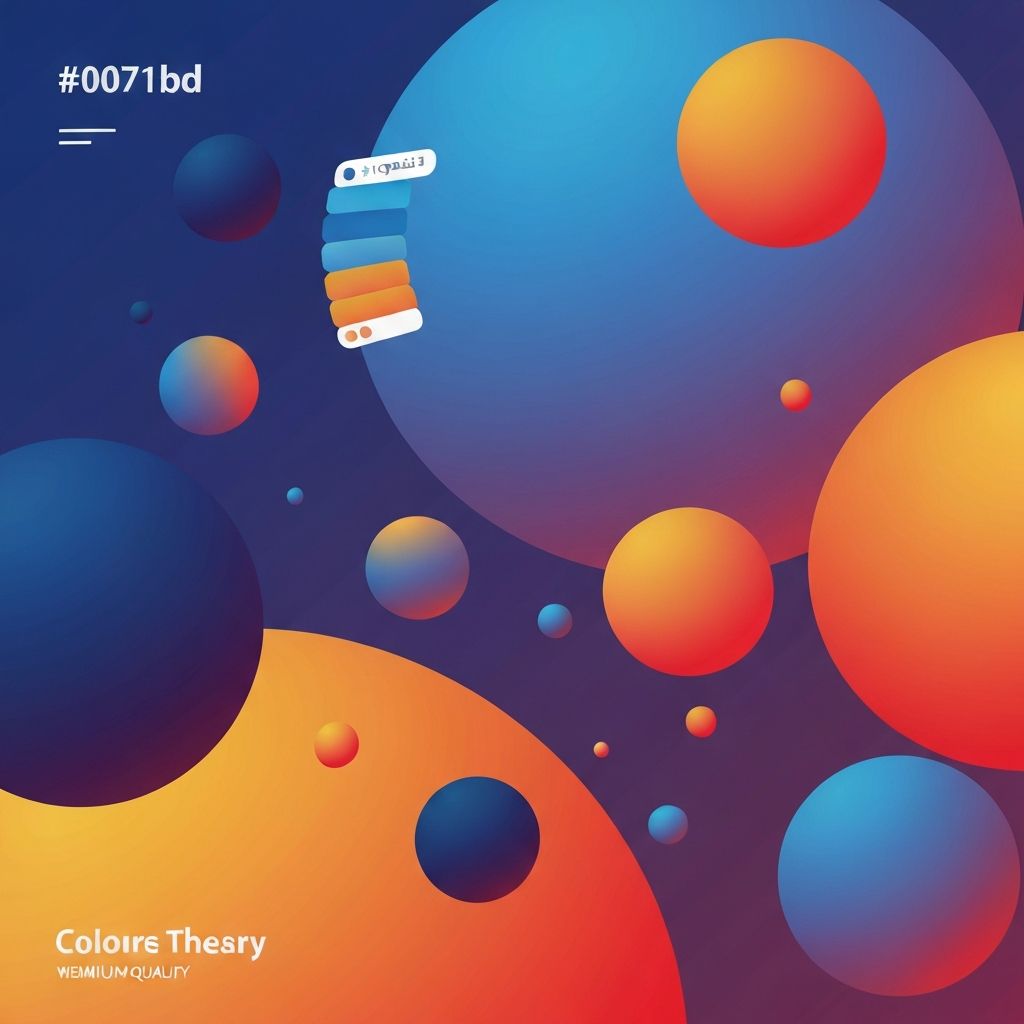
The color wheel, developed from Isaac Newton's experiments with light, organizes colors by their relationships. Primary colors—red, yellow, and blue—combine to create secondary colors (orange, green, violet), which combine further to create tertiary colors. Understanding these relationships is foundational to effective color use.
Color properties extend beyond hue (the color itself) to include saturation (intensity) and value (lightness or darkness). Two blues can feel completely different based on saturation and value. A bright, saturated blue feels energetic while a desaturated, dark blue feels sophisticated.
Color temperature divides the spectrum into warm colors (reds, oranges, yellows) and cool colors (blues, greens, violets). Temperature affects psychological response—warm colors feel energetic and inviting while cool colors feel calm and professional.
Psychology of Color in Digital Contexts
Red evokes urgency, passion, and excitement. It's effective for calls to action and sale notifications but can feel aggressive if overused. Red increases heart rate and creates sense of urgency, making it powerful for conversion-focused elements.
Blue communicates trust, stability, and professionalism. Its widespread use in corporate and financial websites stems from these associations. Blue rarely offends but can feel cold without warm accent colors to balance.
Green represents nature, health, and growth. Environmental organizations, health brands, and financial services (where green suggests money and growth) often feature green prominently. It's easy on the eyes and rarely creates negative associations.
Yellow captures attention and suggests optimism but requires careful use. Bright yellow is difficult to read and can strain eyes. Used strategically for highlights rather than backgrounds, yellow effectively draws attention.
Orange combines red's energy with yellow's friendliness. It's effective for calls to action, particularly for less serious or youthful brands. Orange stands out without the aggressive edge of red.
Purple historically associated with royalty, suggests luxury and creativity. It works well for brands wanting to convey premium positioning or artistic sensibility. Dark purples feel sophisticated while bright purples feel playful.
Black conveys sophistication, luxury, and power. Many high-end brands use black dominantly. It provides maximum contrast for text and creates dramatic visual impact.
White represents cleanliness, simplicity, and space. Generous white space is essential for clean design. White backgrounds improve readability and prevent visual overwhelm.
Color Harmony and Combinations
Complementary colors sit opposite each other on the color wheel (like blue and orange). These combinations create maximum contrast and visual energy. They're effective for highlighting important elements but can be jarring if not balanced carefully.
Analogous colors sit adjacent on the color wheel (like blue, blue-green, and green). These combinations feel harmonious and natural. They work well for designs wanting cohesive, calming aesthetics.
Triadic combinations use three colors equally spaced on the wheel (like red, yellow, and blue). These create vibrant, balanced palettes but require careful management to avoid overwhelming users.
Split-complementary schemes use a base color plus two colors adjacent to its complement. This provides contrast of complementary schemes with more nuance and less tension.
Monochromatic schemes use variations of a single hue, differing in saturation and value. These create sophisticated, unified looks. Our website design often employs monochromatic schemes with strategic accent colors.
Color in Brand Identity
Color recognition dramatically increases brand awareness. Consistent color use across all touchpoints—website, social media, print materials—builds recognition over time. Your website should reinforce established brand colors.
Industry conventions affect color expectations. Financial services often use blue (trust, stability). Health and organic brands lean toward green. Tech companies might use blue or bold modern colors. Understanding conventions helps brands either align with or deliberately differentiate from expectations.
Color differentiation from competitors can create strategic advantage. If every competitor in your space uses blue, a different primary color can help you stand out. Research competitive palettes before finalizing brand colors.
Color evolution should be handled carefully. Dramatic palette changes can confuse existing customers. When updating colors, evolution typically works better than revolution.
Practical Application in Web Design
Establishing primary, secondary, and accent colors creates a usable system. Primary colors appear most frequently (backgrounds, headers). Secondary colors support the primary. Accents draw attention to specific elements like CTAs.
The 60-30-10 rule provides a starting framework: 60% primary color, 30% secondary, 10% accent. This creates balanced compositions while allowing key elements to stand out. Adjust ratios based on specific needs.
Neutral colors (blacks, whites, grays) are essential for readable text and visual breathing room. Most website text should be dark gray on light backgrounds—pure black can be harsh. Neutrals typically dominate most websites with color providing accent and personality.
Consistency through style guides documents color decisions for future reference. Include hex codes, RGB values, and usage guidelines. This prevents drift and ensures brand consistency across pages and over time.
Color and User Experience
Contrast ratios affect accessibility. WCAG guidelines specify minimum contrast between text and backgrounds. Tools like WebAIM's contrast checker verify compliance. Our front-end web development ensures all color implementations meet accessibility standards.
Color blindness affects approximately 8% of men and 0.5% of women. Red-green color blindness is most common. Don't rely solely on color to communicate information—combine color with text, icons, or patterns. Test designs using color blindness simulators.
Cultural considerations matter for international audiences. Color meanings vary significantly across cultures. White signifies purity in Western cultures but mourning in some Eastern cultures. Red means luck in China but danger in Western contexts.
Context affects color perception. The same color appears different against different backgrounds (simultaneous contrast). Test colors in actual use contexts rather than isolation.
Color in Conversion Optimization
Call-to-action colors should contrast with surrounding elements. A green CTA button on a green-themed page disappears. Choose CTA colors that stand out without clashing with overall design.
A/B testing reveals actual performance beyond theory. Color psychology provides starting hypotheses, but testing shows what works for your specific audience. Sometimes counterintuitive colors perform best.
Emotional alignment supports conversion goals. A site selling relaxation products should feel calm (blues, greens). An energy drink site should feel energetic (oranges, reds). Misalignment between product and color creates cognitive dissonance.
Trust-building colors may be more important than attention-grabbing ones for high-consideration purchases. Finance and healthcare sites typically use conservative palettes that communicate stability rather than excitement.
Technical Implementation Considerations
Color consistency across devices is challenging. Monitors display colors differently based on technology, calibration, and settings. Test on multiple devices and accept some variation as inevitable.
CSS custom properties (variables) enable efficient color management. Defining colors as variables makes site-wide changes simple and ensures consistency. Modern website development practices use variables for maintainable color systems.
Dark mode support has become increasingly expected. Sites should either respect system dark mode preferences or offer toggle functionality. Dark mode requires a complete secondary palette, not just inverted colors.
Performance optimization includes efficient color implementation. Avoid images purely for color effects when CSS can achieve the same result. Gradients and solid colors load faster than decorative images.
Evolving Color Trends
Annual color trends influence design expectations. Pantone's Color of the Year and similar announcements shift popular palettes. Awareness of trends helps designs feel current without becoming dated.
Generational preferences affect color reception. Younger audiences may respond to bolder, more saturated colors. Older audiences often prefer more conservative palettes. Know your target demographic.
Technology influences color possibilities. Wider color gamuts in modern displays enable more vibrant colors. P3 color space offers colors impossible in traditional sRGB. As display technology evolves, new color possibilities emerge.
Conclusion
Effective color use in web design combines theoretical understanding with practical application and continuous testing. Color choices impact every aspect of user experience—from initial impression to emotional response to conversion behavior. Strategic color decisions should be as carefully considered as any other design element.
Our design team brings deep understanding of color theory to every project. We create palettes that strengthen brands, serve users, and drive business results. Contact us to explore how strategic color use can transform your website's effectiveness.
Want to publish a guest post on aamax.co?
Place an order for a guest post or link insertion today.
Place an Order