2016 Web Design Trends
A Pivotal Year in Web Design Evolution
The year 2016 represented a significant maturation point in web design history, consolidating emerging trends while introducing innovations that would define the following decade. This period saw flat design reaching refinement, mobile-first approaches becoming standard, and new technical capabilities enabling previously impossible creative expressions. Understanding 2016's design landscape provides valuable perspective on how contemporary website design practices evolved and why certain principles became industry standards.
Flat Design 2.0: Adding Depth Without Excess
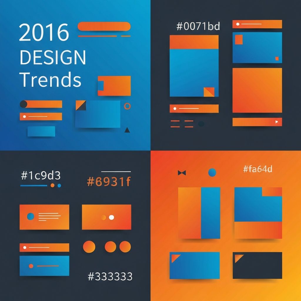
By 2016, flat design had evolved beyond its initial stark minimalism into a more nuanced approach sometimes called Flat Design 2.0 or Material Design-influenced flat design. Designers discovered that subtle shadows, layering, and depth cues improved usability without sacrificing the clean aesthetics that made flat design appealing.
This evolution recognized that some skeuomorphic principles served functional purposes. Shadow effects helped users understand interface hierarchies and identify interactive elements. Subtle gradients added dimension that guided attention without the excessive decoration of earlier eras. This balanced approach demonstrated design maturity, selecting techniques based on effectiveness rather than trend adherence.
Color palettes in 2016 favored bold, confident choices. Vibrant blues, energetic oranges, and striking color combinations replaced the muted tones of earlier flat design iterations. These bold colors created memorable brand impressions while maintaining the clarity that defined modern design sensibilities.
Mobile-First Design Becomes Standard
By 2016, mobile internet usage had surpassed desktop in many markets, making mobile-first design not just recommended but essential. This approach inverted traditional design processes, beginning with small-screen constraints before expanding to larger displays. The methodology ensured core functionality and content remained accessible regardless of device.
Responsive design frameworks matured significantly during this period. Bootstrap, Foundation, and other grid systems provided sophisticated tools for creating fluid layouts that adapted gracefully across breakpoints. These frameworks accelerated website development while ensuring consistent cross-device experiences.
Touch-friendly interfaces influenced design decisions even for desktop experiences. Larger tap targets, generous spacing, and gesture-based interactions translated into improved usability across all platforms. This mobile-influenced design language recognized that users increasingly switched between devices, expecting consistent experiences.
Card-Based Design Dominance
Card layouts achieved near-universal adoption in 2016, organizing content into digestible, scannable units that worked beautifully across screen sizes. Pinterest's influence spread throughout the web, with cards appearing in social feeds, e-commerce product grids, article listings, and dashboard interfaces.
Cards provided natural containers for mixed content types, combining images, text, metadata, and actions in cohesive units. This flexibility made them ideal for responsive designs, as cards could reflow into different grid configurations without losing meaning or hierarchy.
The pattern's success stemmed from alignment with user behavior. Eye-tracking studies showed users scanning pages in patterns that cards naturally accommodated. Each card represented a complete thought or offering, enabling quick assessment before deeper engagement.
Hero Images and Video Backgrounds
Large hero images dominated landing pages in 2016, making powerful first impressions that communicated brand personality instantly. These full-width visual statements replaced text-heavy introductions, recognizing that images conveyed emotion and context more efficiently than paragraphs.
Video backgrounds emerged as a premium technique for high-impact pages. Autoplay video loops created dynamic, immersive experiences that captured attention and differentiated brands. While bandwidth and performance considerations required careful implementation, video headers became aspirational elements for forward-thinking websites.
The parallax scrolling effect, while introduced earlier, reached sophisticated implementation in 2016. Layered movement created depth and engagement as users scrolled, though overuse prompted discussions about when effects enhanced versus distracted from content.
Typography Revolution
Web fonts achieved mainstream adoption, liberating designers from web-safe font limitations. Services like Google Fonts and Typekit made thousands of typefaces accessible, enabling brand-appropriate typography without technical barriers. This typographic freedom transformed web design possibilities.
Large, bold headlines became defining elements of 2016 design. Text sizes that would have seemed excessive years earlier created confident, statement-making layouts. This typographic confidence reflected the medium's maturity and growing design sophistication.
Variable font experiments began, hinting at future capabilities for responsive typography that adapted weight and width based on context. While browser support remained limited, these explorations established foundations for typography innovations that followed.
Microinteractions and Motion Design
Subtle animations and microinteractions added polish and feedback that distinguished refined designs. Button hover states, loading animations, and transition effects communicated system responses while adding personality. These details, while individually minor, collectively created experiences that felt responsive and crafted.
CSS animations and transitions matured, enabling smooth motion without JavaScript dependencies. Designers could specify timing functions, delays, and complex keyframe sequences directly in stylesheets, improving performance while expanding creative possibilities.
Scroll-triggered animations gained popularity, revealing content progressively as users moved through pages. When implemented thoughtfully, these effects created narrative flow and engagement. Our front-end web development services leverage these techniques to create engaging, polished user experiences.
Minimalism and White Space
Generous white space became a hallmark of sophisticated 2016 design. Rather than filling every pixel, designers embraced emptiness as a compositional element that improved readability, emphasized important content, and conveyed premium positioning.
Navigation simplified significantly, with many sites reducing menu items and employing hamburger menus even on desktop. While debates about hamburger menu discoverability continued, the trend toward simplified navigation reflected broader minimalist sensibilities.
Content-first approaches prioritized substance over decoration. Designers stripped interfaces to essential elements, questioning every component's necessity. This disciplined approach improved focus and reduced cognitive load for users.
Technical Advancements
HTTP/2 adoption improved performance by enabling multiplexed connections and header compression. These technical improvements allowed designers to incorporate more assets without proportional performance penalties, expanding creative possibilities while maintaining speed.
CSS Grid and Flexbox support expanded, providing powerful layout tools that reduced reliance on frameworks and float-based hacks. These native CSS capabilities enabled complex layouts with cleaner code and improved maintainability.
Progressive Web Apps emerged as a concept bridging web and native app experiences. Service workers enabled offline functionality, push notifications, and app-like interactions within browsers. This technology continues evolving, with our web application development services leveraging these capabilities for sophisticated digital products.
Lasting Influences on Modern Design
Many 2016 trends evolved into permanent practices rather than passing fashions. Mobile-first methodology remains standard, card patterns continue dominating interfaces, and the balance between flat aesthetics and functional depth persists in current design systems.
The year's emphasis on performance awareness shaped ongoing priorities. Google's mobile-friendly algorithm updates made performance a business concern, not just a technical consideration. This accountability continues driving optimization efforts today.
At AAMAX.CO, we build on these established foundations while embracing contemporary innovations. Our team understands which 2016 principles remain relevant and when newer approaches better serve current user expectations and technical capabilities.
Design System Thinking Emerges
The complexity of maintaining consistent experiences across devices and touchpoints drove design system adoption. Organizations began documenting patterns, components, and guidelines systematically, ensuring consistency while accelerating development. This systematic approach continues maturing in contemporary practice.
Component-based development aligned with design system thinking, creating modular codebases that matched modular design approaches. Our ReactJS web development expertise leverages component architecture to build maintainable, scalable applications that implement design systems effectively.
Conclusion
The 2016 web design landscape represented a maturation point where experimental trends solidified into refined practices. From flat design's evolution to mobile-first methodology's standardization, this year's innovations established patterns that continue guiding contemporary digital experience creation. Understanding this context helps teams appreciate why certain practices became standards and how to build effectively on these foundations while remaining open to continued evolution.
Want to publish a guest post on aamax.co?
Place an order for a guest post or link insertion today.
Place an Order