Web Page Menu Design
Introduction to Web Page Menu Design
Web page menu design is one of the most critical elements of any website. It serves as the primary navigation tool that guides visitors through your content, helping them find what they need quickly and efficiently. A well-designed menu can significantly improve user experience, reduce bounce rates, and increase conversions. At AAMAX.CO, we understand the importance of intuitive navigation systems and have helped countless businesses create menus that not only look great but also perform exceptionally well.
The evolution of web page menu design has been remarkable over the years. From simple text-based links to sophisticated mega menus with rich media content, the options available to designers today are virtually limitless. However, with great power comes great responsibility. The key is to balance creativity with functionality, ensuring that your menu serves its primary purpose while also contributing to your brand's visual identity.
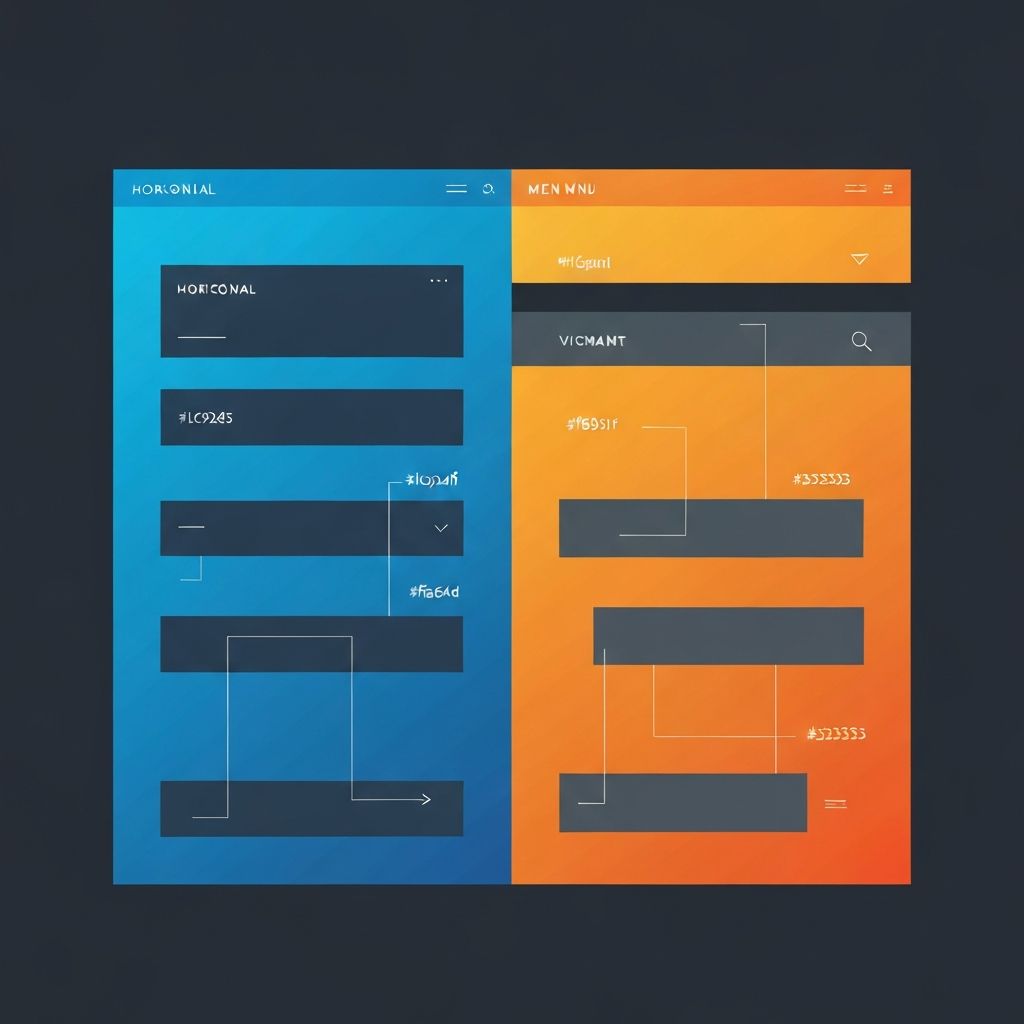
Types of Web Page Menus
Understanding the different types of web page menus is essential for choosing the right one for your project. The horizontal navigation bar remains the most popular choice for desktop websites. Positioned at the top of the page, it provides easy access to main sections without taking up valuable screen real estate. This traditional approach works well for websites with a limited number of primary categories.
Vertical menus, often called sidebar navigation, are another popular option. They work particularly well for websites with many categories or subcategories, such as e-commerce platforms or documentation sites. The vertical layout allows for more items to be displayed without overwhelming the user, and it can easily accommodate dropdown submenus for hierarchical content organization.
Hamburger menus have become ubiquitous in mobile design and are increasingly being adopted for desktop sites as well. While they save space and create a cleaner aesthetic, they can sometimes hide important navigation options from users. The best practice is to use hamburger menus primarily for mobile devices while maintaining visible navigation on larger screens.
Mega menus represent the ultimate solution for websites with extensive content hierarchies. These large dropdown panels can display multiple columns of links, images, and even promotional content. When implemented correctly, mega menus can dramatically improve navigation efficiency for complex websites.
Key Principles of Effective Menu Design
Creating an effective web page menu requires adherence to several key principles. First and foremost is clarity. Every menu item should be labeled clearly and concisely, using language that your target audience understands. Avoid jargon or clever wordplay that might confuse visitors. Remember, the goal is to help users find what they're looking for, not to impress them with your vocabulary.
Consistency is equally important. Your menu should maintain the same structure and styling across all pages of your website. This includes consistent positioning, colors, fonts, and hover effects. When users know what to expect, they can navigate more confidently and efficiently.
Hierarchy plays a crucial role in menu design. Primary navigation items should be prominently displayed, while secondary and tertiary items can be nested in dropdowns or submenus. This hierarchical organization helps users understand the structure of your website and find specific content more easily.
Responsiveness is no longer optional in modern web design. Your menu must work flawlessly across all device sizes, from large desktop monitors to small smartphone screens. This often requires creating different menu variations for different screen sizes, ensuring that the navigation experience remains excellent regardless of how users access your site.
Visual Design Considerations
The visual design of your menu should complement your overall website aesthetic while maintaining usability. Color plays a significant role in menu design. The menu background should provide sufficient contrast with the text to ensure readability. Active and hover states should be clearly distinguishable from the default state, helping users understand where they are and where they can go.
Typography choices affect both the aesthetics and readability of your menu. Choose fonts that are easy to read at smaller sizes and maintain legibility across different devices. Pay attention to font weight, line height, and letter spacing to optimize readability without sacrificing style.
Spacing and alignment are often overlooked but are crucial for a polished menu design. Adequate padding around menu items creates a comfortable clicking or tapping target, reducing user frustration. Consistent alignment creates a sense of order and professionalism that reflects positively on your brand.
Animation and micro-interactions can enhance the menu experience when used judiciously. Subtle hover effects, smooth dropdown transitions, and gentle highlighting can make navigation feel more responsive and engaging. However, excessive animation can slow down navigation and frustrate users, so moderation is key.
Mobile Menu Best Practices
Mobile menu design presents unique challenges and opportunities. Screen real estate is limited, so every pixel must be used wisely. The hamburger icon has become the standard trigger for mobile menus, though some designers are exploring alternatives like tab bars or floating action buttons.
Touch targets must be large enough for comfortable tapping. The recommended minimum size is 44x44 pixels, though larger targets are generally better. Spacing between menu items should prevent accidental taps on adjacent items, which can be particularly frustrating on smaller screens.
Off-canvas menus, which slide in from the side of the screen, have become popular for mobile navigation. They provide ample space for navigation options while keeping the main content visible until the user actively engages with the menu. This pattern works well for most mobile websites and applications.
Consider the thumb zone when designing mobile menus. Most users hold their phones with one hand and navigate using their thumb. Placing important navigation elements within comfortable thumb reach can significantly improve the mobile user experience.
Accessibility in Menu Design
Accessibility should be a priority in every aspect of web design, and menus are no exception. Keyboard navigation must be fully supported, allowing users to tab through menu items and activate them with the Enter or Space key. Focus indicators should be clearly visible, helping keyboard users understand their current position within the menu.
Screen reader compatibility requires proper semantic markup. Use appropriate HTML elements like nav, ul, and li to structure your menu. ARIA attributes can provide additional context for assistive technologies, such as indicating whether a submenu is expanded or collapsed.
Color contrast must meet WCAG guidelines to ensure that menu text is readable for users with visual impairments. Tools are available to test your color combinations and ensure they meet accessibility standards. Remember that color should not be the only means of conveying information, as this excludes colorblind users.
Technical Implementation Tips
From a technical perspective, there are several best practices to follow when implementing web page menus. Use semantic HTML to create a solid foundation. The nav element should wrap your main navigation, with ul and li elements structuring the menu items. This semantic markup improves accessibility and helps search engines understand your site structure.
CSS should handle all visual styling and basic interactions. Flexbox and CSS Grid are excellent tools for creating responsive menu layouts. CSS transitions can create smooth hover effects and dropdown animations without JavaScript overhead.
JavaScript should be used sparingly and progressively. Core navigation functionality should work without JavaScript, with scripting added only for enhanced features like mega menu interactions or animated effects. This progressive enhancement approach ensures that your navigation remains functional even if JavaScript fails to load.
Performance optimization is crucial for menu implementation. Minimize the use of heavy images or complex animations that could slow down navigation. Lazy loading can be applied to mega menu content that includes images or other media. Test your menu performance across different devices and connection speeds to ensure a consistently fast experience.
Testing and Optimization
Testing is essential for creating effective menu designs. User testing can reveal navigation issues that designers might overlook. Watch real users interact with your menu and note any confusion or hesitation. Heat mapping tools can show where users click and how they move through your navigation.
A/B testing allows you to compare different menu designs and determine which performs better. Test variations in layout, labeling, and organization to optimize conversion rates and user satisfaction. Data-driven decisions lead to better menu designs over time.
Analytics provide valuable insights into menu performance. Track which menu items receive the most clicks, identify pages with high exit rates that might indicate navigation problems, and monitor how users flow through your site. Use this data to continuously refine and improve your navigation structure.
Conclusion
Web page menu design is a complex discipline that combines aesthetics, usability, accessibility, and technical implementation. A well-designed menu can significantly enhance user experience and contribute to your website's success. By following the principles and best practices outlined in this guide, you can create navigation systems that serve your users well while supporting your business goals.
At our company, we specialize in creating exceptional website designs that prioritize user experience and conversion optimization. Our team of experienced designers and developers can help you create a menu system that perfectly fits your needs. Whether you're building a new website or improving an existing one, we're here to help you navigate the complexities of modern web design.
Want to publish a guest post on aamax.co?
Place an order for a guest post or link insertion today.
Place an Order