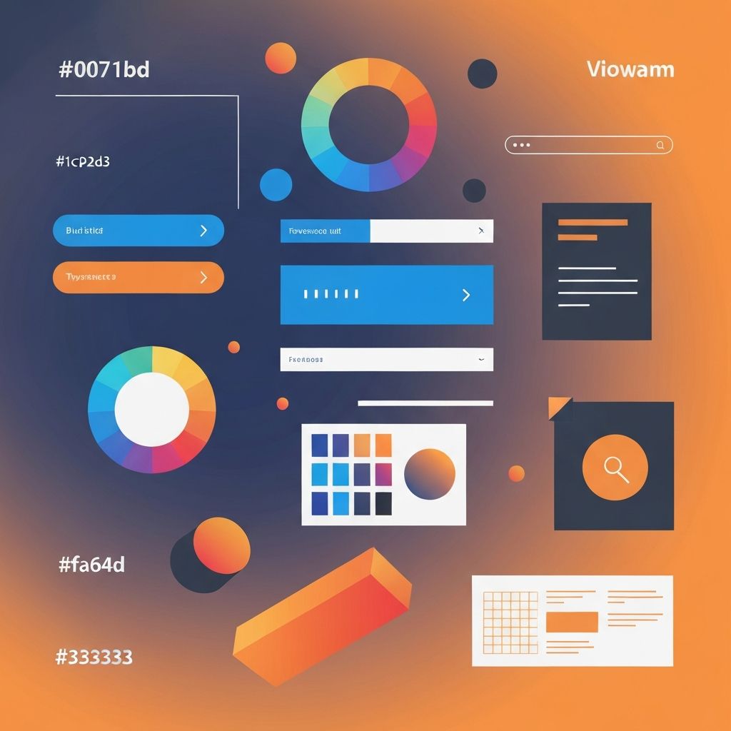
Web Designing Elements
Essential Web Designing Elements Every Designer Must Master
Great web design doesn't happen by accident. It results from the skillful combination of specific elements, each contributing to the overall user experience and visual appeal. Understanding these fundamental elements—and how they work together—is essential for creating websites that truly serve their purpose.
At AAMAX.CO, our design philosophy centers on mastering these core elements while adapting them to each client's unique needs. As a full-service digital marketing company, we understand that effective web design combines aesthetic excellence with strategic thinking to achieve business goals.
Layout: The Foundation of Web Design
Layout is perhaps the most fundamental element of web design. It determines how content is organized and presented, guiding users through the page and establishing visual hierarchy. A well-planned layout makes content easy to consume and actions clear to take.
Grid systems provide structure for layouts. Whether using traditional 12-column grids or more flexible approaches, grids ensure alignment and consistency across pages. They create visual order that users perceive subconsciously, making sites feel professional and trustworthy.
White space (or negative space) is equally important as the content itself. Adequate spacing between elements prevents visual clutter, improves readability, and helps important elements stand out. Inexperienced designers often try to fill every pixel, but skilled designers understand the power of restraint.
Visual hierarchy guides users' attention through the page. Through size, color, position, and spacing, designers create a clear path that leads users to the most important elements first. This hierarchy should align with business priorities—what do you most want users to see and do?
Our website design services begin with careful layout planning, ensuring that structure serves both user needs and business objectives.
Typography: The Voice of Your Website
Typography does more than display text—it conveys personality, establishes hierarchy, and affects readability. The fonts you choose and how you use them profoundly impact user experience and brand perception.
Font selection should reflect brand personality while ensuring readability. Serif fonts often convey tradition and authority, while sans-serif fonts feel modern and clean. Script fonts add elegance but should be used sparingly. Whatever fonts you choose, ensure they're legible at all sizes and on all devices.
Type hierarchy uses size, weight, and style variations to distinguish headings, subheadings, body text, and captions. This hierarchy helps users scan content and understand the relative importance of different text elements.
Line length affects readability significantly. Lines that are too long cause eye fatigue, while lines that are too short disrupt reading flow. Optimal line length is generally 50-75 characters for body text.
Line height (leading) ensures comfortable reading. Text that's too tightly spaced feels cramped; too much space disrupts the visual connection between lines. Generally, line height should be 1.4-1.6 times the font size for body text.
Color: Emotion and Brand Identity
Color is one of the most powerful tools in a designer's arsenal. It evokes emotions, reinforces brand identity, creates contrast, and guides attention. Strategic color use can dramatically improve both aesthetics and effectiveness.
Color psychology influences how users perceive your site. Blue conveys trust and professionalism. Red creates urgency and excitement. Green suggests growth and calm. Orange encourages action. Understanding these associations helps choose colors that support your message.
Brand consistency requires using colors that align with established brand identity. Your website's color palette should reinforce recognition and trust built through other brand touchpoints.
Contrast ensures readability and accessibility. Text must have sufficient contrast against its background to be readable by all users, including those with visual impairments. Tools like WebAIM's contrast checker help verify accessibility compliance.
Color systems define primary, secondary, and accent colors along with their usage rules. A cohesive color system prevents visual chaos and ensures consistency across the site.
Imagery: Visual Communication
Images communicate faster than text and create emotional connections that words alone cannot achieve. Strategic imagery enhances storytelling, demonstrates products, and makes content more engaging.
Image quality matters enormously. Low-resolution, poorly lit, or amateur images undermine even the best designs. Invest in professional photography or high-quality stock images that reflect your brand's standards.
Relevance ensures images support rather than distract from content. Every image should serve a purpose—illustrating a concept, showcasing a product, creating emotional resonance, or breaking up text. Avoid decorative images that don't add meaning.
Optimization balances quality with performance. Large image files slow page loading, hurting both user experience and SEO. Proper compression, responsive images, and modern formats (WebP) maintain visual quality while minimizing file size.
Our front-end web development team ensures images are implemented with optimal performance while maintaining visual integrity.
Navigation: Guiding User Journeys
Navigation is how users move through your site. Clear, intuitive navigation is essential for user experience—if people can't find what they're looking for, they'll leave. Navigation design must balance comprehensiveness with simplicity.
Information architecture underlies navigation design. This involves organizing content logically, creating clear categories, and establishing relationships between pages. Good IA makes navigation intuitive because content is organized the way users expect.
Primary navigation should include only the most important pages—typically 5-7 items maximum. Too many options create decision paralysis. Secondary navigation, footer links, and other mechanisms can provide access to additional content.
Consistency across pages helps users build mental models of your site. Navigation should appear in the same location and function the same way on every page.
Mobile navigation requires special attention. Limited screen space necessitates patterns like hamburger menus, but these should be implemented thoughtfully to remain accessible and user-friendly.
Calls to Action: Driving Conversions
Calls to action (CTAs) prompt users to take specific steps—sign up, buy now, learn more, contact us. Effective CTAs are crucial for achieving business goals, and their design requires careful attention.
Visual prominence ensures CTAs stand out. Contrasting colors, generous size, and strategic placement draw attention to these critical elements. CTAs should be among the most visually prominent elements on any page.
Clear language tells users exactly what will happen when they click. Vague CTAs like "Submit" or "Click Here" are less effective than specific ones like "Start Free Trial" or "Download Guide."
Strategic placement puts CTAs where users are ready to act. This often means after persuasive content has built interest. Multiple CTAs throughout longer pages capture users at different points in their journey.
Forms: Capturing User Information
Forms are how users provide information—signing up, checking out, or contacting you. Form design significantly impacts conversion rates; poorly designed forms frustrate users and cause abandonment.
Simplicity is key. Ask only for information you truly need. Every additional field increases friction and reduces completion rates. If you need detailed information, consider progressive profiling across multiple interactions.
Clear labels and helpful placeholders guide users through form completion. Error messages should be specific and helpful, explaining what went wrong and how to fix it.
Visual design makes forms approachable. Adequate spacing, clear visual hierarchy, and logical grouping of related fields create forms that feel manageable rather than overwhelming.
Responsive Design: Adapting to All Devices
Responsive design ensures websites work well across all devices and screen sizes. With mobile traffic exceeding desktop in many contexts, responsive design is no longer optional—it's essential.
Flexible grids use relative units (percentages, ems) rather than fixed pixels, allowing layouts to adapt to available space. Content reflows naturally as screen size changes.
Responsive images scale appropriately and may serve different resolutions to different devices. This maintains visual quality while optimizing performance across devices.
Mobile-first thinking starts design with the smallest screens and progressively enhances for larger ones. This approach ensures mobile users get thoughtful experiences rather than cramped desktop designs.
Our website development ensures all designs are fully responsive, providing excellent experiences across devices.
Performance: Speed as a Design Element
Page load speed directly affects user experience, conversions, and search rankings. Performance should be considered a core design element, not an afterthought.
Optimized assets—compressed images, minified code, efficient fonts—reduce load times. Every kilobyte counts, especially on mobile networks.
Perceived performance can be improved through techniques like lazy loading, progressive image loading, and skeleton screens. Even when actual load times can't be reduced, perceived performance improvements help user experience.
Accessibility: Designing for Everyone
Accessible design ensures websites work for users with disabilities—visual, motor, auditory, or cognitive. Beyond being the right thing to do, accessibility is often legally required and improves experience for all users.
Semantic HTML provides structure that assistive technologies can interpret. Proper heading hierarchy, meaningful alt text, and labeled form elements make sites navigable by screen readers.
Keyboard navigation allows users who can't use mice to access all functionality. Interactive elements should be keyboard-accessible with clear focus indicators.
Color contrast and text size ensure readability for users with visual impairments. WCAG guidelines provide specific requirements for accessible design.
Bringing Elements Together
Mastering individual elements is important, but great web design comes from combining them skillfully. Each element should support the others, creating cohesive experiences that serve both users and business goals.
Our web application development services demonstrate how thoughtful element integration creates exceptional digital experiences. Whether you're building a simple marketing site or complex application, these fundamental elements remain essential.
At AAMAX.CO, we bring expertise in every element of web design to create websites that look beautiful, function flawlessly, and achieve business objectives. Contact us to learn how we can apply these principles to your next project.
Want to publish a guest post on aamax.co?
Place an order for a guest post or link insertion today.
Place an Order