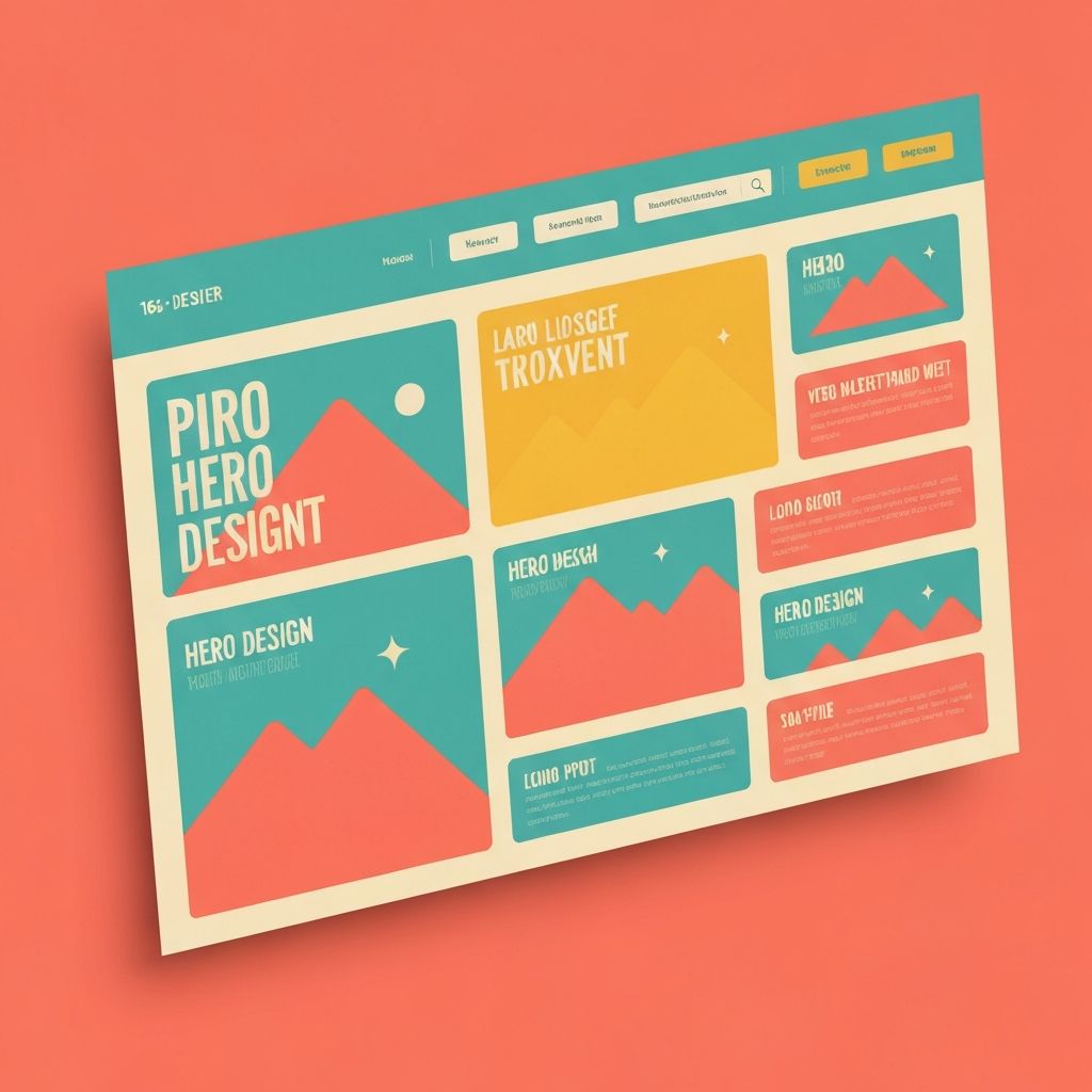
Web Design Trends 2017
Web Design in 2017: A Transformative Year
The year 2017 represented a period of bold experimentation in web design. With mobile-first design firmly established, designers focused on creating more distinctive, expressive experiences. New technologies enabled previously impossible interactions, while evolving user expectations pushed boundaries in various directions. At AAMAX.CO, we participated in and learned from these developments, building expertise that continues to benefit our clients today.
Bold Typography Takes Center Stage
Typography became more expressive and prominent than ever in 2017. Giant headlines, often spanning multiple lines and taking up significant screen real estate, created immediate visual impact. This wasn't just aesthetic choice—large typography improved readability on mobile devices and grabbed attention in scroll-heavy browsing patterns.
Creative font pairing pushed boundaries. Designers combined unexpected typefaces to create visual interest and brand differentiation. Serif fonts returned to web design after years of sans-serif dominance, adding warmth and character to digital experiences.
Variable fonts were announced though not yet widely supported. This technology, enabling single font files to contain multiple weights and styles, promised to revolutionize web typography. Forward-thinking designers began preparing for the possibilities variable fonts would unlock.
Duotone and Bold Color Schemes
Spotify popularized duotone imagery—photos filtered through two contrasting colors—and this treatment spread across the web in 2017. The technique created striking visuals while maintaining a unified color palette. It worked particularly well for hero images and featured content areas.
Bold, vibrant color schemes replaced the muted palettes that had dominated earlier flat design. Bright gradients returned, though more sophisticated than their pre-flat-design predecessors. Color became a tool for differentiation in increasingly crowded digital landscapes.
These bold approaches required careful implementation to maintain accessibility. Bright colors could clash with text readability if not properly balanced. The most successful implementations used bold accents strategically while maintaining comfortable reading experiences.
Broken Grid and Asymmetric Layouts
After years of clean, grid-based layouts, 2017 saw designers intentionally breaking grid conventions. Overlapping elements, asymmetric arrangements, and unexpected white space created dynamic compositions that felt fresh and memorable.
This approach required strong design fundamentals. Without the inherent structure of traditional grids, designers needed to create visual balance through other means—careful attention to weight, color, and negative space. Poorly executed grid-breaking just looked messy.
Broken grids worked particularly well for portfolios, creative agencies, and brands wanting to project innovative personality. More conservative industries generally maintained cleaner structures, demonstrating that trend adoption should always consider context and audience.
Illustrations and Custom Graphics
Custom illustrations became powerful brand differentiators in 2017. As stock photography felt increasingly generic, original illustrations provided unique visual personality that couldn't be replicated by competitors. Major tech companies invested heavily in illustration systems.
Illustration styles varied widely—from minimalist line art to detailed, textured drawings. The key was consistency with brand personality. Playful brands adopted whimsical illustrations; serious enterprises used more restrained approaches.
SVG format enabled resolution-independent illustrations that looked crisp at any size while keeping file sizes small. The combination of creative illustration and efficient delivery improved both aesthetics and performance.
Micro-Interactions and Animation
Subtle animations and micro-interactions became hallmarks of polished design in 2017. These small movements—buttons that responded to hover, progress indicators, loading animations—created more engaging, responsive-feeling interfaces.
CSS animation capabilities matured, reducing reliance on JavaScript for common effects. This improved performance while making animation more accessible to designers without deep programming skills. Animation became a design concern rather than purely a development one.
The best micro-interactions were purposeful rather than decorative. They provided feedback, guided attention, or smoothed transitions between states. Gratuitous animation that served no purpose other than showing off technical capability began to feel dated.
Mobile Navigation Evolution
The hamburger menu debate continued, with designers experimenting with alternatives that balanced visual cleanliness with discoverability. Bottom navigation bars, inspired by native apps, provided thumb-friendly access to primary functions on mobile devices.
Navigation complexity had to serve content complexity. Simple sites could afford minimal navigation; content-rich sites needed robust wayfinding systems. The most successful approaches matched navigation sophistication to actual user needs rather than following trends blindly.
Gesture-based navigation began appearing, though primarily in native apps. Swipe interactions and other gesture controls hinted at future interface possibilities that would eventually reach the web.
Conversational Interfaces and Chatbots
Chatbots emerged as a significant trend in 2017, with businesses across industries implementing conversational interfaces. Facebook Messenger bots, website chat widgets, and voice assistants promised more natural user interactions.
Reality tempered early chatbot enthusiasm. Many implementations frustrated users more than helped them. The technology worked best for simple, well-defined tasks rather than the open-ended conversations marketing materials suggested.
Despite limitations, chatbots pushed designers to think about conversational design patterns. Even when full chatbot implementation wasn't appropriate, conversational tone and progressive disclosure techniques influenced form design and user guidance.
Video Integration
Video content continued growing in importance. Autoplay background videos, product demonstrations, and video testimonials appeared throughout websites. YouTube and social media had conditioned users to expect video content.
Performance and accessibility challenges accompanied video integration. Autoplay videos could frustrate users with limited data plans or in quiet environments. Accessible implementations required captions, transcripts, and controls for users who couldn't or didn't want video content.
Live video and streaming began appearing in web contexts, enabled by improving technology and growing user comfort with video communication. These trends foreshadowed video's increasing importance in subsequent years.
Split-Screen Layouts
Split-screen designs, dividing the viewport into two distinct sections, provided versatile layouts for various content needs. This approach worked well for presenting alternatives (two products, before/after comparisons) or creating visual tension that drew attention.
On larger screens, split layouts created dramatic impact. On mobile, they typically stacked vertically, requiring careful consideration of how the experience translated across devices. The responsive behavior often determined whether split layouts succeeded.
The split-screen trend reflected broader experimentation with screen real estate. As screens grew larger and varied more widely, designers explored new ways to use available space effectively.
CSS Grid Arrives
CSS Grid Layout achieved broad browser support in 2017, fundamentally changing layout possibilities. Unlike earlier techniques, Grid was designed specifically for two-dimensional layouts, making complex arrangements possible with clean, maintainable code.
Early Grid adoption was cautious as browsers caught up and designers learned new capabilities. Those who invested in learning Grid gained powerful layout tools that enabled previously difficult designs. Our front-end web development team embraced Grid early and continues leveraging its capabilities.
Grid's arrival marked a shift in how designers thought about layouts. Rather than fighting against technical limitations, designers could finally implement their visions more directly. This technical enablement influenced the design possibilities that followed.
Progressive Web Apps Emerge
Progressive Web Apps (PWAs) began gaining traction, promising app-like experiences through web technology. Service workers enabled offline functionality; add-to-homescreen prompts brought websites to mobile home screens. The line between web and native apps started blurring.
PWA capabilities influenced design decisions. Offline-first thinking affected content strategy; app-like interactions influenced navigation patterns. Even websites not fully implementing PWA features began adopting aspects of the philosophy.
Performance optimization, already important, became even more critical for PWAs. Fast loading wasn't just about user experience—it enabled specific PWA features and behaviors. This reinforced trends toward performance-conscious design.
Authenticity and Personality
Perhaps the overarching theme of 2017 web design was the pursuit of authenticity and personality. Generic templates and stock imagery felt increasingly inadequate as users encountered countless similar-looking sites. Standing out required genuine expression of brand identity.
This manifested in custom illustrations, unique photography, distinctive typography choices, and voice/tone that felt human rather than corporate. Users responded to brands that felt real and relatable.
Our website design services emphasize this authenticity, creating distinctive digital presences that truly represent each client's unique identity. The lessons of 2017 about standing out through genuine personality remain essential today.
Lessons for Today
The trends of 2017 remind us that the most impactful design decisions serve both aesthetics and function. Bold typography improved readability while creating visual interest. Micro-interactions enhanced usability while adding polish. The best trends succeeded because they solved real problems.
Trends that were purely aesthetic without functional benefit faded more quickly. Understanding this helps evaluate current trends—those grounded in user benefit will likely persist; those that are purely fashionable will likely pass.
Contact us to discuss how our experience navigating design evolution can help your business create a lasting, effective digital presence.
Want to publish a guest post on aamax.co?
Place an order for a guest post or link insertion today.
Place an Order