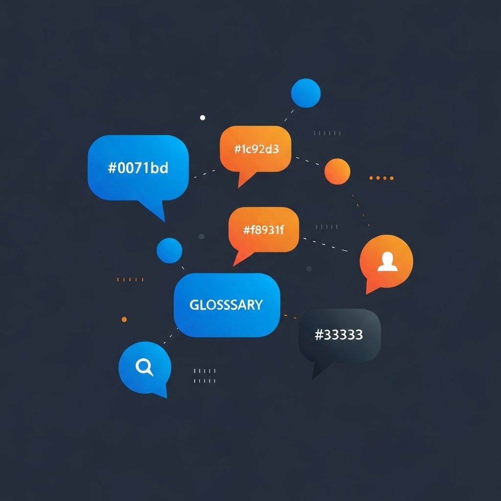
Web Design Terminology
Understanding Web Design Terminology
Effective communication about web design requires familiarity with industry terminology. Whether you're working with designers, discussing projects with stakeholders, or expanding your own knowledge, understanding these terms ensures clarity and prevents misunderstandings. This comprehensive glossary covers essential terminology that every person involved with web design should know.
At AAMAX.CO, we communicate clearly with our clients, but we also believe in empowering them with knowledge. Understanding the language of web design helps you participate more effectively in project discussions and make informed decisions about your digital presence.
Layout and Structure Terms
Above the Fold refers to content visible without scrolling when a page first loads. This term originated from newspaper design, where content above the physical fold received the most attention. In web design, above-the-fold content receives the highest visibility and typically includes key messages and primary calls-to-action.
Viewport describes the visible area of a web page within the browser window. Viewport dimensions vary across devices, from small smartphone screens to large desktop monitors. Responsive design adapts layouts to different viewport sizes.
Grid System provides the structural framework for organizing page content into columns and rows. Grid systems ensure alignment, consistency, and visual harmony across pages. Most professional website design relies on underlying grid structures.
White Space (also called negative space) refers to empty areas between and around design elements. Despite its name, white space need not be white—it simply represents unmarked areas that provide visual breathing room and improve content readability.
Hero Section describes the prominent banner area typically found at the top of web pages. Hero sections often feature large images or videos, headline text, and primary calls-to-action. This area makes the crucial first impression on visitors.
Typography Terms
Typography encompasses all aspects of text appearance and arrangement, including font selection, sizing, spacing, and hierarchy. Good typography significantly impacts readability, aesthetics, and user experience.
Font Family refers to a group of related fonts sharing common design characteristics but varying in weight, style, or width. Examples include Arial, Georgia, and Roboto. Selecting appropriate font families affects brand perception and readability.
Serif and Sans-Serif describe the two primary font categories. Serif fonts feature small decorative strokes (serifs) at letter endpoints, while sans-serif fonts lack these embellishments. Each category conveys different aesthetic qualities and suits different applications.
Line Height (leading) measures the vertical space between lines of text. Appropriate line height improves readability—too tight creates cramped text, while too loose breaks visual connection between lines.
Kerning refers to adjusting space between specific character pairs to achieve visually consistent spacing. Poor kerning creates awkward gaps or collisions between letters that trained eyes immediately notice.
Color Terms
Color Palette describes the set of colors used throughout a design. Professional designs typically use limited palettes of 3-5 colors plus neutrals, ensuring visual cohesion without monotony.
Hex Code represents colors using six-character combinations of numbers and letters (e.g., #FF5733). This notation precisely specifies colors for consistent reproduction across digital platforms.
RGB and RGBA define colors through red, green, and blue values (0-255 each). RGBA adds an alpha channel for transparency control. These color models suit digital displays.
Contrast Ratio measures the difference in luminance between foreground and background colors. WCAG accessibility guidelines specify minimum contrast ratios for text readability, particularly important for users with visual impairments.
Color Psychology studies how colors influence human perception and behavior. Different colors evoke different emotional responses, making color selection strategic rather than purely aesthetic.
User Experience Terms
UX (User Experience) encompasses all aspects of user interaction with a product, including usability, accessibility, and emotional response. Good UX design creates satisfying, efficient experiences that meet user needs.
UI (User Interface) refers to the visual elements users interact with, including buttons, forms, navigation menus, and icons. UI design focuses on creating intuitive, attractive interfaces.
Wireframe represents a basic structural blueprint of a page, showing element placement without visual design details. Wireframes facilitate layout planning and stakeholder alignment before detailed design begins.
Prototype provides an interactive model demonstrating how a design will function. Prototypes range from simple clickable mockups to sophisticated simulations enabling user testing before development.
User Flow diagrams the path users take through a website to accomplish specific goals. Understanding user flows helps designers optimize journeys and identify friction points.
Technical Terms
HTML (HyperText Markup Language) provides the structural foundation of web pages, defining content organization through semantic elements. HTML tells browsers what content means and how it relates.
CSS (Cascading Style Sheets) controls visual presentation of HTML elements, including colors, fonts, layouts, and animations. CSS separates presentation from structure, enabling consistent styling across pages.
JavaScript enables interactive and dynamic website behavior. This programming language handles user interactions, data processing, animations, and communication with servers.
Responsive Design creates websites that adapt to different screen sizes and devices. Responsive techniques ensure optimal experiences whether users access sites from phones, tablets, or desktops. Our website development services always incorporate responsive design.
API (Application Programming Interface) defines how different software systems communicate. APIs enable websites to integrate with external services, databases, and platforms.
Navigation Terms
Navigation refers to elements enabling users to move through a website, including menus, links, and buttons. Clear navigation is fundamental to usable websites.
Breadcrumbs display the user's current location within site hierarchy, showing the path from homepage to current page. Breadcrumbs aid orientation and provide quick access to parent pages.
Mega Menu presents expanded navigation options in large dropdown panels, often organized in columns. Mega menus suit complex sites with extensive content requiring organized access.
Hamburger Menu refers to the three-line icon representing hidden navigation, commonly used on mobile devices. Clicking or tapping reveals the full navigation menu.
Footer Navigation provides secondary navigation links at page bottoms, typically including site maps, legal pages, social links, and contact information.
Performance Terms
Page Speed measures how quickly page content loads and becomes usable. Fast page speeds improve user experience and search rankings, making optimization essential.
Core Web Vitals are Google's metrics measuring user experience aspects including loading performance, interactivity, and visual stability. These metrics influence search rankings.
Caching stores copies of resources for faster subsequent access. Browser caching, server caching, and CDN caching all contribute to improved performance.
CDN (Content Delivery Network) distributes content across geographically distributed servers, reducing latency by serving assets from locations near users.
Minification removes unnecessary characters from code files (spaces, comments) without changing functionality, reducing file sizes for faster loading.
SEO Terms
SEO (Search Engine Optimization) encompasses techniques improving website visibility in search engine results. SEO involves content, technical, and authority-building strategies.
Meta Tags provide information about pages to search engines and social platforms. Title tags and meta descriptions influence click-through rates from search results.
Alt Text describes images for screen readers and search engines. Descriptive alt text improves accessibility while supporting image search optimization.
Backlink refers to links from external websites pointing to your site. Quality backlinks signal authority to search engines, improving rankings.
Sitemap lists all pages on a website, helping search engines discover and index content. XML sitemaps are submitted to search engines while HTML sitemaps aid user navigation.
CMS Terms
CMS (Content Management System) software enables non-technical users to create and manage website content. WordPress, Drupal, and Joomla represent popular CMS options. Our WordPress development services customize this leading CMS.
Theme provides visual design templates for CMS websites, controlling appearance while the CMS manages content. Themes can be customized or built from scratch.
Plugin extends CMS functionality through additional code modules. Plugins add features like contact forms, e-commerce, security, and performance optimization.
WYSIWYG (What You See Is What You Get) editors show content as it will appear when published, enabling visual editing without code knowledge.
Development Terms
Front-End refers to everything users see and interact with directly—the visual interface built with HTML, CSS, and JavaScript. Our front-end web development creates these user-facing elements.
Back-End encompasses server-side operations including databases, server logic, and application functionality invisible to users. Our back-end web development builds these supporting systems.
Full-Stack development combines front-end and back-end skills, enabling developers to build complete applications independently.
Framework provides pre-built code structures and conventions that accelerate development. Examples include React, Angular, and Vue for front-end; Express, Django, and Rails for back-end.
Repository stores and tracks code versions, enabling collaboration and change management. Git repositories on platforms like GitHub are industry standard.
Accessibility Terms
Accessibility (a11y) ensures websites work for users with disabilities, including visual, auditory, motor, and cognitive impairments. Accessible design benefits all users.
WCAG (Web Content Accessibility Guidelines) provides standards for accessible web content. These guidelines define levels of conformance (A, AA, AAA) with increasing requirements.
Screen Reader software converts digital content to speech or braille for blind users. Accessible websites work properly with screen readers.
ARIA (Accessible Rich Internet Applications) attributes provide additional information to assistive technologies, improving accessibility of dynamic content.
Conclusion: Speaking the Language
Familiarity with web design terminology enables effective participation in discussions about your digital presence. While this glossary covers essential terms, the field continues evolving with new terminology emerging alongside new technologies and practices.
We welcome questions about any terminology or concepts you encounter. Clear communication ensures successful project outcomes, and we're committed to helping clients understand every aspect of their web design projects. Contact us to discuss how we can help with your web application development or other digital needs.
Want to publish a guest post on aamax.co?
Place an order for a guest post or link insertion today.
Place an Order