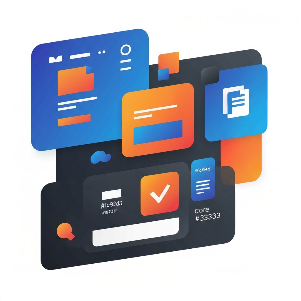
Web Design Fundamentals
The Foundation of Effective Web Design
Web design fundamentals form the bedrock upon which all successful websites are built. Understanding these core principles—whether you're a business owner evaluating agencies or a designer refining your craft—enables better decision-making and ultimately better results. Great websites don't happen by accident; they emerge from deliberate application of proven design principles.
The digital landscape evolves rapidly, with new trends, technologies, and best practices emerging constantly. Yet fundamental principles remain remarkably consistent. Visual hierarchy, balance, contrast, and usability have guided effective design for decades. At AAMAX.CO, we combine these timeless fundamentals with modern techniques to create websites that perform.
Visual Hierarchy: Guiding the Eye
Visual hierarchy determines what visitors see first, second, and third when viewing a page. Through size, color, contrast, and positioning, designers establish clear paths through content. Without effective hierarchy, visitors face overwhelming walls of equally-weighted information, leading to confusion and abandonment.
Primary elements—headlines, key messages, and calls-to-action—should command immediate attention through size, contrast, or positioning. Secondary elements provide supporting information once primary attention is captured. Tertiary elements fill in details for visitors seeking deeper engagement.
The inverted pyramid approach places crucial information prominently at the top, with detail increasing as visitors scroll. This respects that most visitors scan rather than read thoroughly, ensuring key messages reach even casual browsers.
Layout and Composition Principles
Layout determines how elements are arranged on a page, influencing both aesthetics and usability. Grid systems provide underlying structure that creates visual consistency and alignment. Most websites employ grid layouts—whether visible or invisible—to organize content logically.
White space (also called negative space) is a crucial layout element that many underestimate. Adequate spacing around elements prevents crowding, improves readability, and creates visual breathing room. Cramped layouts feel overwhelming; generous white space conveys sophistication and confidence.
Balance doesn't require symmetry but does require visual equilibrium. Asymmetrical layouts can feel dynamic and modern while still achieving balance through careful distribution of visual weight. Our website design services apply these composition principles to create layouts that are both beautiful and functional.
Typography in Web Design
Typography encompasses more than font selection—it includes size, weight, spacing, and how text elements work together. Effective typography enhances readability, establishes hierarchy, and contributes to brand personality. Poor typography, conversely, can undermine otherwise solid designs.
Font pairing combines complementary typefaces for visual interest while maintaining cohesion. Typically, websites use one font for headlines and another for body text. The fonts should contrast enough to differentiate roles while sharing enough characteristics to feel unified.
Line height, letter spacing, and paragraph width significantly impact readability. Lines that are too long exhaust readers; lines that are too short create choppy reading experiences. Optimal body text width falls between 50-75 characters per line. Adequate line height—typically 1.4 to 1.6 times font size—prevents lines from feeling cramped.
Color Theory and Application
Color profoundly influences perception, emotion, and behavior. Color choices affect how visitors feel about your brand, whether they trust your business, and what actions they take. Strategic color application supports business goals while creating visual appeal.
Color psychology associates different hues with specific emotions and concepts. Blues convey trust and professionalism. Greens suggest growth and environmental consciousness. Oranges and reds create urgency and excitement. While not universal rules, these associations influence perception for many visitors.
Effective color schemes typically limit primary palette to 2-3 colors plus neutrals. Accent colors draw attention to key elements like calls-to-action. Consistency in color application reinforces brand identity and creates visual cohesion across pages.
Contrast between text and background affects readability and accessibility. Insufficient contrast strains eyes and excludes visitors with visual impairments. Web accessibility guidelines specify minimum contrast ratios that ensure content is readable for all visitors.
User Experience (UX) Fundamentals
User experience encompasses every aspect of how visitors interact with your website. Good UX means visitors accomplish their goals efficiently and enjoyably. Bad UX frustrates visitors, damages brand perception, and loses potential customers.
User-centered design prioritizes visitor needs over designer preferences or client wishes. Understanding who visits your site, what they're trying to accomplish, and what obstacles they face enables designs that truly serve users. Research methods like user interviews, surveys, and analytics provide insights that inform design decisions.
Intuitive navigation allows visitors to find information without thinking. Conventions exist for good reasons—visitors expect logos linking to homepages, primary navigation in headers, and similar patterns. Innovating on conventions requires compelling justification.
Responsive and Mobile Design
Responsive design ensures websites function effectively across all device sizes. As mobile usage continues growing, designing primarily for large screens then adapting for mobile no longer suffices. Mobile-first approaches design for small screens initially, then enhance for larger displays.
Responsive design involves more than shrinking elements proportionally. Touch interfaces require larger tap targets than mouse interfaces. Navigation patterns must adapt for devices without hover states. Content priorities may differ between users on phones versus desktops.
Our front-end web development team implements responsive design that goes beyond basic adaptation, creating optimized experiences for every device type your visitors use.
Loading Speed and Performance
Page speed is both a design and development consideration with significant business impact. Slow-loading pages frustrate visitors, increase bounce rates, and hurt search rankings. Every second of delay costs conversions and revenue.
Design decisions directly affect performance. Large, unoptimized images are primary offenders. Complex animations and effects add weight. Excessive third-party scripts slow rendering. Designers must balance visual ambition with performance constraints.
Performance optimization techniques include image compression, lazy loading, code minification, and strategic caching. Our website development services prioritize performance, ensuring designs load quickly without sacrificing visual impact.
Accessibility in Web Design
Accessible design ensures websites are usable by people with various disabilities—visual, auditory, motor, and cognitive. Beyond ethical responsibility, accessibility often correlates with better usability for all visitors and provides SEO benefits.
Key accessibility considerations include sufficient color contrast, keyboard navigability, proper heading structure, alternative text for images, and caption or transcript options for multimedia. These considerations should be integrated throughout design and development, not retrofitted afterward.
Accessibility guidelines (WCAG) provide specific criteria for compliance at different levels. Even if not legally required for your business, meeting accessibility standards demonstrates commitment to inclusive user experience.
Conversion-Centered Design
Websites exist to achieve business objectives, and design should support those goals. Conversion-centered design applies psychological principles and strategic thinking to optimize visitor actions—whether purchases, signups, inquiries, or other desired outcomes.
Clear calls-to-action tell visitors exactly what to do next. Button design, placement, and copy all influence click-through rates. Reducing friction in conversion processes—simplifying forms, eliminating unnecessary steps—improves completion rates.
Trust elements—testimonials, security badges, professional design quality—address visitor hesitations that prevent conversions. Social proof, urgency, and scarcity (when authentic) can ethically influence behavior.
Consistency and Brand Coherence
Consistency creates professionalism and builds familiarity. Consistent use of colors, fonts, spacing, button styles, and interaction patterns across all pages creates cohesive experiences. Inconsistency confuses visitors and undermines trust.
Brand coherence extends beyond visual elements to voice, tone, and messaging. How content is written should align with design aesthetics and overall brand positioning. A playful visual design with formal, corporate copy creates cognitive dissonance.
Applying Fundamentals to Your Project
Understanding fundamentals helps you evaluate design proposals, provide informed feedback, and make better decisions throughout web projects. These principles aren't rules to follow blindly but guidelines to apply thoughtfully based on specific contexts and goals.
We bring deep expertise in web design fundamentals to every project. Our team applies these principles consistently while adapting approaches to each client's unique needs, audience, and objectives. The result is websites that look great, function flawlessly, and achieve business goals.
Whether you're planning a new website or evaluating your current site against these fundamentals, we're here to help. Contact us to discuss how solid design principles can transform your online presence and drive better results for your business.
Want to publish a guest post on aamax.co?
Place an order for a guest post or link insertion today.
Place an Order