Web Design Flat
What Is Flat Web Design?
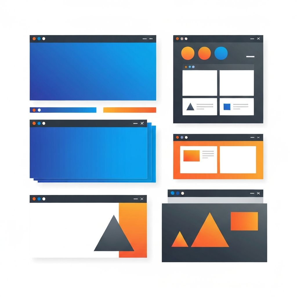
Flat web design is a style that emphasizes minimalism, clean two-dimensional visuals, and a deliberate absence of skeuomorphic effects like drop shadows, gradients, textures, and three-dimensional simulations. It rose to prominence in the early 2010s as a counter-reaction to the heavily textured, button-mimicking style that dominated the early iOS era. Flat design quickly became the default visual language of the modern web, influencing everything from mobile operating systems to enterprise software. At AAMAX.CO, we have used flat design principles in countless projects and continue to evolve them for modern needs.
This article explores the origins of flat design, its core principles, common pitfalls, and how it has evolved into hybrid approaches like flat 2.0 and material design. By the end, you will have a clear framework for applying flat design effectively in your own projects.
The History of Flat Design
Flat design's roots trace back to Swiss style and modernist graphic design from the mid-20th century. Designers like Josef Müller-Brockmann championed clean grids, sans-serif typography, and minimal ornamentation. These principles influenced print design for decades before re-emerging in digital form.
The breakthrough moment for flat design in tech came when Microsoft launched Metro design language for Windows Phone and later Windows 8. Apple followed in 2013 with iOS 7, which dramatically simplified iPhone interfaces by removing skeuomorphic textures. Google's material design followed in 2014, blending flat principles with subtle depth cues. Together, these milestones established flat design as the dominant interface aesthetic of the decade.
Core Principles of Flat Design
Flat design is governed by several core principles. First, eliminate unnecessary visual effects. No gradients, drop shadows, embossed buttons, or three-dimensional textures. Second, embrace strong typography. Without textures and effects to lean on, type carries much of the visual weight. Third, use bold, vibrant colors strategically. Flat design often features wider color palettes than other styles to create hierarchy and visual interest without relying on depth.
Fourth, prioritize clarity and usability. Flat design's restraint serves usability by reducing visual noise and helping users focus on content and actions. Fifth, use ample whitespace. Open space lets each element breathe and reinforces the calm, modern feel of flat layouts. Sixth, choose simple, geometric icons over complex illustrations.
Common Pitfalls of Pure Flat Design
Despite its strengths, pure flat design has notable weaknesses. The biggest is reduced affordance. Without shadows, gradients, or depth cues, users sometimes struggle to identify which elements are clickable buttons versus static text. This led to widespread usability complaints in the early days of flat design.
Another pitfall is visual monotony. Without depth or texture, flat designs can feel cold or generic, especially when designers rely on a small set of stock illustrations and color palettes. The internet briefly had a moment in the late 2010s where every SaaS landing page looked nearly identical due to overuse of the same flat illustration style.
Flat 2.0 and Hybrid Approaches
In response to these issues, designers developed flat 2.0, which retains flat design's minimalism but reintroduces subtle depth cues like soft shadows, gentle gradients, and layered elements. This approach preserves clarity while restoring the affordance and richness that pure flat design lacked.
Google's material design takes a similar approach by simulating physical material properties: surfaces have edges, cast subtle shadows, and respond to interaction with realistic motion. The result is interfaces that feel both modern and intuitive. Our designers at AAMAX often draw on these hybrid approaches to deliver layouts that feel both clean and inviting.
When to Use Flat Design
Flat design works exceptionally well for certain types of websites. SaaS landing pages, corporate websites, dashboards, and content-focused sites all benefit from the clarity and modernity flat design offers. The style aligns with values like efficiency, transparency, and forward-thinking innovation, making it a natural fit for technology brands.
It is less ideal for projects that demand emotional richness, atmosphere, or storytelling. Luxury fashion brands, high-end hospitality, and editorial websites often need richer visual languages with custom illustration, photography, and depth. The right style always depends on the brand's personality and goals.
Typography in Flat Design
Typography carries enormous weight in flat design. Without textures or effects to lean on, fonts must do the heavy lifting of communicating personality and hierarchy. Designers typically choose clean sans-serifs like Inter, Helvetica, or system fonts for their crispness and legibility. For more personality, geometric sans-serifs like Avenir or DM Sans add warmth without losing the modern feel.
Hierarchy in flat design is established through size, weight, and spacing rather than decorative effects. Bold display fonts for headlines, generous line heights for body text, and consistent vertical rhythm across pages create a polished, professional feel.
Color Theory in Flat Design
Flat design embraces strong, intentional color choices. Whereas earlier web styles often relied on subtle gradients and muted palettes, flat design favors bold, saturated colors that create clear visual hierarchy. Brands like Trello, Asana, and Slack popularized this approach with vibrant primary colors and deliberate accent usage.
However, accessibility must remain a priority. High contrast between text and backgrounds is essential. Tools like the WebAIM contrast checker help designers ensure their flat color palettes meet WCAG accessibility standards. We integrate accessibility checks throughout the design process so flat layouts work for all users.
Iconography and Illustration
Flat design relies heavily on simple, geometric icons and illustrations. Icon sets like Lucide, Heroicons, and Tabler offer thousands of consistent, scalable icons that fit flat aesthetics perfectly. For illustration, line-based or geometric styles maintain the flat feel while adding personality. Custom illustration commissioned for your brand can dramatically elevate flat designs above generic templates.
Responsive Considerations
Flat design adapts beautifully to responsive layouts because it relies on geometry and typography rather than complex effects. Removing skeuomorphic textures simplifies the work of maintaining quality across screen sizes. Our front-end web development team builds flat-design websites that look stunning from mobile to ultra-wide desktops without sacrificing performance or fidelity.
The Future of Flat Design
Flat design continues to evolve. Recent trends include neumorphism, glassmorphism, and aurora effects that blend flat principles with subtle depth and light effects. Designers experiment with bold typography, expressive color, and interactive motion to keep flat layouts feeling fresh. The core principles of clarity, restraint, and modernity remain timeless, even as visual treatments continue to shift.
Hire AAMAX.CO for Modern Flat Web Design
If you are considering a flat design approach for your website, partnering with experienced designers makes all the difference. We are a full-service digital agency offering web development, digital marketing, and SEO services. Our designers blend timeless flat design principles with modern depth, motion, and brand expression to deliver websites that feel both classic and contemporary. Hire AAMAX.CO for expert website design that turns visitors into customers.
Want to publish a guest post on aamax.co?
Place an order for a guest post or link insertion today.
Place an Order