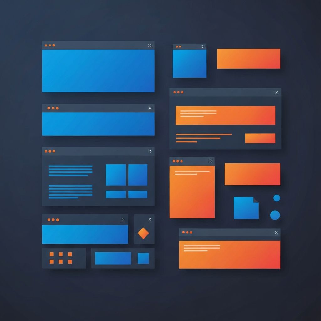
Top Web Design 2015
Why 2015 Still Matters in Web Design
To understand modern web design, it helps to look back at pivotal moments in its evolution. The year 2015 was a watershed for the industry. It was the year flat design fully matured, mobile-first thinking became mainstream, and the foundations for today's sophisticated web experiences were laid. Many of the principles we still rely on every day were either introduced or refined during that period. Studying that era is not nostalgia. It is a way to understand why current best practices exist.
At AAMAX.CO, we believe that great design draws on history while looking ahead. As a full-service digital marketing company offering web development, digital marketing, and SEO services, we have been part of the industry's evolution and continue to apply lessons learned from each era to the projects we build today.
The Shift From Skeuomorphism to Flat Design
The years leading up to 2015 saw a dramatic shift away from skeuomorphic interfaces, which mimicked real-world textures and objects, toward flat design. By 2015, flat design had become the dominant aesthetic across web and mobile. Buttons lost their drop shadows and gradients. Icons became simple, solid shapes. Typography took center stage as a primary design element.
This shift was not just about aesthetics. Flat design loaded faster, scaled better across screen sizes, and aligned with the responsive web that was rapidly becoming the norm. The minimalist sensibility that emerged in 2015 still influences our work today, including the foundation we lay during every Website Design engagement.
Mobile-First Becomes the Default
By 2015, smartphone usage had surpassed desktop in many regions. Designers and developers responded by embracing mobile-first design as a guiding philosophy. Instead of designing for desktop and shrinking down, teams began designing for the smallest screen first and progressively enhancing for larger viewports. This change forced designers to focus on essentials, eliminate clutter, and prioritize content.
Responsive design also matured significantly during this period. CSS media queries, fluid grids, and flexible images became standard tools. The Bootstrap framework popularized component-based responsive design, making it accessible to teams of all sizes.
Long-Form Scroll and Single Page Layouts
2015 was the year long-form scrolling truly came of age. Brands embraced single page layouts that combined storytelling, parallax effects, and rich imagery into immersive experiences. The hero section became a canvas for bold typography and full-bleed photography. Designers learned how to lead users through long pages with clear visual rhythm and strategic call-to-action placement.
Many of these techniques still inform how we approach landing pages today. Storytelling through scroll remains one of the most effective ways to communicate complex value propositions, and our team has refined the approach across hundreds of projects.
Hero Images, Video Backgrounds, and Bold Typography
Large hero images dominated 2015 home pages, often paired with full-screen video backgrounds. The combination delivered an instant emotional impact that simpler designs could not match. Bold, oversized typography became a signature look, with fonts like Lato, Montserrat, and Open Sans appearing on countless sites.
While trends have evolved since then, the underlying lesson remains valid. Visual impact in the first few seconds is critical. Today's sites still use hero sections strategically, just with more attention to performance, accessibility, and storytelling sophistication.
Card-Based Layouts and Material Design
Google's introduction of Material Design in 2014 had a massive influence on 2015 web design. Card-based layouts became ubiquitous, providing a flexible system for displaying diverse content in a uniform way. Cards worked beautifully across screen sizes and gave designers a powerful pattern for dashboards, feeds, and product listings.
This pattern is now baked into virtually every modern UI framework, and we use it extensively in our Web Application Development projects to deliver clean, scalable interfaces.
Performance and Page Weight Awareness
2015 also marked an important shift in how the industry thought about performance. As pages grew heavier with images, scripts, and tracking pixels, designers and developers began to push back. Performance budgets, lazy loading, and image optimization became standard topics in design discussions. Tools like Google PageSpeed Insights raised awareness about the cost of bloat.
This focus on performance has only intensified. Today's Core Web Vitals and modern build tools owe much to the awareness raised during the 2015 era. Our team continues this tradition with rigorous performance practices in every Website Development engagement.
Microinteractions and Subtle Animation
Designers in 2015 embraced microinteractions as a way to add personality and feedback to interfaces. Hover states, button animations, loading indicators, and form validation all became opportunities for thoughtful motion design. The best examples felt alive without being distracting.
Modern motion design has built on this foundation, with even more sophisticated tools and frameworks available. The core lesson remains that motion should always serve communication, never decoration.
Content Strategy Steps Forward
2015 also saw content strategy take a more central role in design. Designers learned to work with real content rather than lorem ipsum, to consider voice and tone, and to design for scenarios rather than abstract layouts. This shift produced sites that felt more authentic and aligned with brand storytelling.
The CMS Evolution
WordPress was already dominant in 2015, but new CMS options were emerging. Editorial teams demanded more flexible authoring experiences, and the seeds of today's headless CMS movement were being planted. We honor this lineage through our continued investment in WordPress and modern CMS platforms, helping clients choose the right tool for their workflow needs.
Lessons That Carry Forward
The most important takeaway from looking back at 2015 is that great web design balances aesthetic ambition with practical realities. Performance, accessibility, content, and user needs were front and center then, and they remain central now. The technology has changed, but the principles endure.
Our team draws on more than a decade of evolving experience to help clients avoid trendy mistakes and invest in design that lasts. Whether you are launching your first website or modernizing a legacy property, we bring this perspective to every project.
Build the Next Era With Us
If you are inspired by the design history that shaped today's web and want a partner who understands both the past and the future, we would love to talk. Our team blends timeless design principles with cutting-edge technology to help your brand stand out. Reach out and let us build a website that respects history while leading you confidently into what comes next.
Want to publish a guest post on aamax.co?
Place an order for a guest post or link insertion today.
Place an Order