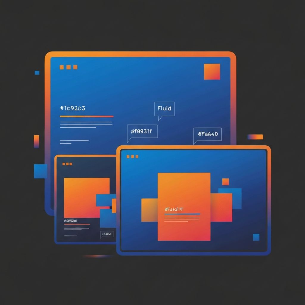
Responsive vs Adaptive Web Design
Understanding the Fundamentals of Modern Web Design Approaches
In the ever-evolving landscape of digital technology, the way websites adapt to different screen sizes has become a critical factor in determining online success. Two primary methodologies have emerged as the frontrunners in creating flexible, user-friendly websites: responsive web design and adaptive web design. Understanding the nuances between these two approaches is essential for any business looking to establish a strong online presence.
At AAMAX.CO, we specialize in creating websites that not only look stunning but also perform exceptionally across all devices. Our team of expert designers and developers understands that choosing the right design approach can significantly impact your website's performance, user engagement, and ultimately, your bottom line.
What is Responsive Web Design?
Responsive web design is a fluid approach that uses flexible grids, layouts, images, and CSS media queries to automatically adjust the website's appearance based on the screen size of the device being used. Think of it as water taking the shape of its container – the content flows and reorganizes itself to fit any screen perfectly.
The core principles of responsive design include fluid grids that use relative units like percentages instead of fixed pixels, flexible images that scale within their containing elements, and media queries that apply different CSS styles based on device characteristics. This approach ensures that whether a visitor is using a smartphone, tablet, laptop, or desktop computer, they receive an optimized viewing experience without the need for separate versions of the website.
One of the significant advantages of responsive design is its maintenance efficiency. Since there is only one version of the website to manage, updates and changes need to be made only once. This translates to reduced development costs and faster deployment of new features or content updates.
What is Adaptive Web Design?
Adaptive web design takes a different approach by creating multiple fixed layouts that are designed for specific screen sizes or device types. Instead of fluidly adjusting, an adaptive website detects the device being used and serves the most appropriate pre-designed layout for that particular screen size.
Typically, adaptive designs include layouts optimized for common breakpoints such as 320px for mobile phones, 480px for larger smartphones, 768px for tablets, 1024px for small laptops, and 1200px or larger for desktop computers. When a user visits the site, the server or client-side code determines which layout to display based on the detected device.
The adaptive approach offers more control over the design for each specific device category. Designers can craft pixel-perfect experiences for each breakpoint, ensuring that every element appears exactly as intended on the target devices. This level of control can be particularly beneficial for complex designs or when specific functionality needs to differ significantly between device types.
Key Differences Between Responsive and Adaptive Design
Understanding the fundamental differences between these two approaches is crucial for making an informed decision about your website design strategy. The primary distinction lies in how each method handles the transition between different screen sizes.
Responsive design uses a single fluid layout that continuously adapts as the screen size changes. If you were to slowly resize your browser window on a responsive site, you would see the elements gradually shift and reorganize in real-time. This creates a seamless experience across the entire spectrum of screen sizes.
Adaptive design, on the other hand, snaps between fixed layouts at predetermined breakpoints. When resizing the browser window, you might not see any changes until you cross a specific threshold, at which point the entire layout switches to the next predetermined design. This can sometimes result in a slightly jarring transition but allows for more precise control over each layout.
Performance Considerations
Performance is a critical factor in modern web development, affecting everything from user experience to search engine rankings. Both responsive and adaptive designs have their own performance characteristics that should be considered during the planning phase of your website development project.
Responsive websites typically load the same content regardless of the device, using CSS to hide or reorganize elements as needed. While this simplifies development, it can sometimes result in mobile devices downloading unnecessary assets intended for larger screens. However, modern techniques like responsive images and lazy loading can mitigate these issues effectively.
Adaptive websites can be optimized to serve only the assets needed for each specific device category. This targeted approach can result in faster load times, particularly on mobile devices with limited bandwidth. However, this optimization requires more development effort and careful planning to implement correctly.
SEO Implications of Each Approach
Search engine optimization is a vital consideration for any website, and your choice of design approach can impact your SEO performance. Google and other search engines have expressed a preference for responsive design, primarily because it simplifies their crawling and indexing processes.
With responsive design, search engines only need to crawl and index a single URL for each page, which is the same URL used by all devices. This eliminates issues related to duplicate content and ensures that all link equity is consolidated to a single URL. Additionally, responsive design aligns well with Google's mobile-first indexing approach.
Adaptive design can present more challenges for SEO if not implemented correctly. If separate URLs are used for different device versions, proper canonical tags and redirects must be configured to avoid duplicate content issues. However, when properly implemented with the same URLs for all device versions, adaptive design can also achieve excellent SEO results.
When to Choose Responsive Design
Responsive design is often the preferred choice for many modern websites, particularly when budget constraints require a single solution that works across all devices. It is ideal for content-heavy websites like blogs, news sites, and portfolios where the primary goal is to present information consistently across all devices.
If your website needs to be future-proof against new device sizes and form factors, responsive design offers the most flexibility. Since it adapts fluidly to any screen size, new devices are automatically accommodated without requiring additional design work. This makes it an excellent choice for businesses looking for long-term maintainability.
Our front-end web development team frequently recommends responsive design for clients who prioritize ease of maintenance and want a consistent brand experience across all devices. The single codebase approach also facilitates easier updates and reduces the risk of inconsistencies between device versions.
When to Choose Adaptive Design
Adaptive design may be the better choice when you need highly optimized experiences for specific device categories. E-commerce websites with complex product pages, applications with device-specific features, or sites targeting a well-defined range of devices can benefit from the precise control that adaptive design offers.
If your analytics show that the majority of your traffic comes from a limited set of device sizes, adaptive design allows you to focus your design efforts on optimizing for those specific devices. This targeted approach can result in superior user experiences for your primary audience segments.
Organizations with the resources to maintain multiple layout versions may find that adaptive design offers the best balance of performance and user experience. However, this approach requires careful planning and ongoing maintenance to ensure all versions remain synchronized and up to date.
Hybrid Approaches and Modern Best Practices
In practice, many modern websites employ a hybrid approach that combines elements of both responsive and adaptive design. This might involve using responsive techniques for general layout fluidity while implementing adaptive breakpoints for significant layout changes at specific screen sizes.
Our web application development services often incorporate this hybrid methodology, leveraging the strengths of both approaches to create optimal user experiences. By understanding the specific needs of each project, we can determine the most effective combination of techniques.
Progressive enhancement and mobile-first design principles have also become integral to modern web development. By starting with a basic mobile experience and progressively adding features and complexity for larger screens, developers can ensure that all users receive an appropriate experience regardless of their device capabilities.
Making the Right Choice for Your Business
The decision between responsive and adaptive design should be based on a careful analysis of your specific business needs, target audience, budget, and long-term goals. Consider factors such as your audience's device usage patterns, the complexity of your content and functionality, your available development resources, and your ongoing maintenance capabilities.
At AAMAX.CO, we work closely with our clients to understand their unique requirements and recommend the most suitable approach for their situation. Whether you need a fully responsive website, an adaptive solution, or a custom hybrid approach, our team has the expertise to deliver exceptional results.
We invite you to explore our web development consulting services to discuss your project requirements. Our experienced consultants can help you navigate the complexities of modern web design and development, ensuring that you make informed decisions that align with your business objectives.
Conclusion
Both responsive and adaptive web design have their place in the modern web development landscape. Responsive design offers simplicity, maintainability, and flexibility, making it suitable for most websites. Adaptive design provides precise control and optimization opportunities for specific devices, making it ideal for complex applications with well-defined user bases.
The key to success lies in understanding your audience, defining your priorities, and working with experienced professionals who can implement the chosen approach effectively. By partnering with a full-service digital marketing company that understands the nuances of both methodologies, you can ensure that your website delivers an exceptional experience to every visitor, regardless of how they access it.
Want to publish a guest post on aamax.co?
Place an order for a guest post or link insertion today.
Place an Order