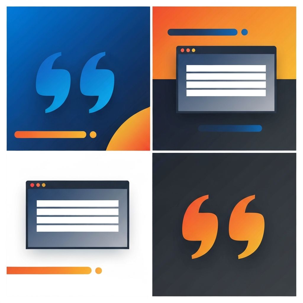
Pull Quote Examples Web Design
What a Pull Quote Is and Why It Matters
A pull quote is a short excerpt taken from the body of an article and displayed prominently, usually with larger typography and a different visual treatment. Originally a print convention, pull quotes have become a powerful tool in modern web design. They give long-form content rhythm, emphasize key insights, and invite scanners to dive deeper into the article. At AAMAX.CO, we use pull quotes thoughtfully across editorial sites, brand storytelling pages, and product narratives.
Done well, a pull quote feels like a confident pause in a conversation, signaling that what follows is worth paying attention to. Done poorly, it disrupts the flow and feels like decoration for decoration's sake.
Why Pull Quotes Work Online
Web readers scan more than they read. Pull quotes give scanners a fighting chance to absorb the most important ideas without committing to every paragraph. They also create visual variety on pages that might otherwise feel like a wall of text. This variety helps maintain attention and encourages users to keep reading.
From a design perspective, pull quotes provide an opportunity to inject brand personality into long-form content. The typography, color, and ornamentation of a pull quote can reinforce the publication's voice in a way that body text cannot.
Common Pull Quote Layout Patterns
The most traditional pull quote sits in the middle of a column, with body text wrapping around it. This pattern is popular in print but tricky on responsive websites, since text wrapping behaves unpredictably across breakpoints. A more modern approach is the full-bleed pull quote, which spans the entire content width and clearly separates the surrounding paragraphs.
Another popular pattern is the side pull quote, which floats to the left or right of the main column on wider screens and stacks vertically on mobile. This pattern works well in editorial layouts where the main content is constrained to a readable measure but the canvas is wider.
Typography Choices That Make Pull Quotes Sing
The typography of a pull quote should contrast with the body text without breaking the brand voice. We often use a display serif against a sans-serif body, or a heavy weight against a regular weight. Italics can add elegance, while uppercase tracking suggests a stronger editorial tone.
Line height matters too. Pull quotes usually benefit from tighter line height than body text because the type size is larger. We pay close attention to optical kerning and hanging punctuation, since these details elevate the craft of the layout.
Real Pull Quote Examples That Work
Some of our favorite pull quote examples come from publications like The Verge, Bloomberg Businessweek, and The New Yorker. They use oversized type, restrained color, and confident spacing to make each quote feel inevitable. On product pages, brands like Apple and Stripe use pull quotes to highlight customer testimonials, often pairing them with a clean photograph of the speaker.
For our own clients, we have used pull quotes to highlight customer outcomes in case studies, to surface key principles in long-form thought leadership, and to break up product narratives on landing pages. In every case, the quote is chosen carefully so that it can stand alone and still make sense.
Pull Quotes in Mobile Design
Pull quotes need special attention on small screens. A quote that feels powerful on a desktop monitor can feel overwhelming on a phone. We adjust type sizes, reduce ornamentation, and sometimes change the layout entirely so that mobile readers experience the same emotional beat without the design feeling cramped.
Our Front-end Web Development team uses CSS clamp and container queries to make pull quotes fluid across breakpoints. This avoids awkward jumps between mobile, tablet, and desktop sizes.
Accessibility Considerations
Pull quotes should be marked up semantically. The body of the quote belongs in a blockquote element, with the original speaker noted in a cite element when relevant. Screen readers benefit from these cues, and so do search engines. We also ensure that the quoted text exists in the article body so that the pull quote does not become a duplicate that confuses assistive technology.
Color contrast is another accessibility consideration. Designers love subtle gray quotes, but if the contrast falls below WCAG thresholds, we adjust. The quote should be readable to everyone, not just visually unimpaired users.
How to Choose What to Pull
Choosing the right sentence to pull is half art, half science. We look for sentences that are self-contained, emotionally resonant, and aligned with the article's core argument. We avoid pulling sentences that depend on surrounding context, since the quote will feel confusing on its own.
For long articles, we often add two or three pull quotes spaced evenly through the piece. They act like landmarks, helping readers track their progress and giving them reasons to keep going.
Hire AAMAX.CO for Editorial-Grade Web Design
Pull quotes are a small detail, but they reflect a larger commitment to craft. If you want a website that treats every element with intention, our team can help. Explore our Website Design and Strapi CMS Website Development services to learn how we build editorial experiences that feel as good to read as they are to look at.
Want to publish a guest post on aamax.co?
Place an order for a guest post or link insertion today.
Place an Order