Psychology Web Design
What Psychology Web Design Means
Psychology web design is the practice of using insights from human cognition, perception, and behavior to design more effective websites. It is closely related to user experience design, but it leans more heavily on the science of why people behave the way they do online. At AAMAX.CO, our designers and strategists treat psychology as a foundational input to every project, not as a finishing touch added at the end.
When done well, psychology-driven design feels invisible. Users do not notice the careful choices behind every interaction. They simply feel that the website is easy, trustworthy, and pleasant to use.
How Users Actually Read Web Pages
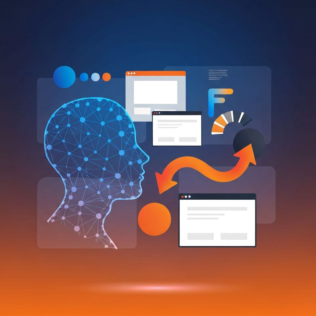
Eye-tracking research has shown that people rarely read websites word for word. They scan in F-shaped or Z-shaped patterns, picking up headings, the first few words of paragraphs, and visually distinctive elements. Designing for scanning means writing strong headings, frontloading important information, and using bullet lists or short paragraphs.
It also means accepting that not every word will be read. Long blocks of marketing copy almost always underperform shorter, more focused alternatives. We test this assumption regularly, and it consistently holds up.
Visual Hierarchy as a Tool of Attention
Visual hierarchy directs the eye through a page in a deliberate sequence. Size, color, contrast, and position all contribute. The largest, most contrasting element usually gets noticed first, followed by elements that share its color or shape. Skilled designers use these tools to ensure that the most important message lands before the user scrolls.
We sketch visual hierarchies on paper before opening a design tool. This forces clarity about what matters most, second most, and so on. The discipline pays off when the design is translated into code by our Front-end Web Development team.
The Hick-Hyman Law and Choice Reduction
The Hick-Hyman law states that decision time grows logarithmically with the number of choices. Translated to web design, this means that fewer options usually lead to faster decisions and higher conversion rates. We see this play out in pricing pages, navigation menus, and checkout flows.
That said, removing choices is not always the answer. Sometimes a richer menu is necessary, especially for sites with complex inventories. The trick is to organize choices in ways that match the user's mental model so that scanning still feels easy.
Anchoring and Pricing Psychology
Anchoring is the tendency to rely heavily on the first piece of information encountered. On pricing pages, the first plan a user sees becomes the reference point against which everything else is judged. Designers can use this strategically by leading with a higher-priced plan or by displaying an original price next to a discounted one.
Used responsibly, anchoring helps users make confident decisions. Used dishonestly, it crosses into manipulation. We always make sure that the pricing story we tell matches the actual value being offered.
The Mere Exposure Effect
People tend to develop preferences for things they encounter often. This is why consistency in branding, layout, and tone matters so much. A user who returns to your site multiple times, sees the same colors, the same voice, and the same patterns, slowly develops a sense of familiarity that turns into trust.
This insight reinforces the importance of design systems. Without a design system, even small changes can introduce inconsistency that erodes the mere exposure effect. Our Website Development team builds systems that scale across pages, products, and campaigns.
Loss Aversion in Forms and Checkouts
Forms and checkouts are particularly sensitive to psychology. Long forms feel risky, since users imagine all the time and effort they might lose. Breaking forms into clear steps with progress indicators reduces this perceived risk. So does explaining why each piece of information is needed.
For checkouts, displaying a saved-cart message or showing items the user might lose if they abandon the page can recover sales without feeling pushy. The framing must be honest, but loss-framing often outperforms gain-framing.
Color, Contrast, and Emotional Tone
Color is one of the fastest signals in any visual experience. Within milliseconds, a color palette can suggest professionalism, warmth, urgency, or playfulness. We pick palettes that align with the brand's positioning and test them with real users when possible. Contrast is equally important, both for emotional impact and for accessibility. We never let aesthetic preferences override readability.
Designing for Mobile Behavior
Mobile users behave differently. They are often distracted, in motion, or short on time. Psychology tells us that they need larger tap targets, bigger fonts, and clearer paths than desktop users. We design for these realities first and then layer in desktop enhancements rather than the other way around.
Hire AAMAX.CO for Psychology-Driven Web Design
If your website is not converting the way you hoped, the issue is often psychological rather than technical. Our team can audit your site, identify friction points, and redesign the experience to feel intuitive and trustworthy. Visit our Website Design service to start the conversation.
Want to publish a guest post on aamax.co?
Place an order for a guest post or link insertion today.
Place an Order