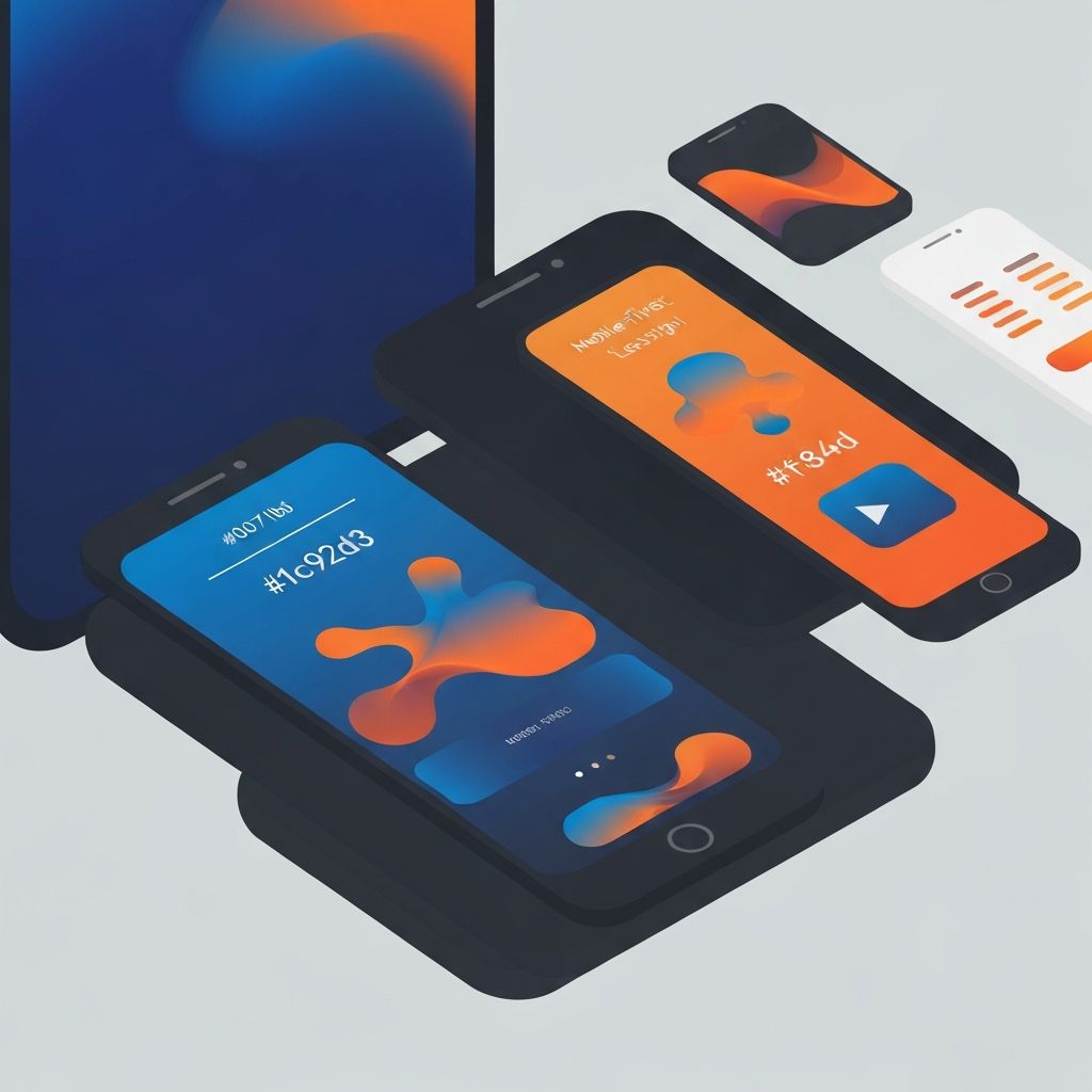
Mobile Web Design Services
The Mobile-First Imperative
Mobile devices now account for the majority of web traffic worldwide. For many businesses, mobile visitors significantly outnumber desktop users. Yet too many websites still treat mobile as an afterthought, offering cramped, slow, or difficult-to-use experiences on smartphones. Professional mobile web design services address this gap, ensuring your website excels on the devices your customers actually use.
At AAMAX.CO, mobile-first design is fundamental to our approach. We design for the smallest screen first, then enhance for larger displays. This methodology ensures that mobile users get a great experience rather than a compromised version of a desktop site. Our mobile web design services deliver fast, intuitive, and beautiful experiences across all devices.
Understanding Mobile User Behavior
Mobile users have different needs and behaviors than desktop users. They're often on the go, dealing with distractions, and have limited time and attention. Connections may be slow or unreliable. Screen space is precious, and touch interaction requires different design considerations than mouse and keyboard.
Our mobile designs accommodate these realities. Content prioritization ensures the most important information is immediately accessible. Streamlined navigation helps users find what they need quickly. Touch targets are sized appropriately for finger interaction. Load performance is optimized for mobile networks.
We study mobile user behavior through analytics and user research to understand how your specific audience uses their devices. This data informs design decisions that align with real user needs rather than assumptions.
Responsive Design Excellence
Responsive web design adapts layouts to fit any screen size, from small smartphones to large desktop monitors. Our front-end web development expertise ensures that these adaptations are seamless and intentional, not awkward compromises.
True responsive design goes beyond shrinking desktop layouts. We redesign navigation systems, restructure content hierarchies, and reimagine interactions for each viewport range. What works beautifully on desktop often needs fundamental rethinking for mobile, not just resizing.
Breakpoint strategy determines how designs transition between screen sizes. We identify the points where layout changes are needed and implement smooth transitions between design states. The result is a consistent experience that feels native to each device.
Performance Optimization for Mobile
Mobile performance directly impacts user experience and business outcomes. Slow-loading pages frustrate users and increase bounce rates. Google's mobile-first indexing means mobile performance affects search rankings. Every second of load time matters.
We optimize every aspect of mobile performance. Image optimization delivers appropriate resolution for each device without wasting bandwidth. Code minification and efficient delivery reduce file sizes. Critical rendering path optimization ensures content appears quickly even before pages fully load.
Our website design services include comprehensive performance auditing and optimization. We test on real devices across various network conditions to ensure acceptable performance even in challenging circumstances.
Touch-Friendly Interface Design
Touch interaction is fundamentally different from mouse interaction. Touch targets must be large enough for fingers, with adequate spacing to prevent accidental taps. Gestures like swiping and pinching can enhance usability when implemented thoughtfully.
Interactive elements are designed with touch in mind. Buttons are sized and spaced for easy tapping. Form inputs are optimized for mobile keyboards. Carousels and galleries respond to natural swipe gestures. Menus expand and collapse with smooth touch interactions.
We consider the full range of touch interactions in our designs. Hover states, which are central to desktop design, don't exist on touch devices. We create mobile-appropriate feedback mechanisms that acknowledge user interactions without relying on hover.
Mobile Navigation Systems
Navigation presents unique challenges on small screens. Desktop mega-menus simply don't work on mobile devices. We design navigation systems that provide access to all content while respecting screen constraints.
Hamburger menus, bottom navigation bars, and other mobile navigation patterns each have strengths and weaknesses. We select the right approach based on your content structure and user needs. Sometimes hybrid approaches work best, combining patterns for optimal usability.
Search functionality becomes even more important on mobile, where browsing extensive navigation can be tedious. We implement effective mobile search with auto-suggest, filters, and results optimized for small screens.
Mobile Forms and Input Optimization
Form completion on mobile devices can be frustrating without thoughtful design. Small screens, on-screen keyboards, and touch input all complicate data entry. Our mobile form designs minimize friction and maximize completion rates.
Input fields are configured for appropriate mobile keyboards. Phone number fields bring up numeric keypads. Email fields show the @ symbol prominently. Password fields can toggle visibility for easier entry. These small details significantly improve the mobile form experience.
We minimize required fields and use smart defaults, autofill, and progressive disclosure to reduce the burden on mobile users. Error handling is clear and helpful, guiding users to correct problems without frustration.
Mobile E-Commerce Optimization
Mobile commerce continues to grow, making mobile shopping experiences critical for online retailers. Our website development team creates mobile e-commerce experiences that convert browsers into buyers.
Product browsing is optimized for touch interaction and small screens. Product images are clear and zoomable. Key information is immediately visible without scrolling. The path from product discovery to checkout is streamlined for mobile completion.
Mobile payment integration includes options like Apple Pay and Google Pay that simplify checkout. Saved payment information and address autofill reduce checkout friction. Cart persistence across devices supports users who start shopping on mobile and complete on desktop.
Progressive Web Apps
Progressive Web Apps (PWAs) bring app-like capabilities to web experiences. Offline functionality, push notifications, and home screen installation enhance engagement and provide features previously available only to native apps.
Our ReactJS web development and Next.js web development services include PWA implementation for clients who need these advanced capabilities. Service workers enable offline functionality, and web app manifests allow installation on device home screens.
PWAs are particularly valuable for businesses whose users frequently access content in low-connectivity situations or return frequently enough to warrant home screen installation. We help you determine whether PWA features are appropriate for your audience.
Mobile SEO Considerations
Google's mobile-first indexing means your mobile site is what Google evaluates for search rankings. Mobile usability issues directly impact your search visibility. Our mobile designs are built with SEO best practices from the start.
Mobile page speed is a ranking factor. Core Web Vitals metrics that measure user experience are heavily weighted toward mobile performance. Our optimization efforts address these specific metrics to improve both user experience and search rankings.
Mobile-friendly testing and continuous monitoring ensure your site maintains good standing with search engines. We identify and address issues before they impact your rankings.
Testing Across Devices
Mobile design must work across a vast range of devices with different screen sizes, operating systems, and browsers. Our testing process includes real device testing on popular phones and tablets, supplemented by emulator testing for broader coverage.
Cross-browser testing verifies consistent behavior across Safari, Chrome, Firefox, and other mobile browsers. We pay special attention to Safari on iOS, which has unique behaviors and limitations that require specific consideration.
Our website maintenance and support services include ongoing monitoring to catch issues that emerge as new devices and browser versions are released.
Conclusion
Professional mobile web design is essential for businesses that want to reach and serve customers on the devices they use most. Our mobile-first approach, technical expertise, and commitment to user experience ensure your website excels on every screen size.
Whether you need a responsive redesign of an existing site or a new mobile-first build, we deliver mobile web experiences that perform, convert, and delight users.
Want to publish a guest post on aamax.co?
Place an order for a guest post or link insertion today.
Place an Order