Gradient Web Design
The Return and Evolution of Gradient Web Design
Gradients have been part of web design since the earliest days of CSS, but they have gone through dramatic cycles of popularity. After a long period of flat design dominance, gradients returned in force during the late 2010s and have continued to evolve into something richer and more refined. In 2026, gradient web design is no longer about skeuomorphic shiny buttons. It is about mood, depth, and brand identity.
At AAMAX.CO, we see gradients used in everything from startup landing pages to enterprise dashboards. Used thoughtfully, they add personality and warmth to otherwise minimalist layouts. Used poorly, they can feel dated or chaotic. This article explores how modern web designers can harness gradients to create stunning, effective websites.
Why Gradients Work
Gradients tap into how our eyes naturally perceive the world. Real objects rarely have a single flat color; they shift in tone based on light, distance, and texture. By applying subtle color transitions on the web, designers create a sense of depth and movement that flat colors cannot match. Gradients also evoke emotion. A soft peach-to-amber gradient feels warm and optimistic, while a cool blue-to-purple gradient feels calm and futuristic.
From a practical standpoint, gradients help establish visual hierarchy. A call-to-action button with a vibrant gradient stands out against a muted background, guiding users toward the desired action without needing extra elements.
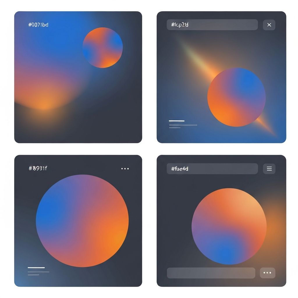
Types of Gradients in Modern Web Design
Several gradient styles dominate current trends. Linear gradients remain the most common, offering smooth transitions between two or more colors along a defined axis. Radial gradients create circular transitions that work beautifully as background accents or spotlight effects. Mesh gradients, which blend multiple color stops in organic shapes, have become especially popular for hero sections and brand visuals.
Conic gradients, which sweep color around a center point, open up new creative possibilities like color wheels and pie charts styled without images. With CSS now supporting all these options natively, designers no longer need to rely on exported images or heavy graphics.
Using Gradients for Brand Identity
Many modern brands use gradients as a core part of their identity. Instead of a single logo color, they define a palette that transitions between complementary hues. This approach makes brand assets feel dynamic across different contexts while maintaining recognition. When gradients are applied consistently across a website, from buttons to illustrations to backgrounds, they reinforce brand memory.
Creating a strong brand gradient starts with choosing colors that work harmoniously together. Tools like color wheel apps and gradient generators help visualize options. The most successful brand gradients feel intentional, not random, and align with the emotional positioning of the company.
Gradient Best Practices
To use gradients well, follow a few key principles. Keep color stops close in hue to avoid muddy transitions. Test gradients on different screens, since some displays handle subtle color shifts better than others. Ensure text placed on gradient backgrounds remains readable by using sufficient contrast or overlaying a semi-transparent solid color. Finally, avoid overusing gradients; if everything has a gradient, nothing stands out.
Accessibility should always be front of mind. A gradient that looks beautiful on a designer's high-end monitor may fail contrast checks for visually impaired users. Always validate combinations using accessibility tools.
Technical Implementation
Modern CSS makes gradient implementation straightforward. Developers can combine linear-gradient, radial-gradient, and conic-gradient functions with multiple background layers to create rich visual effects. SVG filters and CSS blend modes add even more creative possibilities. For dynamic gradients that animate or respond to user input, JavaScript and WebGL libraries open up advanced options.
Performance remains an important consideration. CSS gradients are very efficient because they render on the GPU without extra image downloads. However, complex mesh gradients rendered in JavaScript or WebGL can impact battery life on mobile devices. Our team specializes in balancing creativity with performance through careful Front-end Web Development techniques, ensuring gradients enhance experiences without slowing them down.
Dark Mode and Gradients
Dark mode has become standard across most websites and applications, and gradients play a special role in dark themes. In dark interfaces, subtle gradients add much-needed depth and visual interest without shouting for attention. A dark navy background that fades to near-black at the edges feels more sophisticated than a flat black panel.
However, dark mode gradients require extra care. Colors often appear more saturated against dark backgrounds, so what looks subtle in light mode can feel overwhelming in dark mode. Always design both modes intentionally, not as an afterthought.
Gradient Web Design Trends in 2026
This year, we are seeing several notable gradient trends. Iridescent gradients that shift through multiple colors bring a premium, futuristic feel. Duotone gradients blending only two colors continue to be popular for their simplicity and brand alignment. Noise-textured gradients, which add subtle grain to smooth transitions, give websites a more tactile, analog quality.
Animated gradients are also on the rise. Slowly shifting colors in hero sections or background elements create a sense of liveliness without being distracting. When paired with micro-interactions, they make sites feel alive and responsive.
When Not to Use Gradients
Despite their appeal, gradients are not right for every project. Highly technical dashboards, enterprise software, and data-heavy sites often benefit from flatter, more neutral palettes that let the information shine. Healthcare, government, and financial sites may favor simpler visual styles that communicate seriousness and trust.
The key question is always whether a gradient supports the user's goals. If it adds clarity, personality, or brand strength, use it. If it distracts or complicates, leave it out.
Bringing Gradient Design to Your Website
Incorporating gradients into your own website does not require a complete redesign. Start with small accents, such as button hovers, section dividers, or illustration backgrounds. Over time, evaluate whether a stronger gradient presence aligns with your brand direction.
At AAMAX.CO, our designers and developers collaborate closely to bring gradient design to life in ways that feel fresh yet timeless. Whether you need a complete rebrand, a new landing page, or a refined dashboard, we can help you harness color in ways that delight users and elevate your business.
Final Thoughts
Gradient web design in 2026 is all about nuance. It rewards designers who understand color theory, restraint, and brand storytelling. Done right, it transforms a good website into an unforgettable one. Done poorly, it feels like a relic of an earlier era.
If you want a design partner who takes color seriously and understands how to apply gradients strategically, hire AAMAX.CO. Let us help your brand stand out with beautiful, modern web design that connects with your audience on every level.
Want to publish a guest post on aamax.co?
Place an order for a guest post or link insertion today.
Place an Order