Flat Web Design
Understanding Flat Web Design
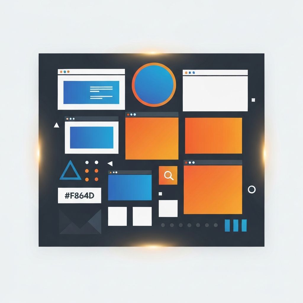
Flat web design is a visual style that emphasizes simplicity, clarity, and usability by removing ornamental elements like gradients, drop shadows, textures, and three-dimensional effects. Interfaces are built from clean geometric shapes, solid colors, thoughtful typography, and generous whitespace. The result is a refined, fast-loading experience that feels modern and intentional. At AAMAX.CO, we have used flat web design principles to build hundreds of websites that combine elegance with measurable performance, and this guide shares the principles, history, and practical applications of the style.
The Origins of Flat Web Design
Flat web design emerged as a reaction to skeuomorphism, the earlier style that mimicked real-world materials like leather, wood, and paper textures. While skeuomorphism helped new users navigate digital interfaces by borrowing familiar metaphors, it eventually became visually cluttered and slow to render. As devices and users matured, designers began stripping away decoration in favor of clarity.
Microsoft's Metro design language, introduced on Windows Phone in 2010, is widely credited as the first mainstream flat design system. Apple followed with iOS 7 in 2013, and Google formalized its own take with Material Design in 2014. These shifts quickly influenced the web, leading to a widespread adoption of flat principles across consumer and enterprise websites.
The Core Principles of Flat Web Design
Flat web design is guided by a small set of principles. Simplicity reduces visual noise so users can focus on content and actions. Clear hierarchy uses size, weight, and color to show which elements matter most. Bold color choices create energy and personality without relying on decoration. Typography is elevated to a primary design element, carrying both function and aesthetic. Whitespace gives every element room to breathe.
These principles translate directly into practical benefits. Interfaces load faster because they use fewer images and effects. They scale better across devices and resolutions. They remain accessible and legible even in challenging viewing conditions. And they age gracefully, because trends in gradients and textures tend to date faster than clean typography and restrained color.
Flat Design Versus Flat 2.0
Early flat web design was sometimes criticized for reducing usability. Without any visual cues, it could be hard for users to tell which elements were buttons or links. In response, designers evolved toward Flat 2.0, which reintroduced subtle affordances like soft shadows, gentle gradients, and thin borders. These small cues improved usability while preserving the clarity of the original style.
Today, most modern websites embrace a hybrid approach that combines flat principles with subtle depth cues, motion, and selective illustration. Our team uses this balanced approach in our website design work, ensuring interfaces feel both modern and deeply usable.
Color Systems in Flat Web Design
Color plays a starring role in flat web design. Without gradients and shadows, color becomes the primary way to express brand personality and guide attention. Effective flat color palettes are carefully balanced, with a limited set of primary colors, supporting neutrals, and semantic colors for states like success, warning, and error.
Our design process always begins with a thoughtful color system that performs well in light and dark modes, passes accessibility contrast checks, and translates gracefully into marketing materials. This systematic approach prevents the chaos that undermines many DIY flat designs.
Typography and Flat Design
Typography is arguably the most important element in flat web design. With fewer visual effects, type becomes the main carrier of personality and hierarchy. Modern flat websites often feature large display headlines, distinctive font pairings, and strong attention to line height, letter spacing, and optical sizing.
Variable fonts, responsive typography scales, and modern font loading strategies make it easy to deliver sophisticated typography without sacrificing performance. Our front-end web development team integrates typography systems that render beautifully on every device while meeting strict performance budgets.
Layout, Grid, and Whitespace
Flat web design relies heavily on structured layouts, strong grids, and generous whitespace. Instead of leaning on textures or decorations, flat layouts use alignment, rhythm, and negative space to create visual interest. A well-crafted grid gives every element a deliberate position and creates a sense of calm confidence.
Responsive design is deeply integrated with flat principles. Modern frameworks like Tailwind CSS and design systems built on component libraries make it straightforward to apply consistent flat layouts across breakpoints, ensuring a seamless experience from mobile to desktop.
Motion and Micro-Interactions
Subtle motion adds life to flat interfaces without returning to the ornamental excess of skeuomorphism. Hover states, focus animations, and smooth transitions signal interactivity and guide attention. Our team frequently incorporates motion through CSS transitions and JavaScript libraries like Framer Motion in our ReactJs web development and Next.js web development projects.
Motion is most effective when it is purposeful. Each animation should reinforce a user action, communicate a state change, or create delight without distraction. Respect for reduced-motion preferences ensures accessibility for users sensitive to movement.
Flat Design and Performance
Flat web design naturally supports excellent performance. Fewer images, simpler CSS, and fewer assets translate to faster loads and better Core Web Vitals. Combined with modern frameworks, thoughtful asset optimization, and strong back-end architecture, flat websites can achieve near-instant loads even on mid-range mobile devices.
Our back-end web development team pairs flat front-end design with efficient APIs, caching strategies, and server-side rendering to deliver holistic performance that benefits users, SEO, and business outcomes.
Flat Design for Marketing and E-Commerce
Flat web design fits almost any industry, but it is especially powerful for marketing and e-commerce. Clean product pages let photography shine. Simple checkout flows reduce friction and increase conversion. Clear navigation and typographic hierarchy guide shoppers toward decisions without overwhelming them.
We apply flat design principles to e-commerce builds on platforms such as Shopify, WooCommerce, and headless commerce stacks, often combined with content powered by Strapi CMS website development for maximum flexibility.
The Future of Flat Web Design
Flat web design continues to evolve. Recent trends include bold blocky layouts, neo-brutalist styles, refined minimalism, and systematic design tokens that scale across brands and products. Regardless of trend cycles, the core principles of clarity, hierarchy, and intentionality will remain valuable.
If you want a website that feels timeless, performs exceptionally, and communicates with confidence, flat web design is an excellent foundation. Our team blends flat principles with strategic thinking, brand-specific creativity, and strong engineering to deliver websites that stand out for the right reasons. Reach out today to discuss how flat web design can help your brand communicate clearly and convert consistently.
Want to publish a guest post on aamax.co?
Place an order for a guest post or link insertion today.
Place an Order