Contrast in Web Design
What Is Contrast in Web Design?
Contrast is the visual difference between elements on a page. It is how your eye knows where to look first, what to read next, and which button to click. Without contrast, a website becomes a flat, monotonous wall of information that users cannot navigate. With thoughtful contrast, a website becomes intuitive, accessible, and persuasive. It is one of the fundamental principles of design, yet it is often misunderstood or overlooked.
At AAMAX.CO, we use contrast strategically to guide users toward the actions that matter most. Whether we are designing a simple landing page or a complex enterprise application, contrast is always part of the conversation from the earliest wireframes to final implementation.
The Different Types of Contrast
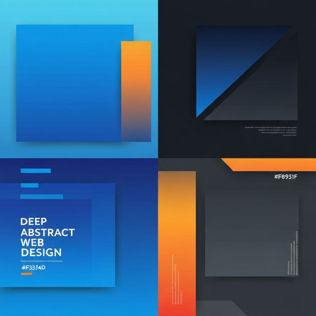
Contrast is not just about light versus dark colors. In web design, contrast can exist across many dimensions: color, size, weight, shape, spacing, texture, and motion. A skilled designer uses these dimensions together to create clear visual hierarchies that feel effortless to navigate.
Color contrast is perhaps the most well-known form. It determines how readable text is against its background and how well buttons stand out. Size contrast separates primary headlines from supporting paragraphs. Weight contrast, using bold versus regular typefaces, adds emphasis without overwhelming the eye. Shape contrast, such as a rounded button in a grid of rectangles, draws immediate attention. Spacing contrast, created through strategic use of white space, tells users where sections begin and end. Texture and motion can add further layers of distinction when used sparingly.
Why Contrast Matters for Conversion
Every website has a purpose. Whether it is generating leads, selling products, or educating visitors, success depends on guiding users toward specific actions. Contrast is the silent director of that journey. A call-to-action button that blends into the background will be ignored. The same button in a contrasting color can double or triple conversion rates.
Successful conversion-focused design uses contrast to create a visual path from headline to subheadline to action. At every step, the next logical element should stand out just enough to be noticed without overwhelming the user. This balance is harder than it looks, and it often takes testing and refinement to get right.
Accessibility and Contrast
Contrast is not just an aesthetic choice. It is an accessibility requirement. Users with visual impairments, color blindness, or aging eyes rely on strong contrast to read content and interact with interfaces. The Web Content Accessibility Guidelines (WCAG) define specific contrast ratios that text must meet to be considered accessible: 4.5 to 1 for normal text and 3 to 1 for large text at the AA level, with AAA requiring even higher ratios.
Meeting these standards is not optional for most businesses. Accessibility laws in many regions require compliance, and more importantly, inclusive design is simply the right thing to do. Our team at AAMAX.CO checks every design against WCAG standards during development, ensuring that your website serves every user who visits it.
Using Color Contrast Effectively
Color contrast is powerful, but it must be used with intention. Too many high-contrast elements competing for attention create visual chaos. A well-designed page usually has one or two dominant accent colors that stand out against a neutral background. These accent colors are reserved for the most important actions, such as the primary call-to-action button.
When choosing brand colors, consider how they will perform across different contexts. A color that looks beautiful in isolation may be hard to read when used as text or a button. Always test your color combinations in real layouts, and use contrast-checking tools to verify accessibility.
Typography and Contrast
Typography offers many opportunities to create meaningful contrast. Pairing a bold display font for headlines with a clean, readable body font creates natural hierarchy. Contrast in size, from 14-pixel body text to 48-pixel headlines, guides the eye down the page. Weight contrast, mixing light and heavy weights within the same typeface family, adds emphasis without changing fonts.
Be careful not to overuse decorative fonts. One or two typefaces, used consistently, almost always look more professional than a page with four or five competing styles. Our Website Design team carefully selects typography pairings that reinforce brand personality while maintaining clarity.
Spatial Contrast and White Space
Empty space is not wasted space. White space, also called negative space, is a form of contrast that gives visual elements room to breathe. A button surrounded by generous padding feels more important and easier to click. Sections separated by clear spacing feel organized and navigable. Dense, cluttered layouts overwhelm users and bury important content.
Designers often hesitate to use enough white space because they worry the page will look empty. In reality, strategic use of space increases perceived quality and makes key elements stand out more. A luxury brand does not crowd its storefront, and your website should not crowd its homepage.
Contrast in Interactive States
Interactive elements such as buttons, links, and form fields need contrast between their default, hover, focus, and active states. Users rely on these visual changes to understand that an element is interactive and that their action has been registered. A button that looks identical whether or not it has been hovered is confusing and feels broken.
Focus states are especially important for accessibility. Keyboard users rely on visible focus indicators to navigate websites. Removing or weakening focus outlines may look cleaner, but it makes the site unusable for many people. Our development team, skilled in Front-end Web Development, ensures that every interactive state is clear, consistent, and accessible.
Testing and Iterating on Contrast
Even experienced designers cannot predict exactly how users will interact with a page. Testing is essential. A/B testing button colors, headline sizes, and layout variations often reveals surprising insights. What works for one audience may not work for another, and contrast decisions should be informed by real user behavior, not just aesthetic preference.
Heatmaps, session recordings, and conversion tracking tools provide valuable data about how contrast is working on your site. Regular audits and refinements keep your website performing at its best as your audience and business evolve.
Let Us Help You Master Contrast
Great contrast is invisible to users but unmistakable in its results. It makes websites easier to use, more accessible, and more persuasive. If you want a website that leverages contrast strategically to drive conversions and delight visitors, hire AAMAX.CO for Web Design and Development services. Our team combines aesthetic sensibility with technical precision to create websites that work beautifully for everyone. Learn more about our full range of Website Development solutions.
Want to publish a guest post on aamax.co?
Place an order for a guest post or link insertion today.
Place an Order