Alignment in Web Design
The Fundamental Importance of Alignment in Web Design
Alignment stands as one of the most fundamental yet frequently underappreciated principles of effective web design. When elements align properly, designs feel organized, professional, and intentional. When alignment fails, even otherwise beautiful designs feel chaotic and unfinished. At AAMAX.CO, we understand that mastering alignment separates amateur designs from professional ones, which is why this principle guides every project we undertake.
The power of alignment lies in its ability to create invisible connections between elements. When objects share alignment, they become visually related even without explicit grouping. This implicit organization helps users understand content relationships and navigate interfaces intuitively. Proper alignment reduces cognitive load and makes information easier to process.
Understanding Different Types of Alignment
Web design employs several types of alignment, each serving different purposes and creating distinct visual effects. Edge alignment—left, right, top, or bottom—creates strong visual lines that guide the eye. Center alignment creates symmetry and formality. Baseline alignment ensures text elements relate harmoniously.
Left alignment dominates western web design for good reason. It aligns with how we read, creating a natural starting point for each line. Body text should almost always be left-aligned for optimal readability. Right alignment creates visual tension and should be used sparingly and intentionally.
Center alignment works well for headlines, calls to action, and elements meant to feel balanced and formal. However, center-aligned body text is difficult to read because each line starts at a different position. Our website design services apply these principles thoughtfully to every project.
Creating Visual Hierarchy Through Alignment
Alignment contributes significantly to visual hierarchy—the organization that tells users what to look at first, second, and so on. Elements that align with each other are perceived as related; elements that break alignment attract attention. Skilled designers use these perceptions strategically.
Headlines often span wider than body text, but their left edge should align with the body below. This shared alignment connects the heading with its content while size difference establishes hierarchy. Breaking this alignment would disconnect the elements visually and create confusion.
Call-to-action elements sometimes benefit from alignment breaks that make them stand out. A button that sits slightly outside the normal alignment grid catches the eye precisely because it differs from surrounding elements. This technique should be used sparingly to maintain its effectiveness.
Grid Systems and Alignment Structure
Grid systems provide the foundation for consistent alignment throughout a website. These invisible structures divide the page into columns and rows, creating alignment points that elements snap to. Modern responsive design relies heavily on grids that adapt to different screen sizes.
The most common web design grids use 12 columns because 12 divides evenly by 1, 2, 3, 4, and 6, providing flexibility for different layouts. Elements might span 4 columns (one-third width), 6 columns (half width), or various combinations. The grid ensures these different configurations still align with each other.
Consistent gutters—the spaces between grid columns—are as important as the columns themselves. These spaces create breathing room while maintaining alignment relationships. Our front-end web development team implements grid systems that ensure perfect alignment across all devices.
Alignment in Responsive Design
Responsive design presents unique alignment challenges as layouts adapt to different screen sizes. Elements that align perfectly on desktop might not align on mobile without careful planning. Maintaining alignment relationships across breakpoints requires systematic approaches.
Fluid grids help maintain alignment as screens resize. Rather than fixed pixel widths, elements use percentage-based sizing that preserves proportional relationships. As the viewport changes, elements shrink or expand together, maintaining their alignment connections.
At certain breakpoints, layouts may need to restructure entirely. A three-column layout might become two columns on tablets and one column on mobile. At each breakpoint, new alignment relationships must be established clearly. The goal is visual harmony within each configuration, even if configurations differ.
Text Alignment Best Practices
Text alignment significantly impacts readability and user experience. Left-aligned text with a ragged right edge is easiest to read because consistent left positioning helps the eye find each new line. This approach works for virtually all body text scenarios.
Justified text—aligned on both left and right edges—can create clean visual lines but often introduces uneven spacing that harms readability. Rivers of white space can form through justified paragraphs, disrupting reading flow. Use justification cautiously and only when appropriate for the design.
Headlines offer more flexibility. Short headlines can work well centered, creating a formal, balanced appearance. Longer headlines typically benefit from left alignment to maintain readability. The choice should consider both the specific content and overall design aesthetic.
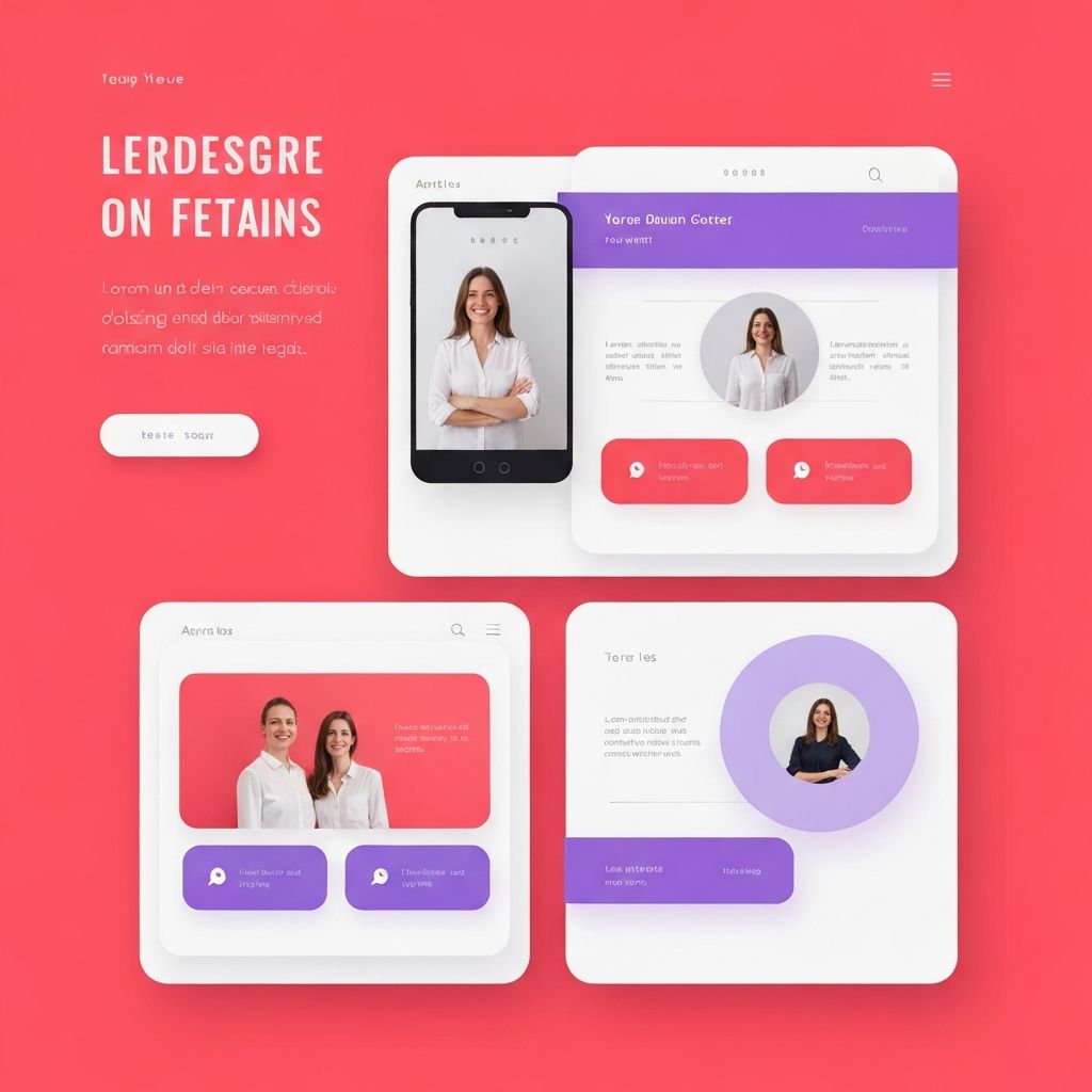
Aligning Images and Visual Elements
Images and graphical elements require the same alignment attention as text. Photos and illustrations should align with surrounding text and other elements rather than floating arbitrarily. This integration makes visual content feel intentional rather than randomly placed.
Caption alignment should match the image it describes. If an image spans certain grid columns, the caption should align with those same columns. Inconsistency between image and caption alignment creates disconnect that confuses the visual relationship.
Icons and small graphics particularly benefit from precise alignment. These elements often appear in rows or columns where slight misalignment becomes obvious. Careful attention to icon alignment—with each other and with accompanying text—creates polished, professional results. Our website development team ensures pixel-perfect alignment throughout.
Navigation and UI Element Alignment
Navigation elements require particularly careful alignment because users interact with them frequently. Menu items should align consistently, both horizontally in navigation bars and vertically in dropdown menus. Inconsistent navigation alignment creates usability problems and appears unprofessional.
Form elements present alignment challenges that directly impact usability. Labels might align left with inputs below, or appear to the left of inputs on the same line. Either approach works when implemented consistently, but mixing approaches within a form creates confusion.
Button alignment varies by context. Groups of related actions should align with each other. Primary and secondary actions might align but differentiate through size or color. Modal dialogs typically align action buttons to the right following platform conventions.
Common Alignment Mistakes to Avoid
Even experienced designers sometimes make alignment mistakes that undermine otherwise strong designs. Approximate alignment—elements that are close but not precisely aligned—often looks worse than deliberately different alignment. If elements should align, they must align exactly.
Mixed alignment within sections creates visual confusion. If a section begins with left-aligned text, all text within that section should typically left-align. Introducing centered text mid-section without clear purpose disrupts visual flow.
Ignoring vertical alignment is a common oversight. Horizontal alignment receives attention while vertical relationships are neglected. Elements in horizontal rows should align vertically—top, center, or bottom—consistently. Baseline alignment for text is particularly important for professional results.
Tools and Techniques for Perfect Alignment
Modern design and development tools provide features specifically for ensuring alignment. Design software offers snap-to-grid functionality, alignment guides, and smart guides that indicate when elements align with each other. Learning these tools thoroughly improves alignment accuracy.
CSS provides powerful alignment capabilities. Flexbox and Grid layout make complex alignments achievable with clean code. Properties like align-items, justify-content, and various alignment utilities handle scenarios that previously required complicated workarounds.
Our ReactJS web development projects leverage component-based architecture to ensure consistent alignment through reusable, properly aligned building blocks.
Achieving Alignment Excellence in Your Projects
Mastering alignment transforms web design quality. What seems like a subtle detail has profound impact on how users perceive and interact with websites. Professional designs feel professional largely because of consistent, intentional alignment throughout.
We bring deep expertise in alignment principles to every project. From initial design through development and testing, we ensure elements relate properly, grids are implemented correctly, and the final result demonstrates the polish that alignment excellence provides.
Ready to elevate your website with professional alignment and thoughtful design principles? Contact us to discuss how our attention to fundamentals like alignment creates websites that look and perform exceptionally.
Want to publish a guest post on aamax.co?
Place an order for a guest post or link insertion today.
Place an Order